Weekly Roundup
/
I’ve rounded up what I’ve been digging this week!
Read MoreI've been reading Design*Sponge for a decade, so just imagine my thrill seeing our home on one of my favorite design resources! In case you missed it, the full write-up including before-and-afters, as well as a source list, is below. Enjoy!
Ross and Ashley Goldman and their cat, Mabel, have lived in their 1915 San Diego, CA craftsman for two years. Much of that time has been spent making their house into a home, highlighting the beautiful original details of the century-old structure, and creating a modern respite fit for sitting back and reflecting on all of their hard work. All of which led Ashley to create a blog to document their renovations, The Gold Hive — a name created from a combination of their last name and the literal hive that was found in their home when they bought it. When she’s not working on the house, Ashley can be found at a local art museum where she works on programs with school kids, anthropomorphizing her plants and vintage portraits, or making pies.
Ashley and Ross both grew up in the suburbs, in 70s tract housing, only a few blocks away from each other. When they were looking to purchase their first home, they knew they wanted one with a little more history than those in which they spent their childhoods. Unfortunately, San Diego isn’t replete with historic districts. The couple looked for two years before they found their craftsman gem in a neighborhood only 15 minutes from downtown that somehow retains a small-town charm despite its proximity to the city center. With all of the charm, the mom-and-pop shops and restaurants, it’s not hard to imagine how difficult finding an available house in that neighborhood would be — Ross didn’t even see their house before Ashley had to put an offer in because he was working out of town (he’s an audio engineer for live events) and there were only two days the home was being shown!
One thing the “before” photos can’t accurately depict is the stench that awaited the industrious couple. Ashley remarked that it was so bad at first that they could barely stand inside — a delightful combination of old cigar smoke and pet urine. “It took us three months of floor refinishing, wall retexturing, cleaning, electrical updates, and a restored bathroom before we could move in. We did a lot upfront to get the house to a place where we could put our things inside, but for the past two years since then, we’ve taken a slow approach to renovations and decorating,” Ashley shares. While there was something of a rush to make their home livable, since then the actual decorating of the space has had an organic flow that took shape as Ashley stumbled upon a perfect piece of art, vintage piece, or as they needed furniture. They’ve also not rushed into remodels, but instead lived in their home, hosted parties, friends, and holiday gatherings learning exactly what their needs are before launching into a project. While they don’t feel like their home is “done,” they actually relish in the process and the discoveries they make in getting there, and now, at least for a little while, they get to kick back and watch their favorite Netflix dramas. Follow along to see the work they’ve done so far, and hear what they still dream of changing up. —Rebekah
Photography by Dani Toscano
Image above: “Here is a view into the den and down the hallway to the bathroom. It isn’t the biggest of masters, but with the adjoining den, it feels like a suite. One day, we hope to add a bathroom to the master. The photo over our bed is from our wedding and it is printed as an engineering print for $7 at Staples. I hung it up two years ago when I felt like I needed something temporary on the walls and it’s stayed this whole time,” Ashley explains.

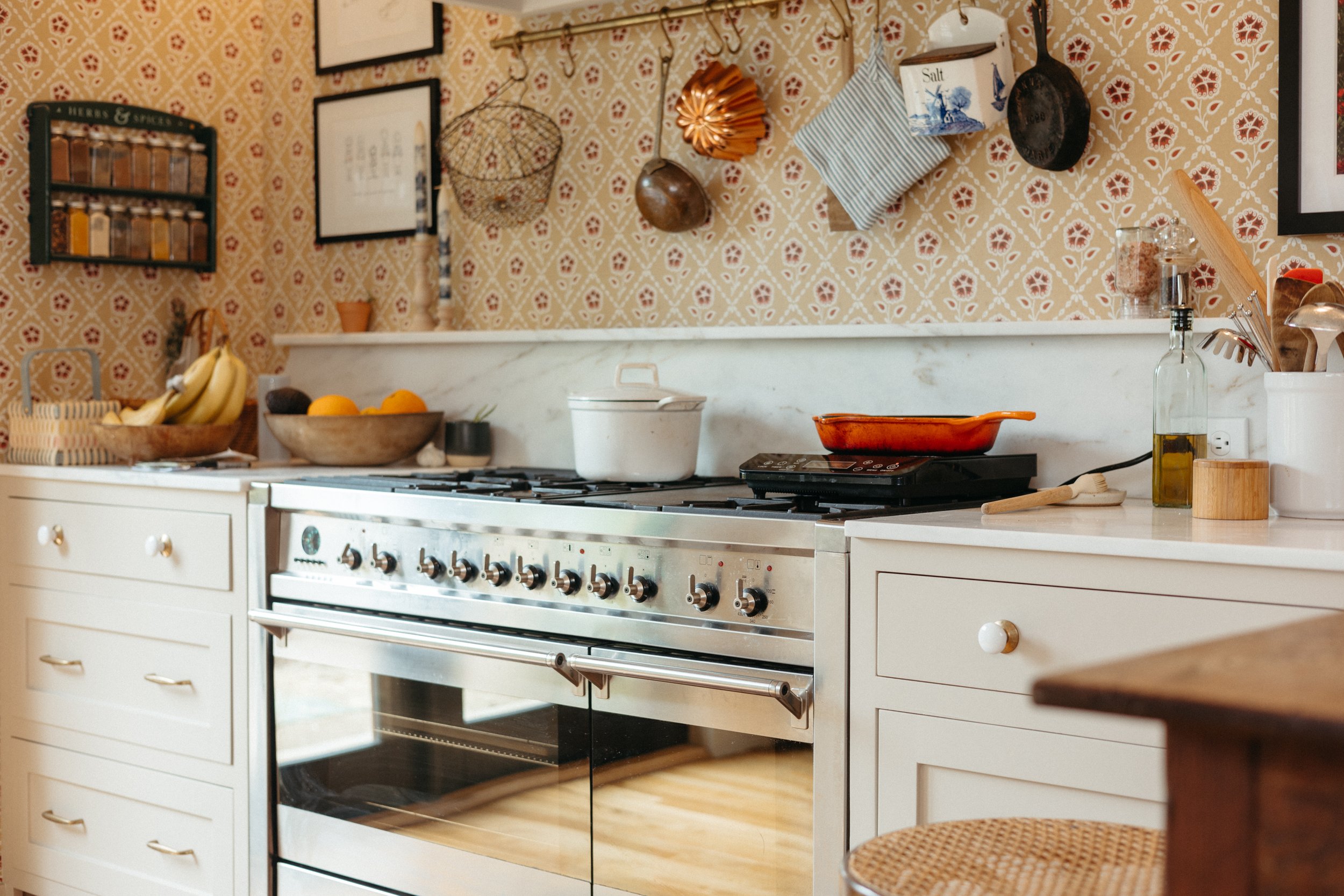
While Ashley and Ross' kitchen has gone from dark and dated to bright and welcoming, it's not yet in its final iteration. The couple will be doing a remodel at some point in the future to make their kitchen more of a workhorse. "The kitchen earned so many changes without affecting the footprint. New counters, paint, hardware, lighting, appliances, counter space, backsplash, and flooring. The only thing that stayed unaffected by the kitchen updates was the fridge. It merely got a heavy cleaning," Ashley shares.

Ashley's rare find proves new isn't always necessary, "I got this vintage O’Keefe & Merritt stove at an estate sale down the street when I found that the existing one was in disrepair. I’ve scrubbed the whole thing clean, and it works just as well as the day it was made."

"The garden window above the sink is the perfect home for houseplants. They do double duty as greenery decor as well as hiding the neighbor’s trash cans," Ashley admits.

Ashley's problem-solving creates a stylish corner and further functionality: "The corner of the kitchen had no storage or counter space, so I made a floating countertop to extend our work surface and prep area."
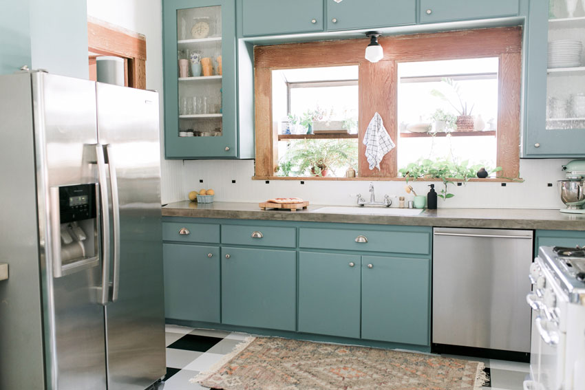
"It’s amazing what some paint and new hardware can do. I also coated the tile counters in [a] few layers of concrete," Ashley explains.

"My hobby other than restoring the house is making pies and experimenting with new recipes," Ashley shares.

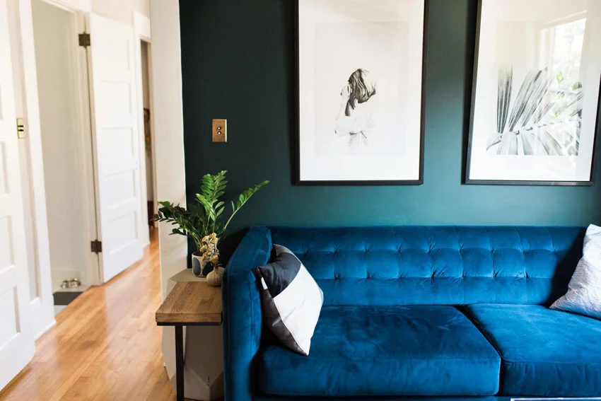
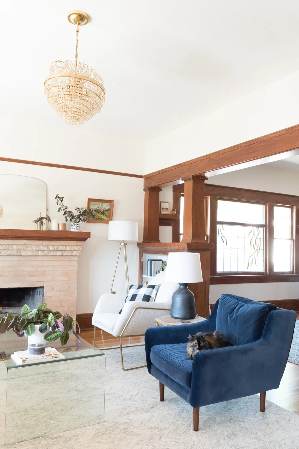
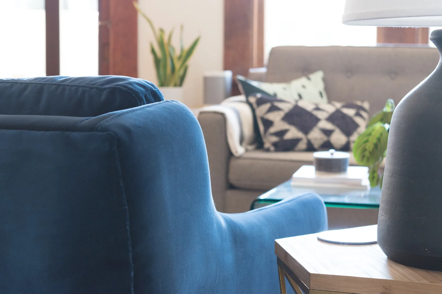
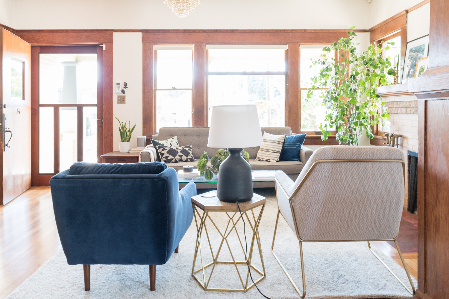
“We kept all of the original stone and woodwork, but gave the walls a new texture coating after repairing all of the cracks throughout the home. The living room is a formal sitting room. We love the architecture in this space, so we opted not to put a TV here. While it’s a ‘formal’ room in the sense that it isn’t designed to be a place to binge-watch Netflix, I want the space to be comfortable. I chose to pair two non-matching chairs to make the space feel more casual,” Ashley explains.

“Between the living room and office are a set of French doors. I love how the individual panes frame the view of the fireplace.”

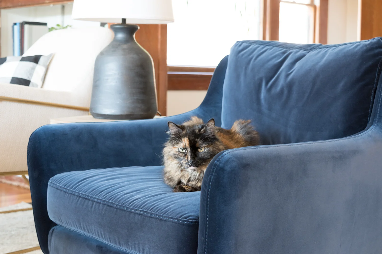
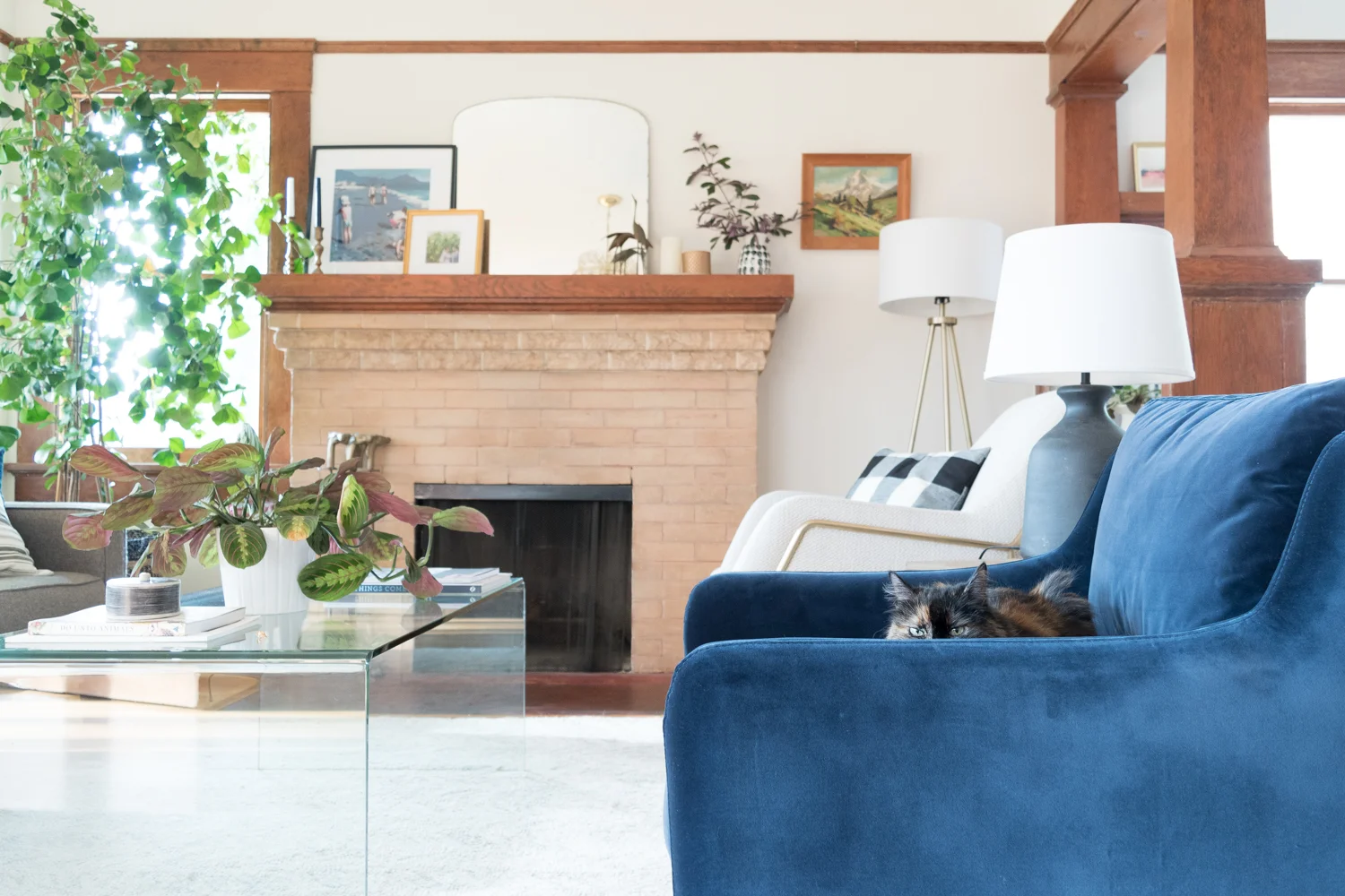
Ashley explains what makes their little family such a good fit, “Our cat, Mabel, is big on snuggles and plush pillows. She fits in nicely with us because we like the same.”

Ashley shares the story of where her chandelier came from in a most relatable way: “I got this art deco chandelier after I fell in love with a similar one on Nicole Curtis’ show, Rehab Addict. It’s called a wedding cake chandelier and I love the round, feminine shape it adds to a room that’s full of rectangular shapes.”

“The built-in room dividers between the living room and dining room have ample space for my tchotchkes and a few of our favorite reads. I try to sprinkle art around the home no matter how small,” Ashley explains.

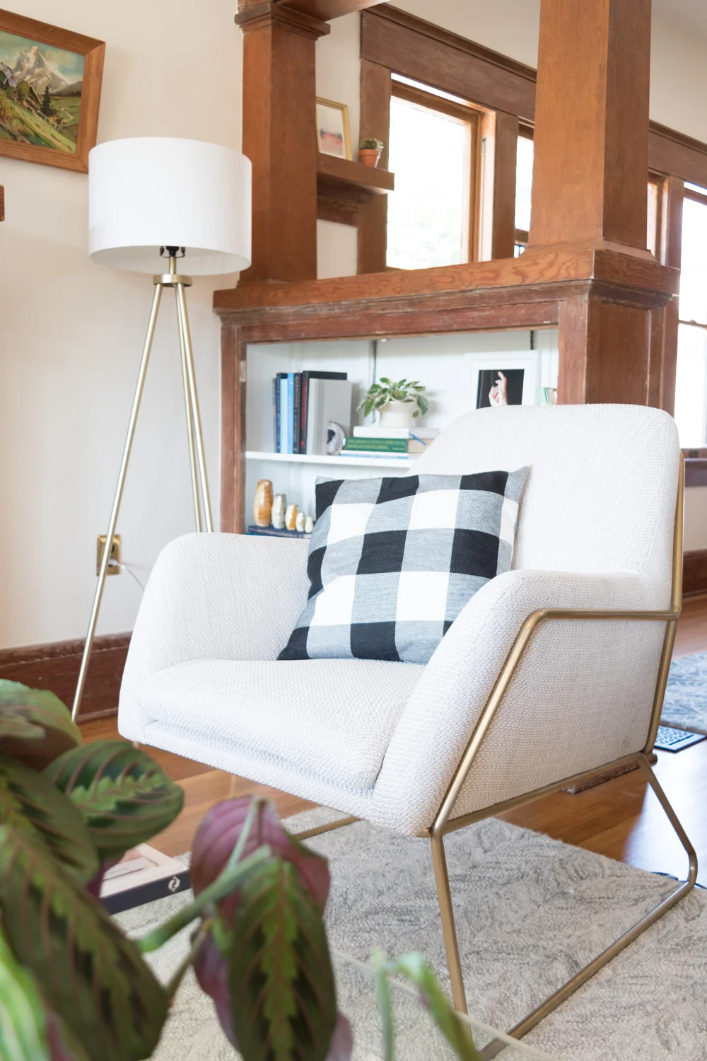
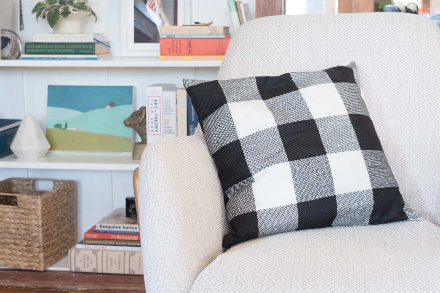
Ashley describes her style, “I’m drawn to basic and minimal designs that still have something special. This chair from Article has an interesting metal shape that complements that brass throughout the house. I’m also a big fan of buffalo check and it makes an appearance in nearly every room.”

“On the mantel live brass candlesticks and a mirror from a local estate sale along with a few of our favorite framed pieces. The Kids on the Shore print by Tali Yalonetzki came from Artfully Walls and I adore the painterly quality and blue tones. It’s a reoccurring theme with the art I gravitate towards. The photo of Ross and me is from our wedding day when we got married in the gardens of the historic Marston House Museum,” Ashley shares.

Ashley found a luxurious solution to Mabel’s destructive habits, “The cat loves scratching on our furniture and we’ve found that velvet is the one material she can’t destroy. Not only does she not ruin this chair, but it’s her absolute favorite and she can be found lounging in it all the time. It’s from Article and what I love about it is that it’s a scaled down version of a wingback chair.”

“When I toured the house it was a nighttime, so I had no idea how much natural light would flood into the house. We have lots of windows, and these west-facing Chicago style windows show off great views of the sunsets, and even 4th of July fireworks,” Ashley explains.

Ashley describes some of the steps they took to making this space more livable, “The hardwoods in the dining room were marred by pet stains. The floors were refinished and much of the damage is repaired, or hidden under the rug. I painted the walls the same color from floor to ceiling to make the space feel bigger. The built-in buffet is what truly sold me on the house. The intact leaded glass and 100-year-old mirror were added bonuses! The door to the left of the buffet swings both directions and leads into the kitchen. The chairs are inspired by the classic molded Eames chair, but these have a plush seat which makes long meals extra comfy.”

“I wanted a chandelier more modern than the one in the living room, and one that had a slim profile that wouldn’t compete with the buffet. This piece was custom ordered to fit our space from an Etsy shop,” Ashley explains.
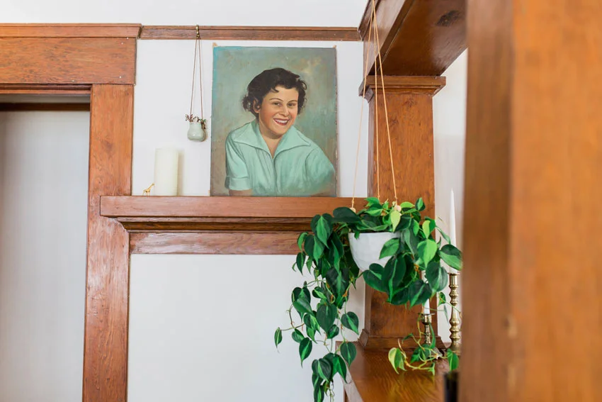
“I’m a sucker for vintage oil paintings, especially portraits. I refer to this gal as ‘my pretty lady’ and feel like she’s a part of my family,” Ashley admits.

“The previous homeowner left us a bunch of dirt and grime to clean up after him, but he also bestowed this painting of our house from a decade ago when it was featured in the historic home tour.”

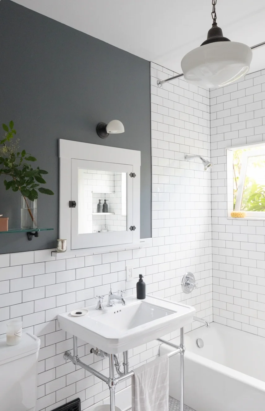
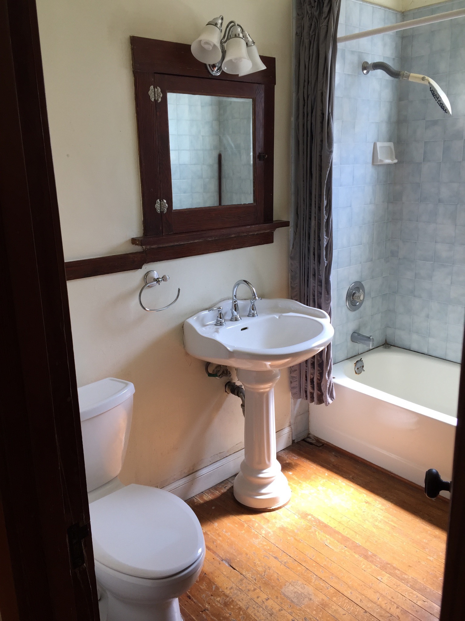
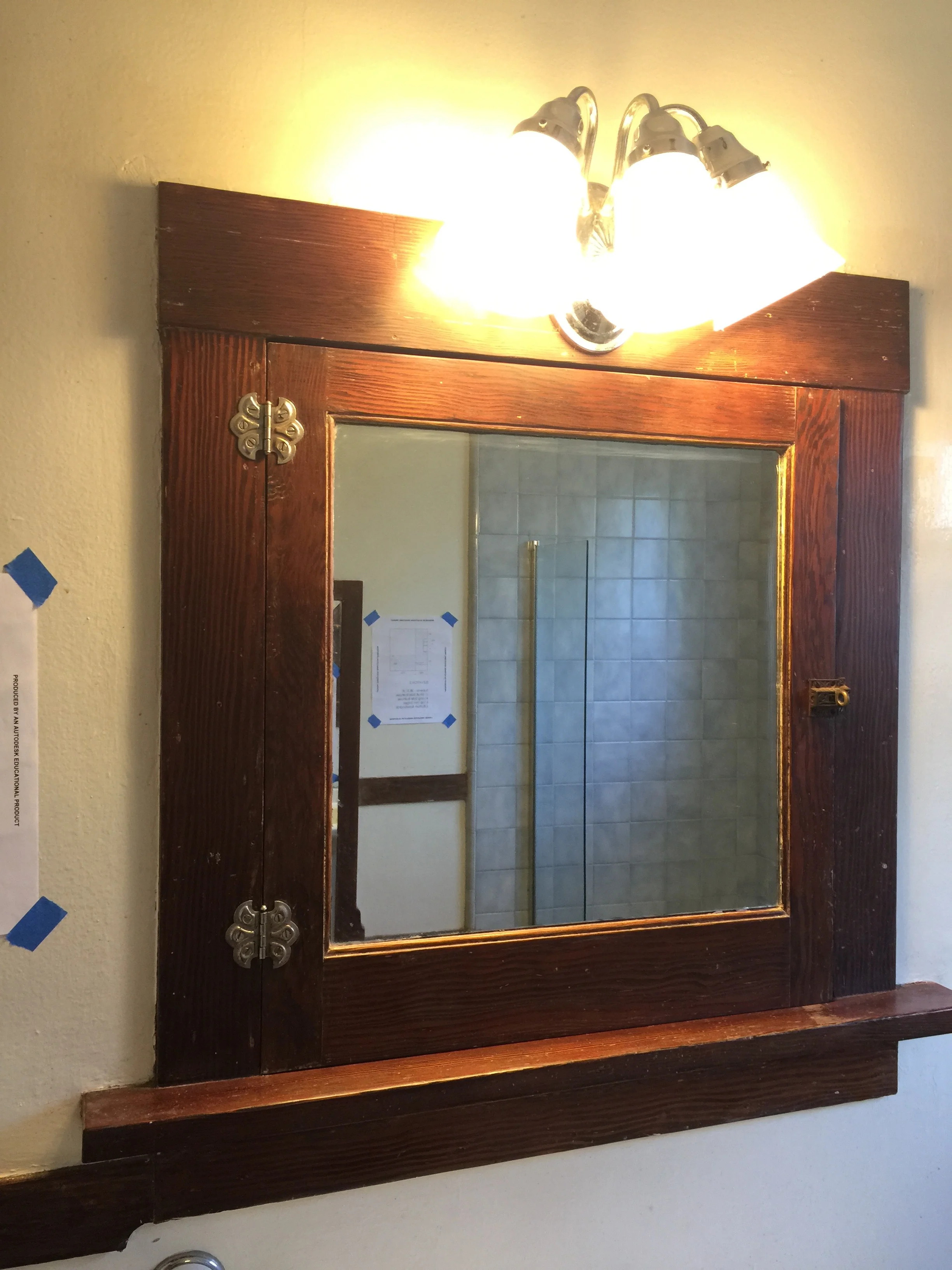
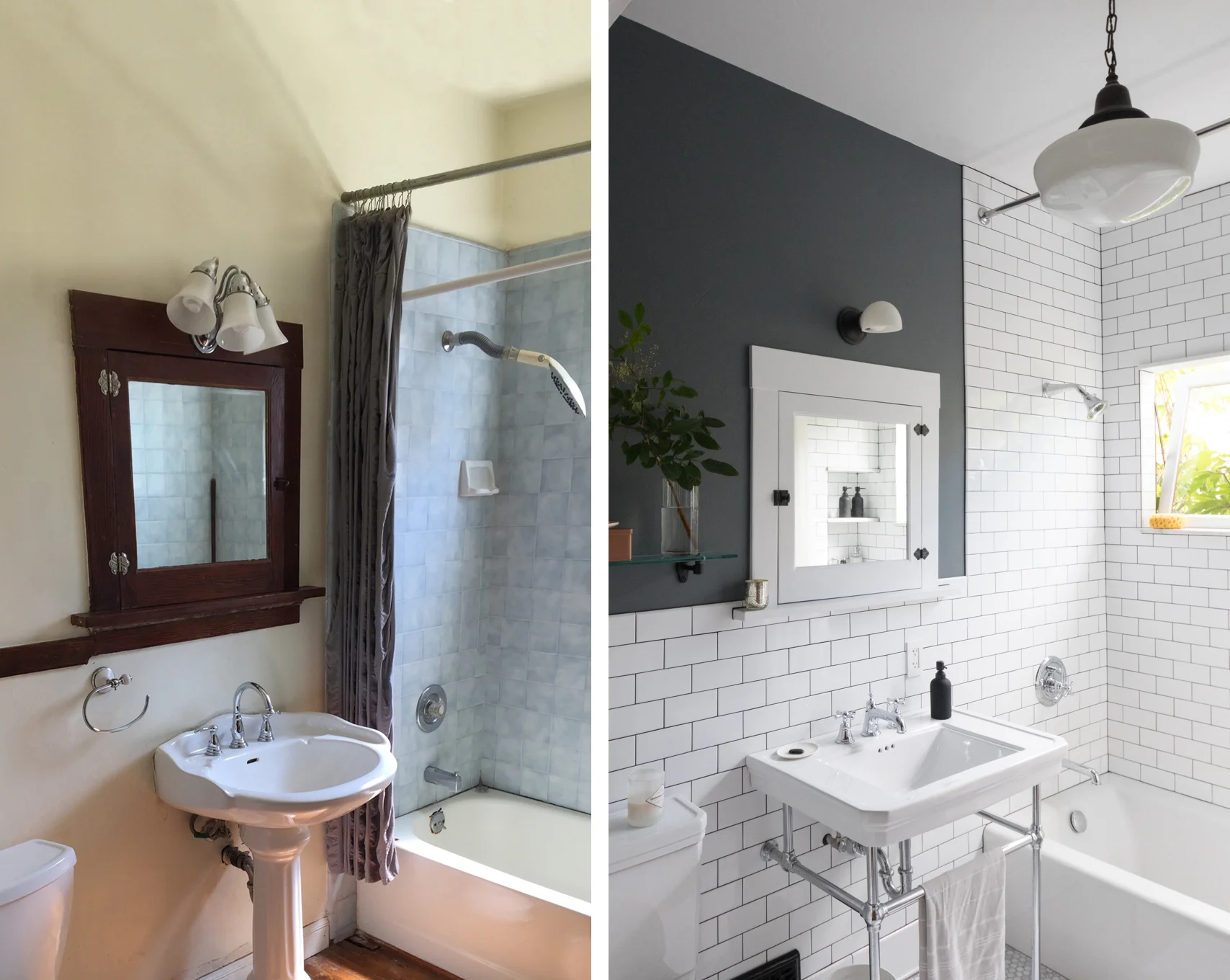
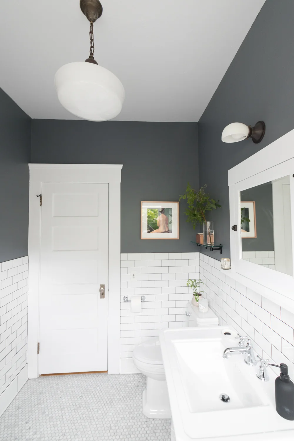
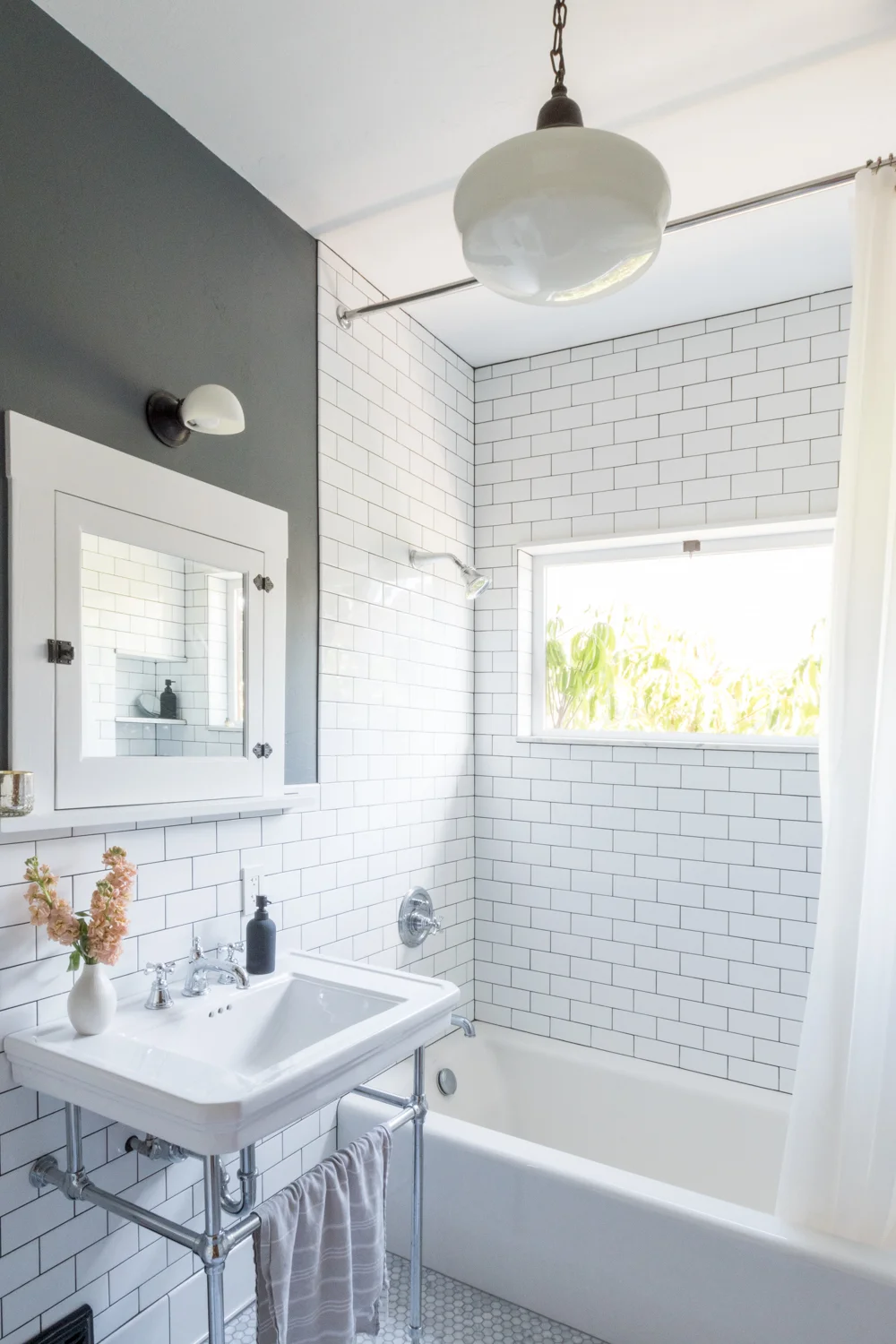
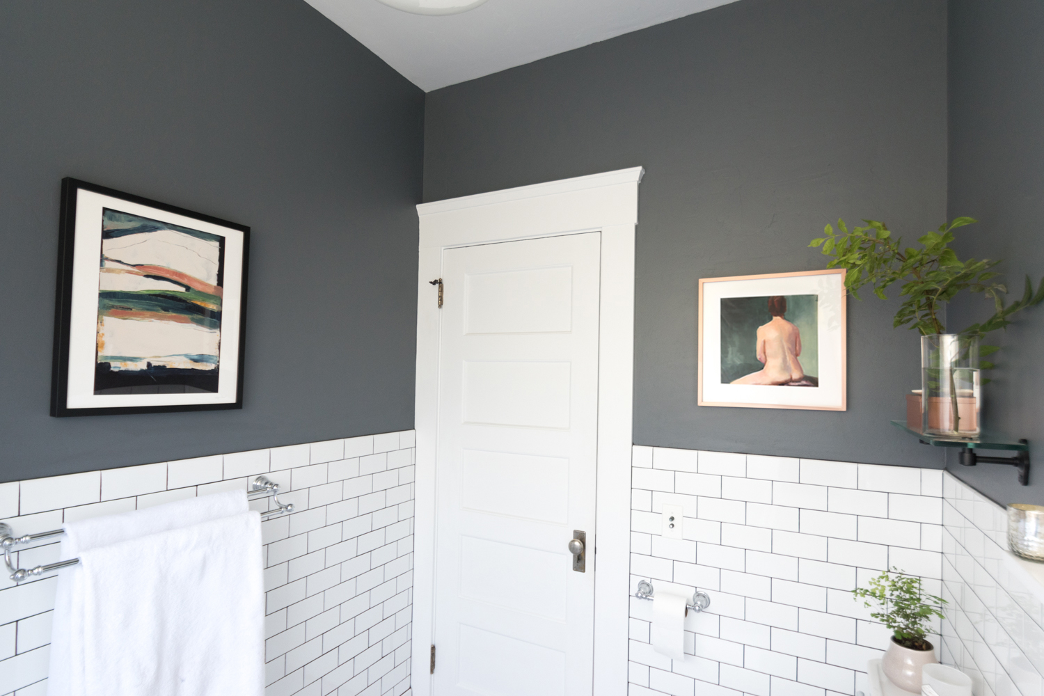
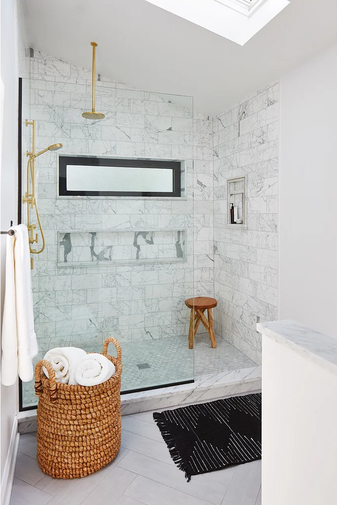
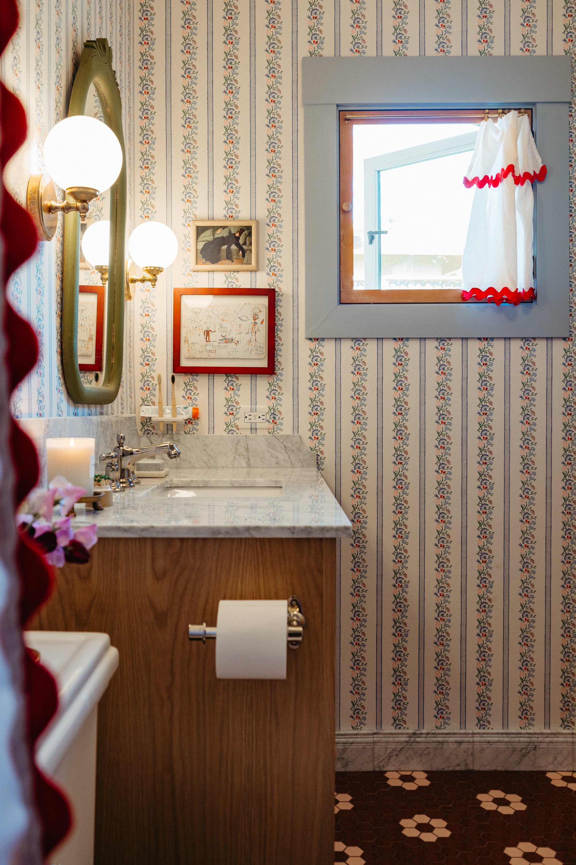
“The bathroom was entirely gutted down to the crawl space and up into the attic. The floor was rotting and the plumbing was corroded. This space was the first big remodel when we got the house and it’s still a favorite. We took the classic subway tile all the way to the ceiling in the shower, and at a chair rail height around the rest of the walls. The dark grout gives a heritage feel and ties into the dark paint on the walls. Everything in the space is new except for both of the light fixtures and the original medicine cabinet.”
“We did a dark charcoal on the walls to add contrast to the bright white tiles,” Ashley says. “I played with mixed metals in this space and did black, chrome, and brass. Some may not love the combination, but we do.”

The remodel revealed a little unexpected extra storage, “When we redesigned the space, there was room at the foot of the tub for a tall storage unit and behind it was space for a recessed niche in the corner of the shower. It’s tucked out of sight of guests, but so handy while showering.”
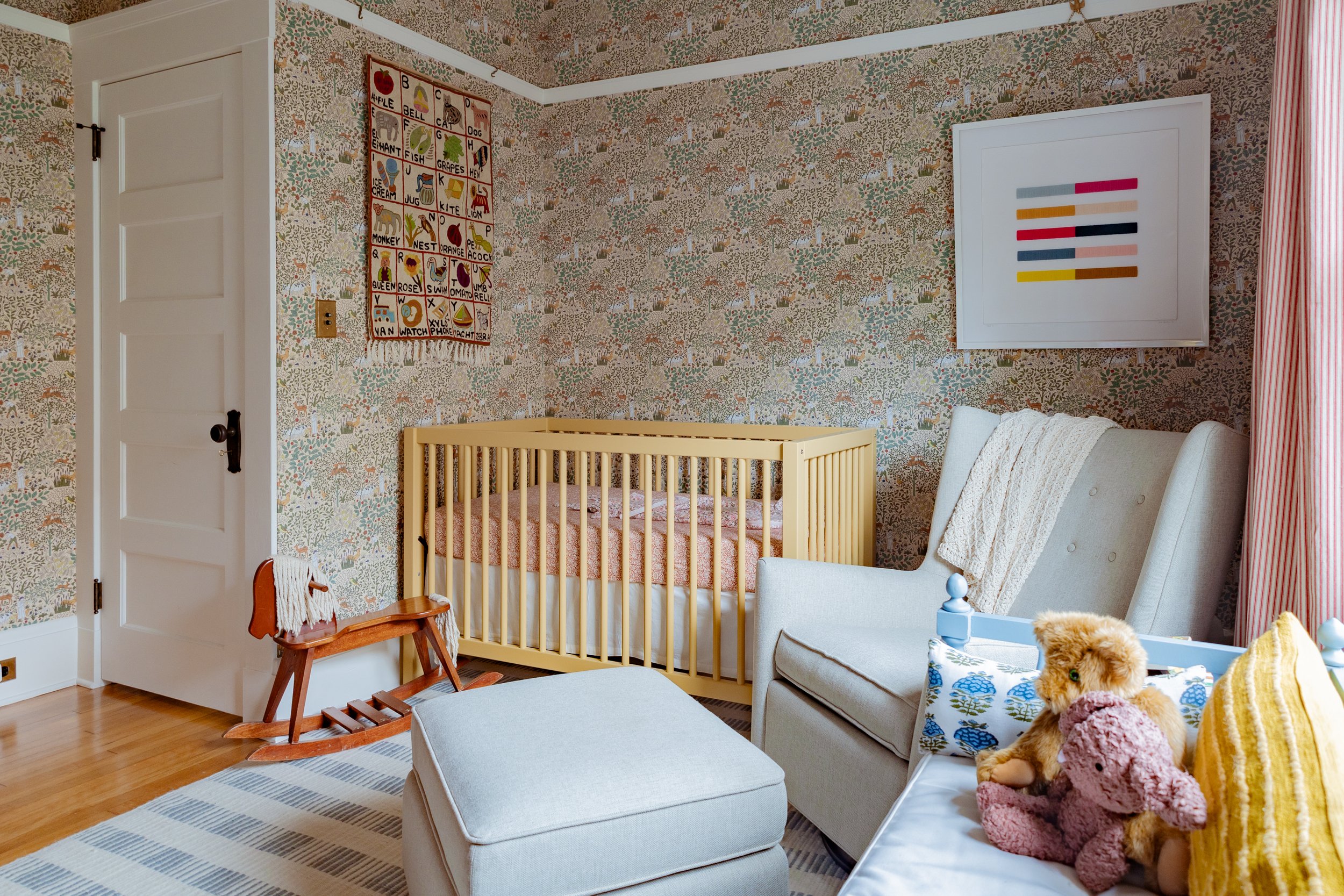
Ashley goes over the before and after details of the second bedroom that was turned into a den: “This room got refinished floors and retextured walls like the rest of the house. We also removed the garden window and replaced it with a wood double-hung window to match the style and materials used throughout the rest of the house. The second bedroom is where we watch TV, and it doubles as a guest bedroom with this pull-out couch from West Elm.”

“This St. Bernard print from painter Mary Sinner is one of my favorites in the house. It pops on the green walls that transition from green to blue to nearly black throughout the day,” Ashley shares.
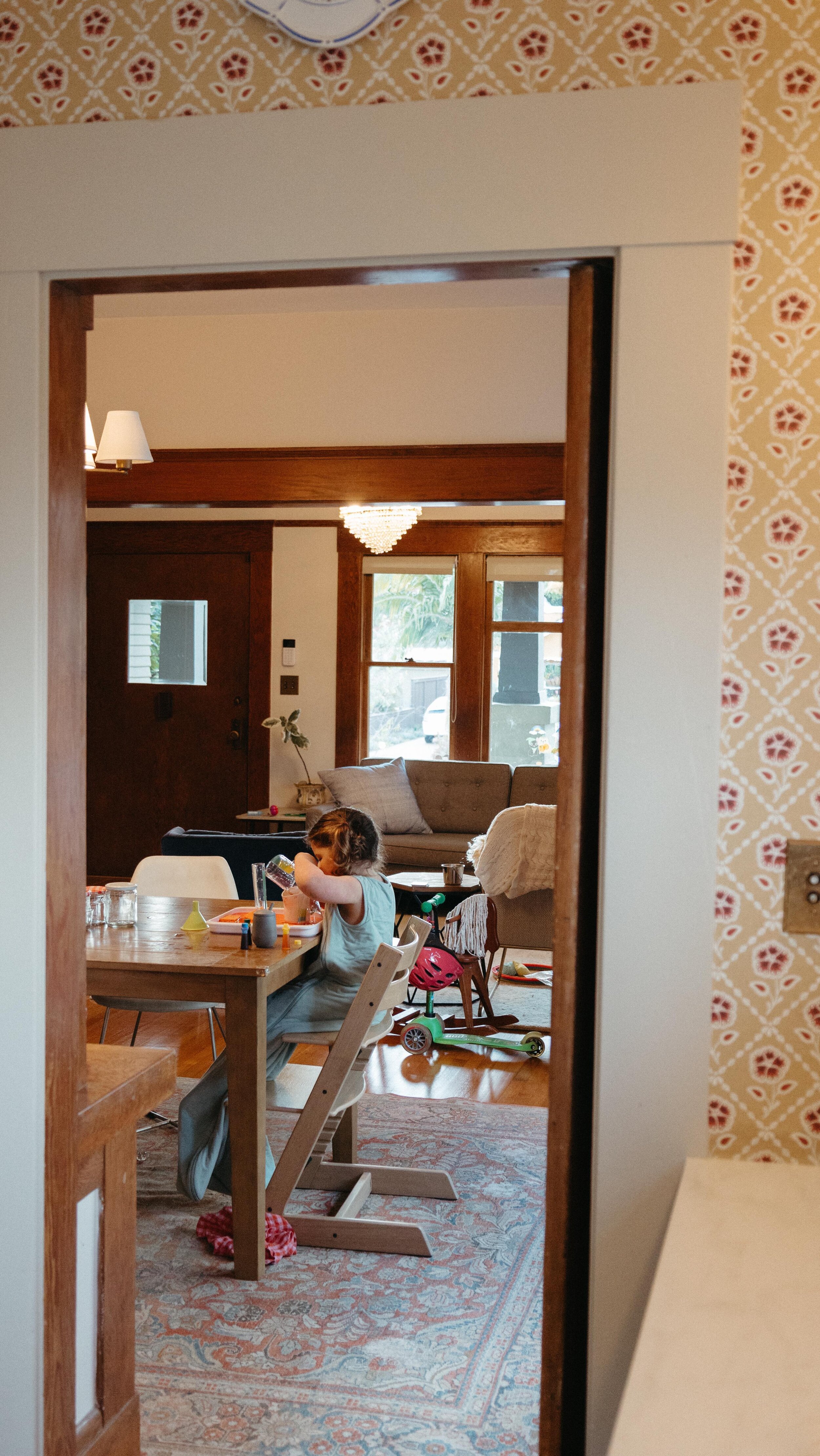
“This room is right off of the master and close to the kitchen,” Ashley explains. “You could walk the house in one loop and pass through each of the rooms. The flow is perfect for us now, but we may move some walls when this room becomes a kid’s room.”

“I reupholstered that chair, and decorated with layers of blues and greens,” Ashley shares.
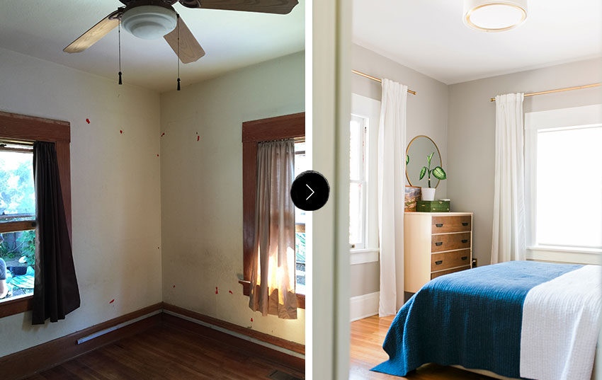
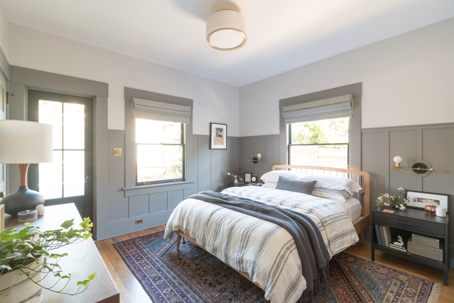
The beautiful refinished floors and freshly painted walls continue into the master bedroom makeover.

“The painting is from a flea market, the jewelry box is from Etsy, the dresser is from Craigslist, and the mirror is from Target. This is a perfect example of how I collect items for our home. The Sonos is never not playing music or a podcast at home. When Ross travels for work, our soundtrack keeps me company,” Ashley shares.

“The quilt is handmade and purchased from Etsy — perfect for our summery days. All of the furniture in the master came from our old apartment and I’m growing tired of it. The beauty of buying off Craigslist is selling the same items on Craigslist,” Ashley explains.

“This early-1900s painting sits on the floor, but that doesn’t mean I love it any less.”
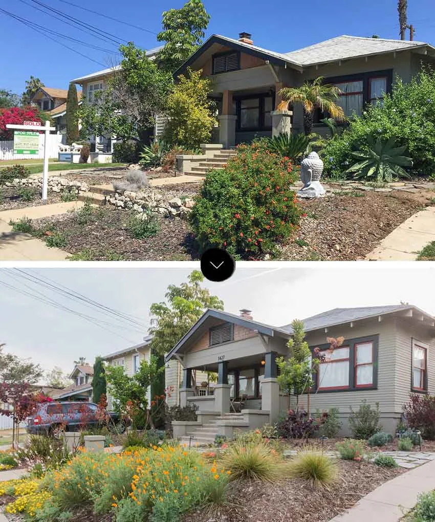
“The chunks of concrete and overgrown landscape were taking over the facade of the house. The craftsman elements were finally able to breathe after we cut back all of the overgrowth. We recently installed a low-water garden in the front yard. It’s still young but already flourishing,” Ashley shares.

Ashley, Ross, and Mabel, all sitting pretty in their lovely home.

A clear layout of Ross and Ashley’s 1,400-square-foot, three-bedroom, one-bath, 1915 San Diego craftsman home.
Paint color- “Sail Cloth” by Behr
Green and brushstroke pillow – Cotton & Flax
Art on Mantel- The Kids on the Shore print by Tali Yalonetzki from Artfully Walls
Paint-by-numbers painting of mountain- vintage (similar)
Brass cranes- vintage (similar)
Brass fireplace tools with horse heads- vintage (identical)
Wedding photo- Photographed by Stacy Keck, framed by Framebridge
Striped Blanket- Paradise People
Blue velvet chair- Article
Ivory chair- Article
Floor lamp- Target
Table lamp- World Market
Hand print- Society 6
Green landscape painting- Artfully Walls
Ram head bookends- vintage (identical)
Side table- discontinued from Target (similar)
Polka dot vase- Anthropologie
Chandelier- vintage (similar)
Coffee table- Craigslist (similar)
Rug- West Elm
Buffalo check pillow- Amazon
Paint color- Sail Cloth by Behr
Table- World Market
Chairs- Amazon
Rug- West Elm
Chandelier- custom from Illuminate Vintage on Etsy
Flowers- Native Poppy
Print- The Denny’s Parking Lot by Esther Pearl Watson from 20×200
Droplet art- Anthropolgie
Pretty Lady painting- vintage from Mesa Vintage (similar)
Hanging planter- Wayfair
Paint color- “Antique Tin” by Behr
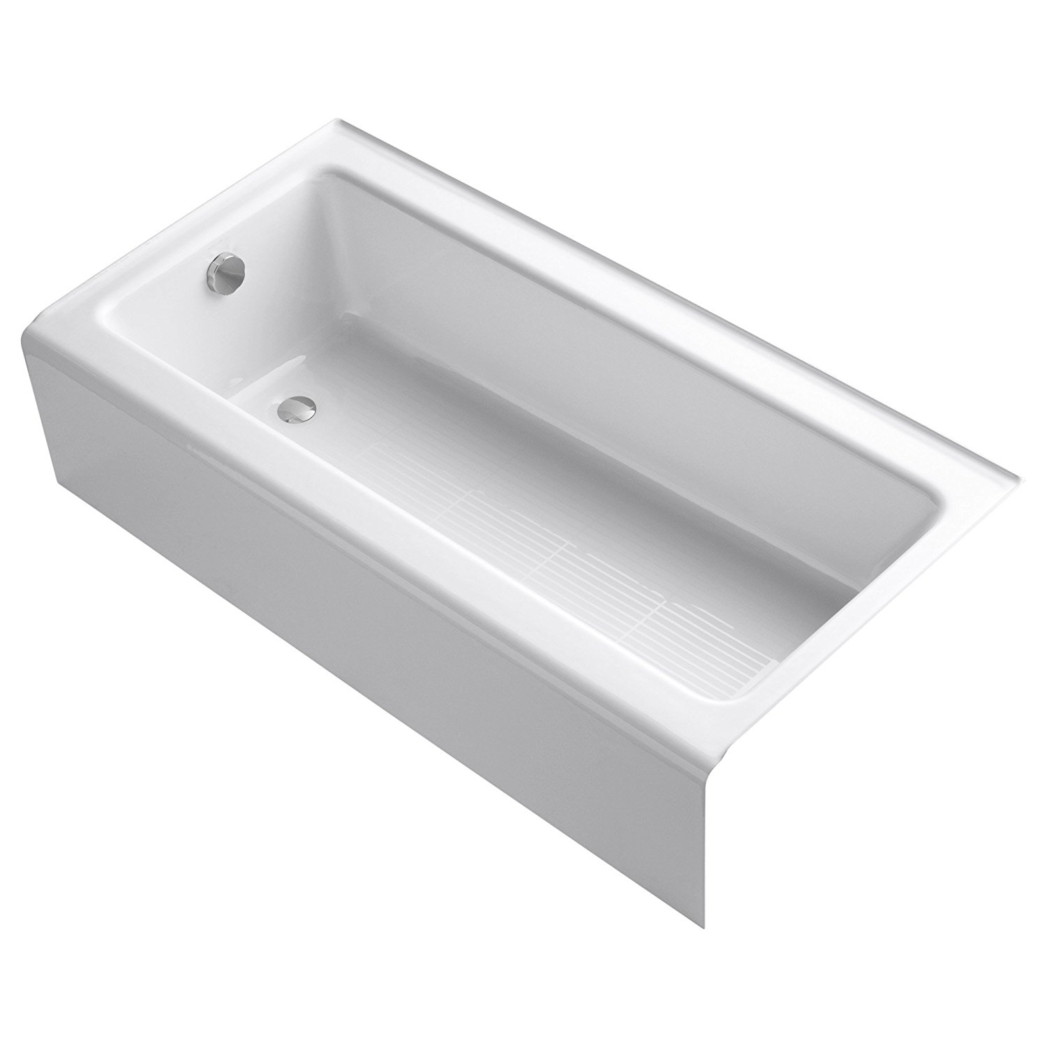
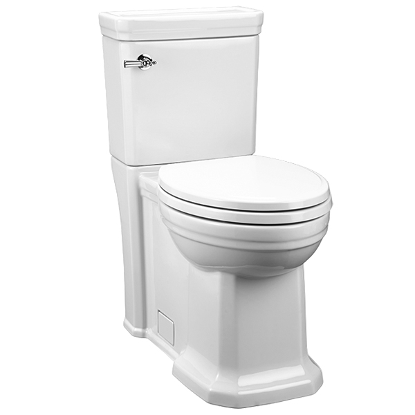
Tub- Kohler
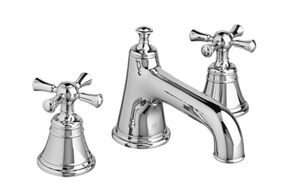
Shower and sink fixtures- DXV
Console sink- Signature Hardware
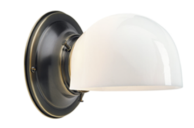
Wall sconce- vintage (similar)
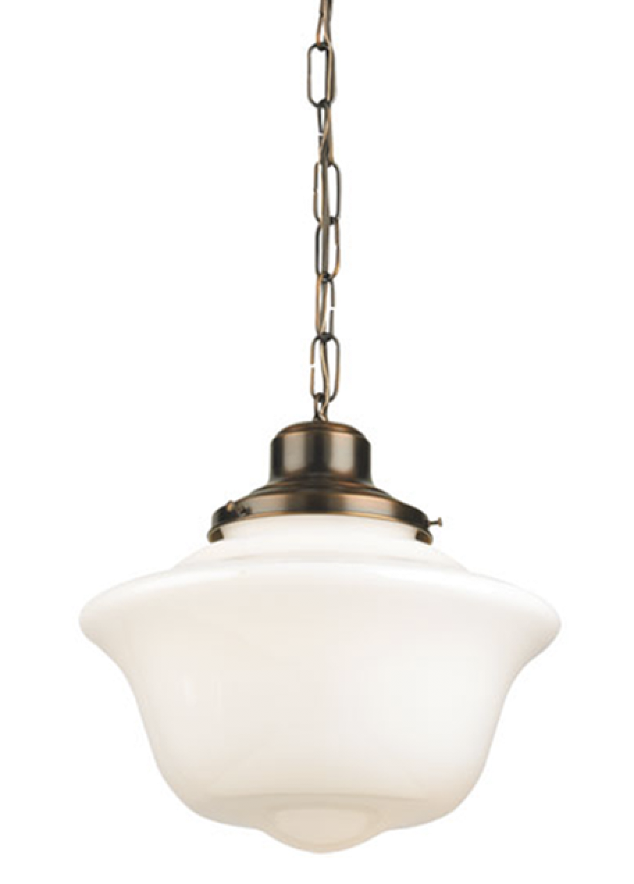
Pendant light- vintage (similar)
Wall tile- The Tile Shop
Floor tile- The Tile Shop
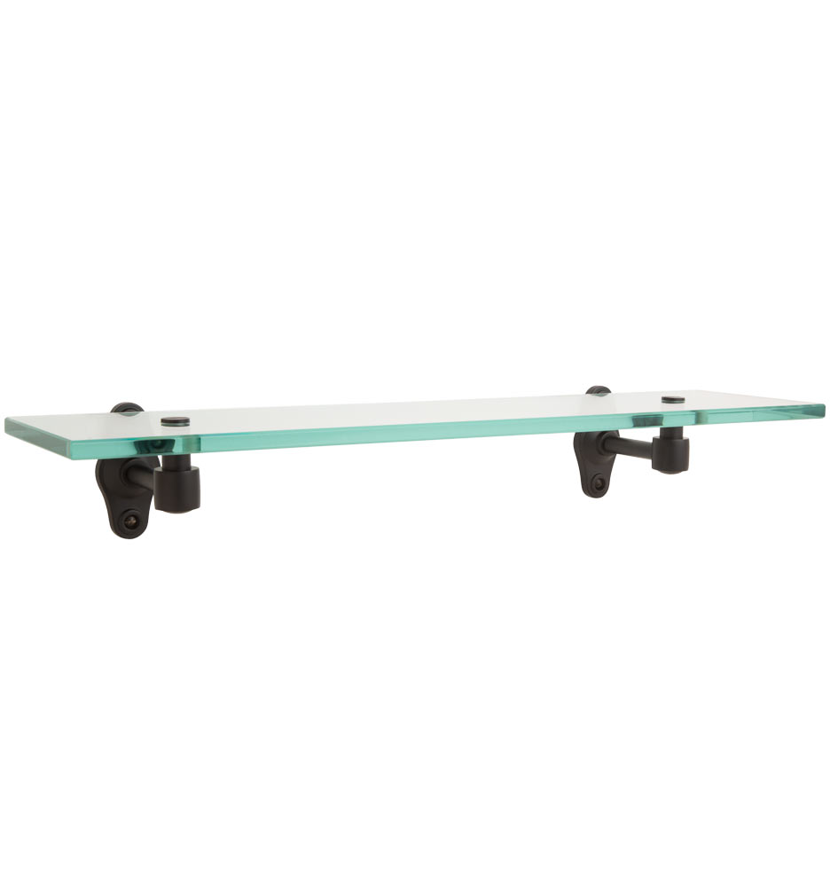
Glass shelf- Rejuvenation
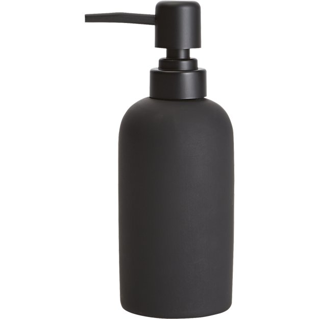
Soap dispenser- CB2
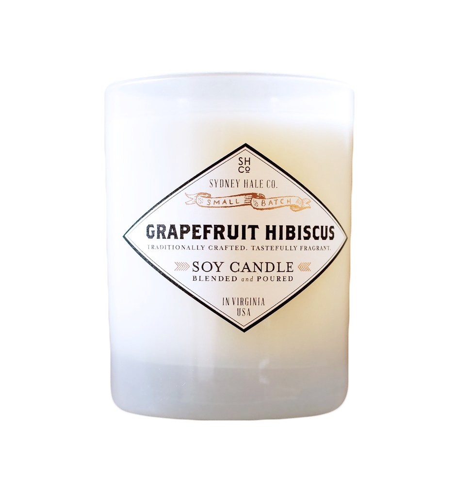
Candle- Sydney Hale Company
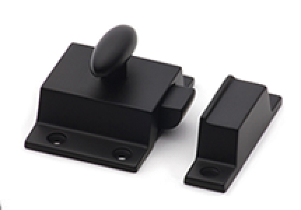
Medicine cabinet latch- House of Antique Hardware
Medicine cabinet hinges- House of Antique Hardware
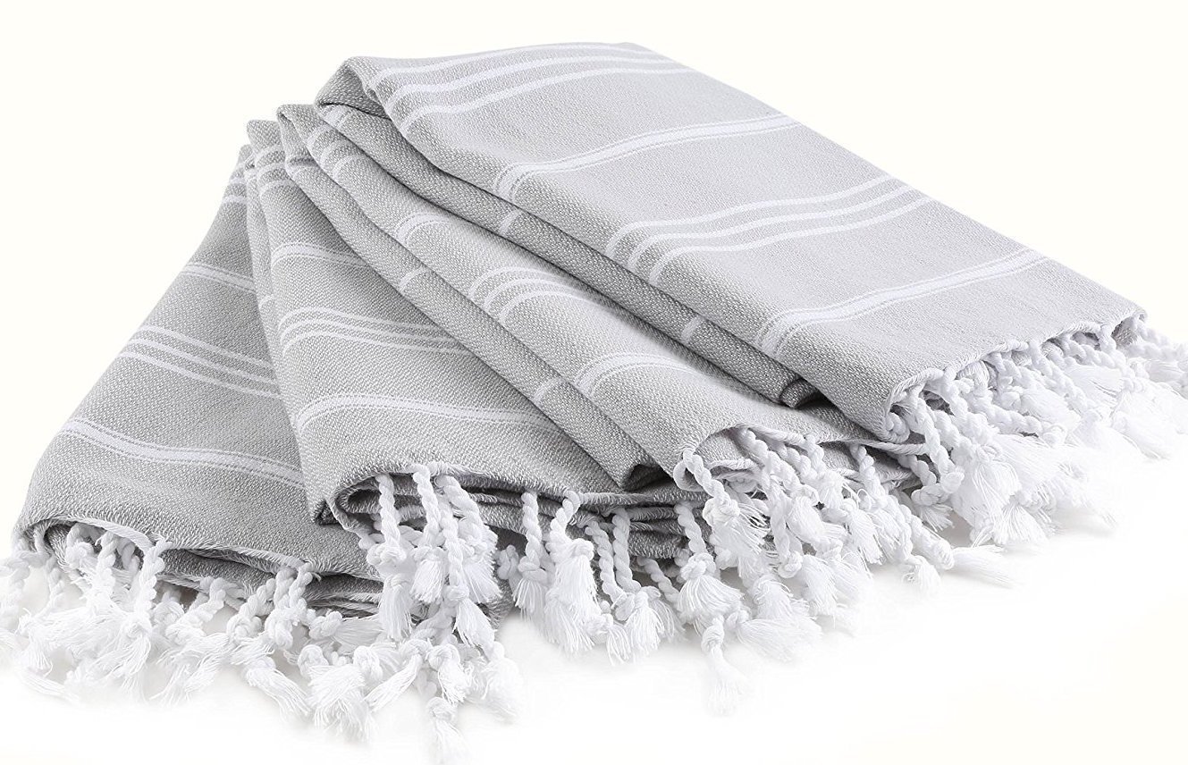
Turkish hand towel- Amazon
Nude print- Etsy
Paint color- “Schooner” by Behr
Rug- Rejuvenation
Tile- Amazon
Stove- vintage (similar)
Mirror- Vintage from Loveseat (Similar)
Planter by cookbooks- Moonbird Pottery
Light over sink- Amazon
Mixer- Amazon
Paint color- “Salamander” by Benjamin Moore
Rug- eCarpet Gallery
Curtains- Ikea
Couch- West Elm
Side table- Article
Wall art above couch- Lucie Birant from Society 6
Pillow- Article
Ottoman- Minda Living
Tray- CB2
Floor lamp- Article
Chair- Craigslist (similar)
TV cabinet- vintage (similar)
Chandelier- West Elm
St. Bernard print- Mary Sinner from Artfully Walls
Feral House print- James Griffioen from 20×200
Floral pillow- Society 6
Picture rail molding- House of Antique Hardware
Picture rail hooks- House of Antique Hardware
Candlesticks- World Market
Table lamp- vintage (similar)
Paint color- “Silver City” by Behr
Quilt- custom from VLiving from Etsy
Curtain rods- Amazon
Curtains- Ikea
Sconces- Allmodern
Bedding- Target
Bed- Amazon
Dresser- vintage (similar)
Side table- vintage (similar)
Print above bed- Photographed by Stacy Keck (smashingweddings.com), printed as engineering print at Staples
Flush mount light- Rejuvenation
Mirror- Target
Jewelry box- vintage (similar)
Sonos- Amazon
Landscape painting- vintage (similar)
Fruit painting- vintage ( similar )
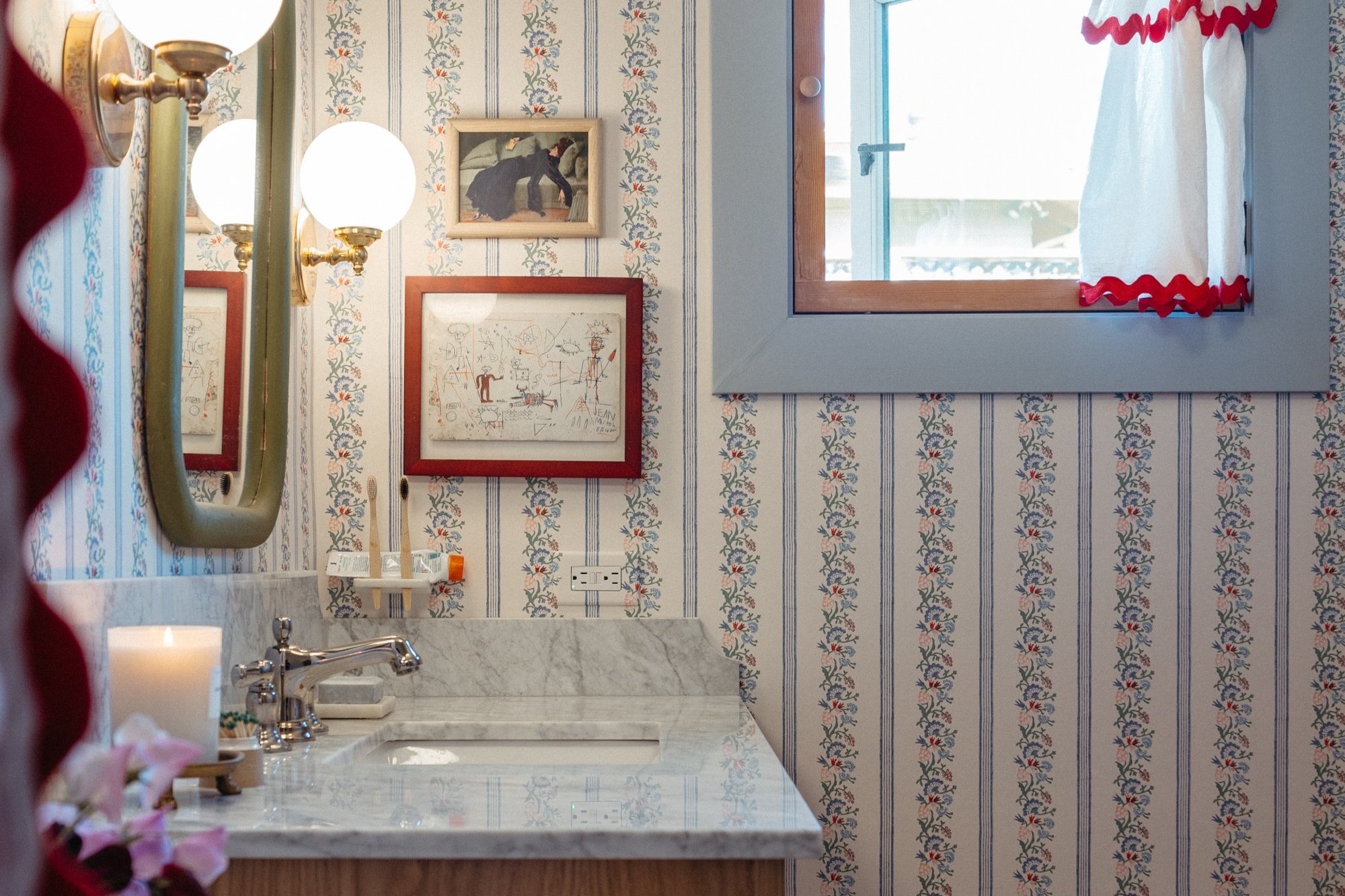
Welcome to the renovated bathroom! It was gutted and rebuilt two years ago, but it continues to evolve. Shall we take a look at what she looked like before we demolished everything?
And for that satisfying side-by-side, I give you this.
This is our one and only bathroom in the house and it's been serving us so well after we did a number on it. As a refresher, here are all of the posts I've written about the bathroom so far:

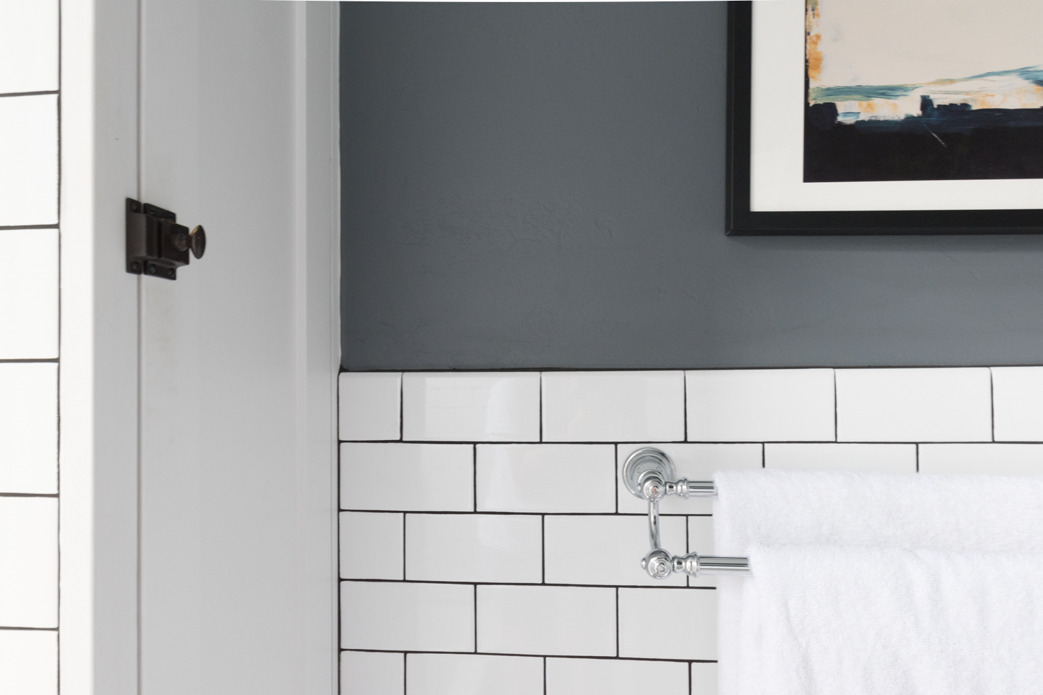
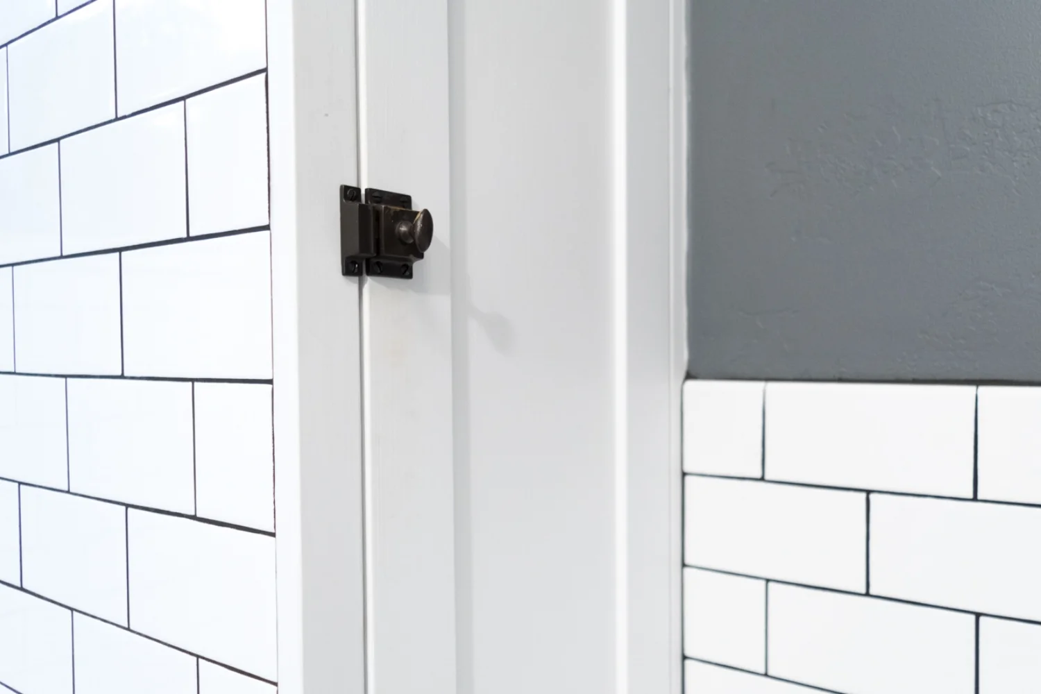
We gutted the whole room and the only elements that were worth saving were the door, and the medicine cabinet. They got a good cleaning and a fresh coat of white paint that was custom color matched to the white tiles.
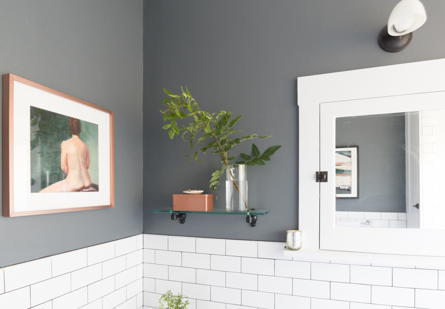
The walls were coated in Behr's Antique Tin which is the perfect deep grey that's neither too blue nor too warm.
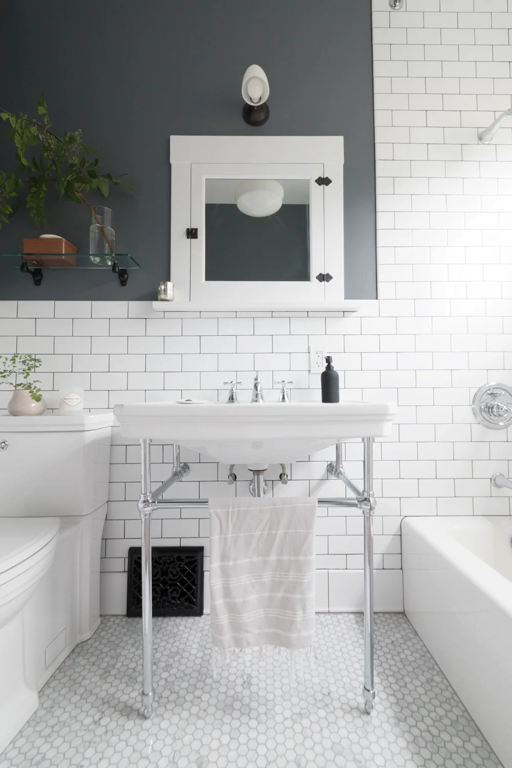
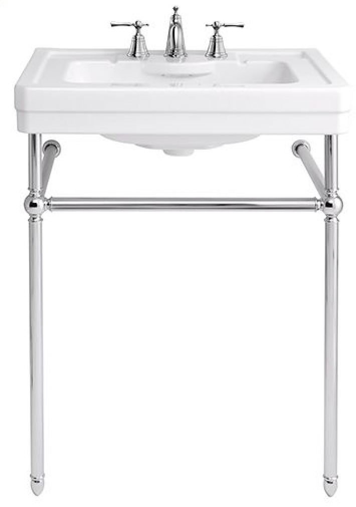
The console sink sits front and center in the bathroom. We opted for a console-style sink that would keep things open and airy. I waffled between a few styles before picking this leggy chrome beauty.
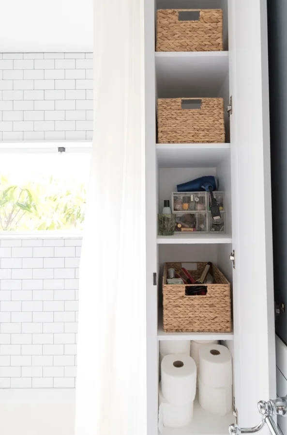
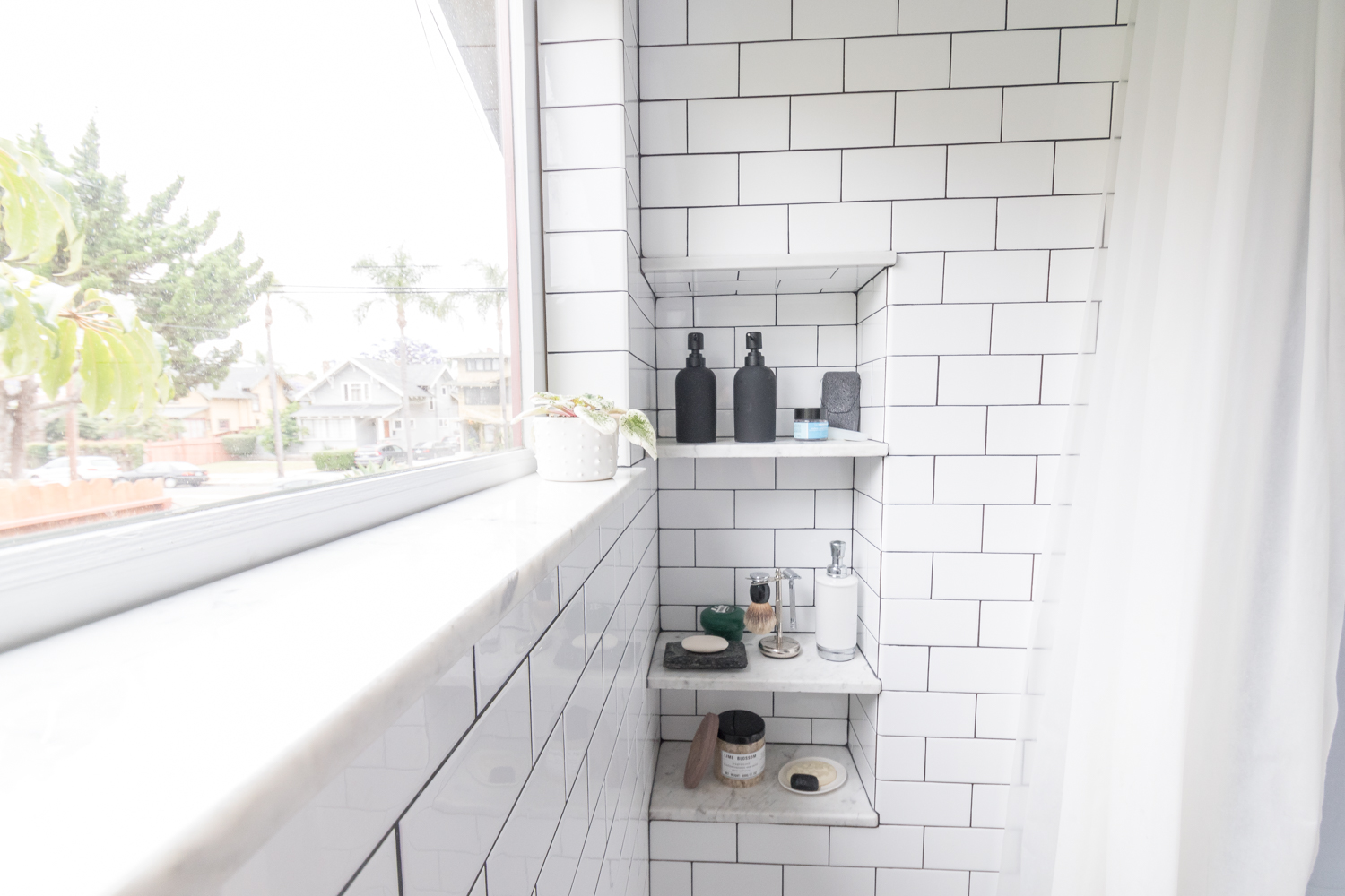
Since it's clear that the sink can't be used for storage, we built a spiffy cabinet at the end of the tub. Baskets hold all of our toiletries, and then more storage is accessible from inside the shower for our shampoos.

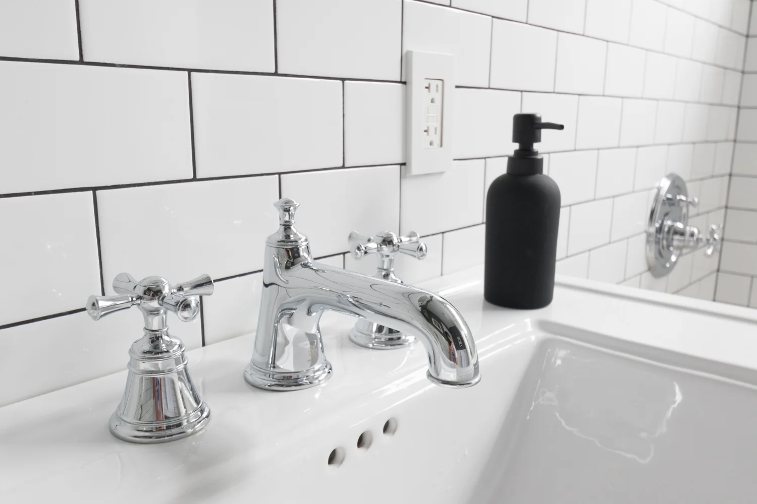
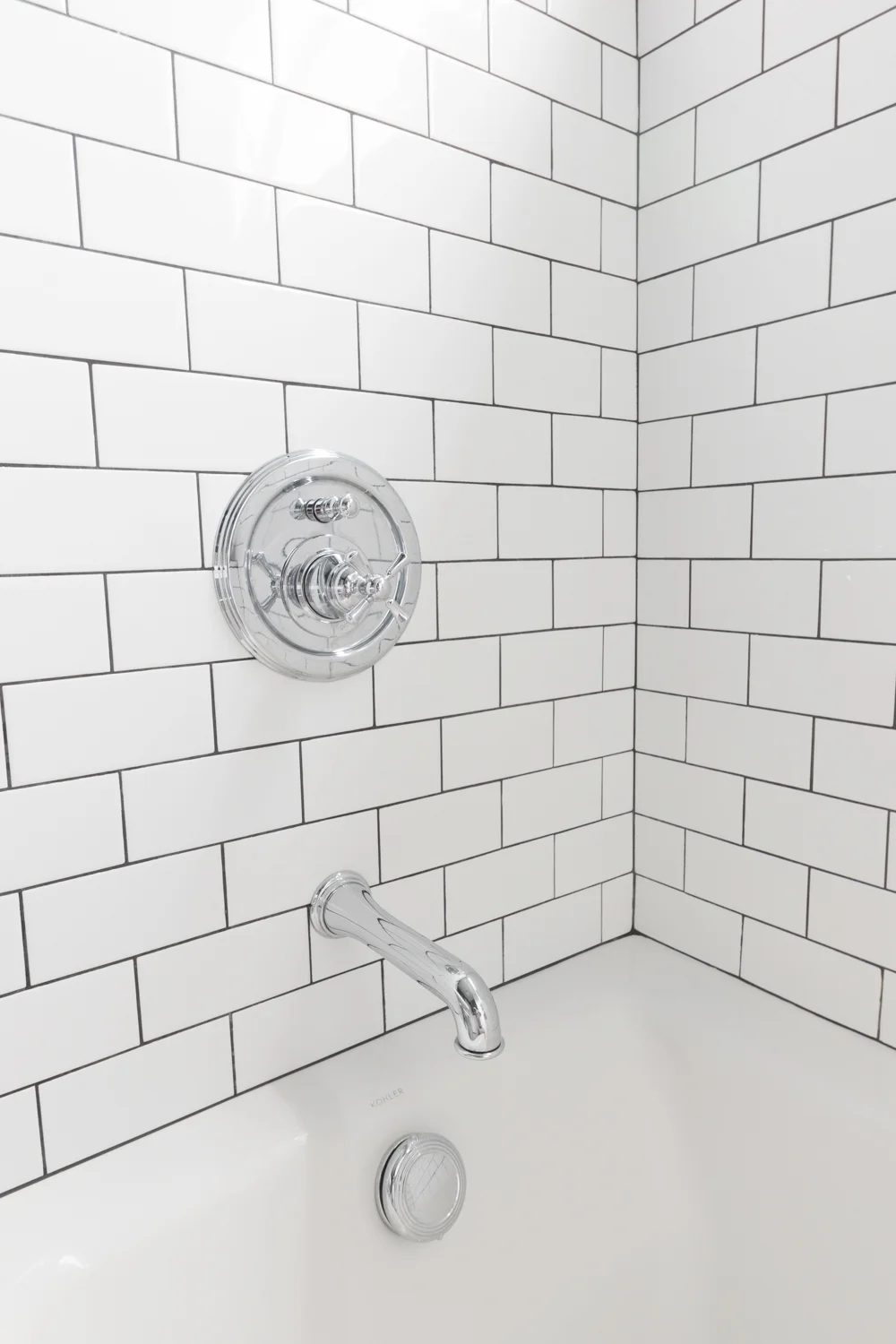
The plumbing fixtures on the sink and in the shower are all from the DXV by American Standard Randall line. They are good reminders that we're in an old house with their vintage-y vibes.
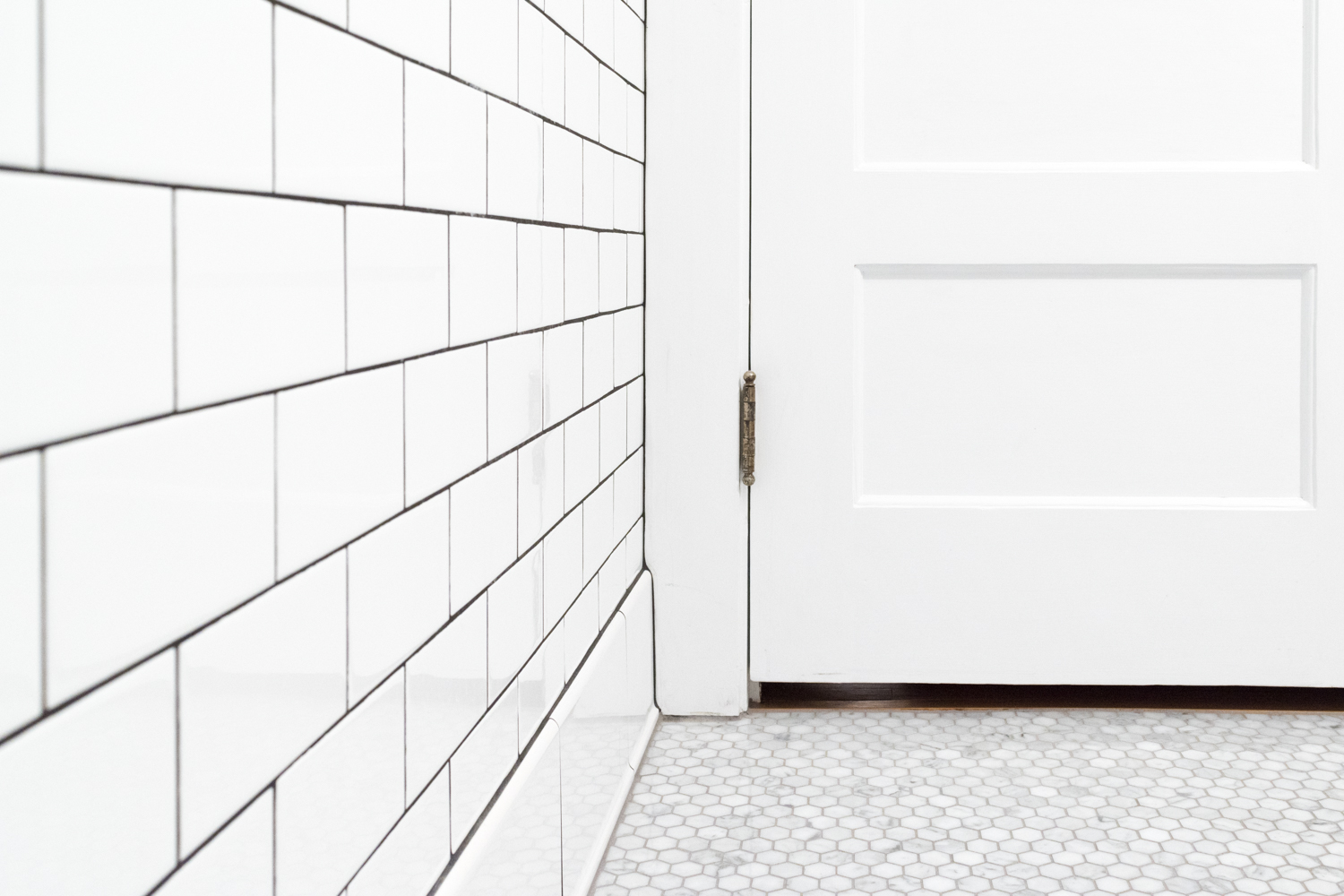
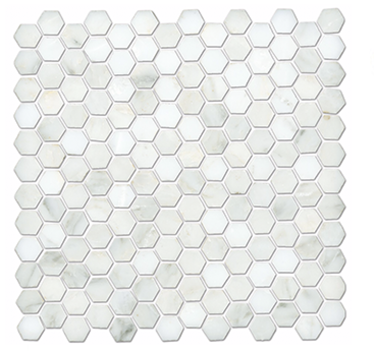
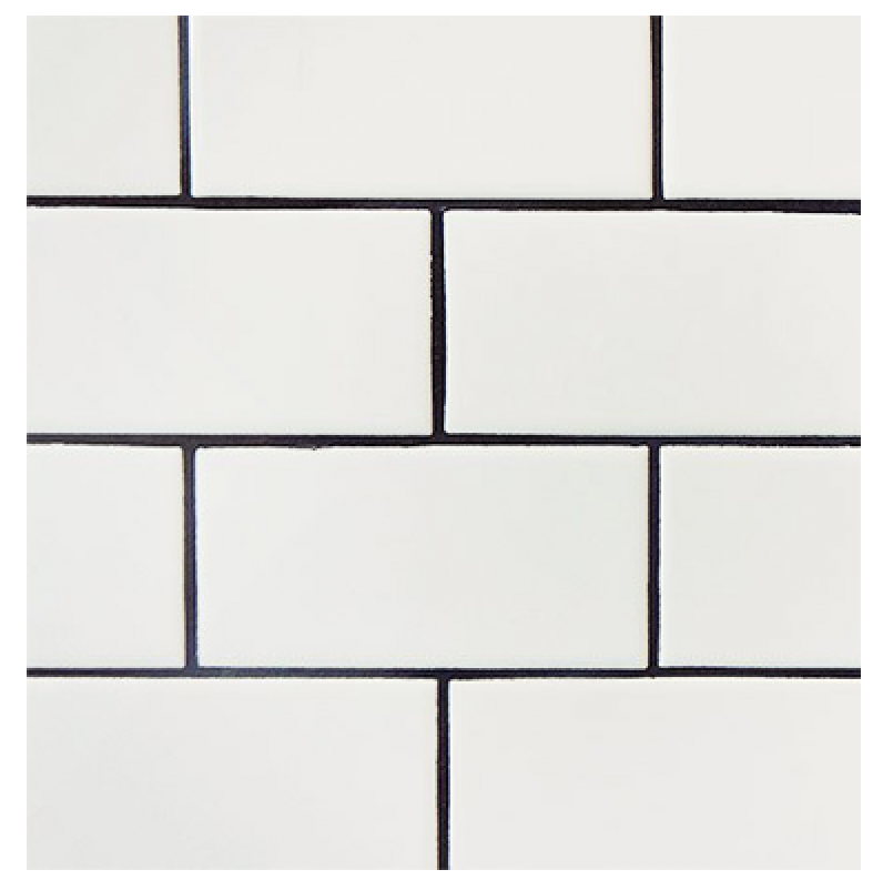
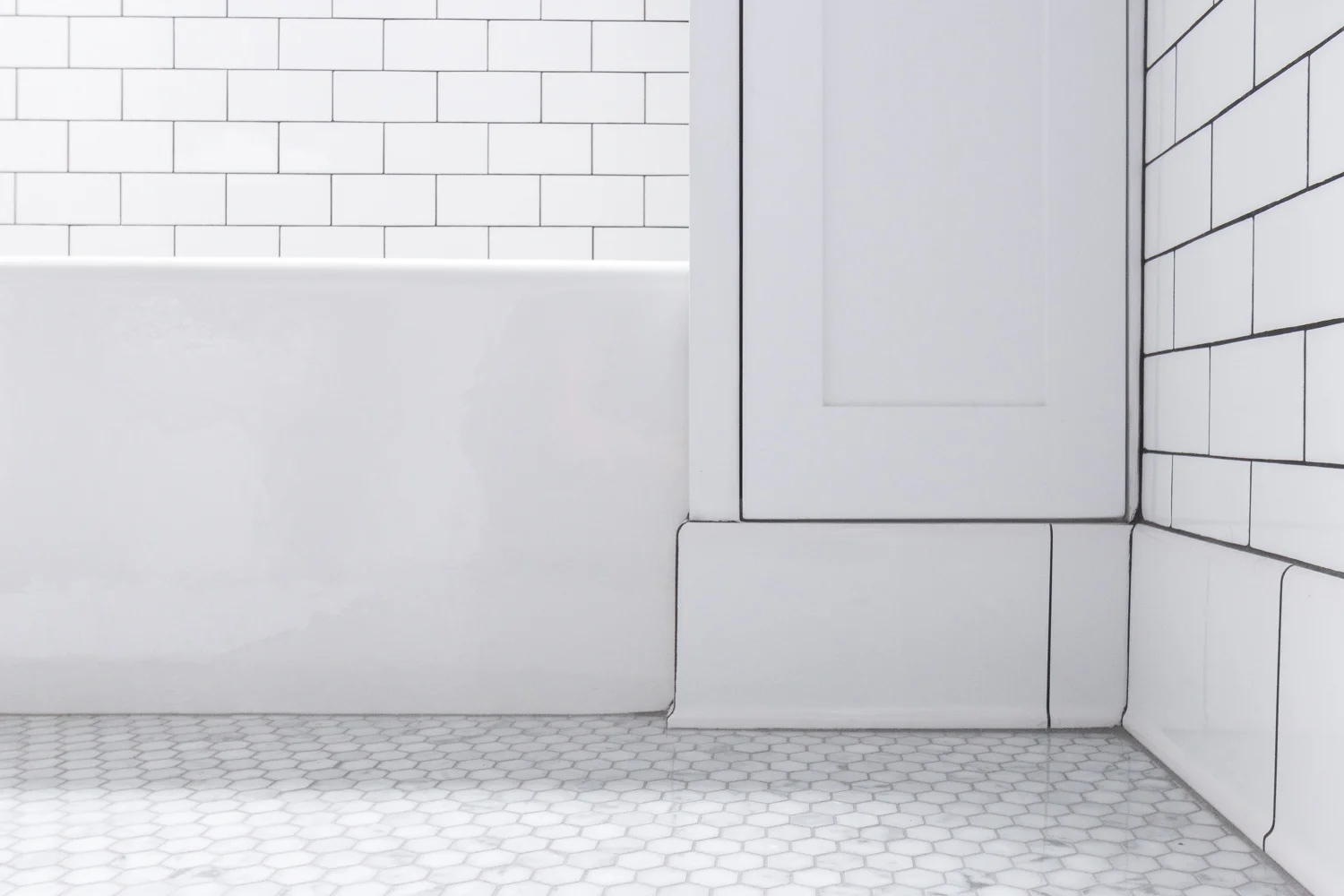
The tile is the star of the show in this bathroom. We went for a simple subway tile and a bullnose edge detail on the walls. The dark grout was a must and I couldn't be happier with how crisp and clean it looks two years later. The marble hex flooring gives just a touch of sophistication without making the space feel too precious.
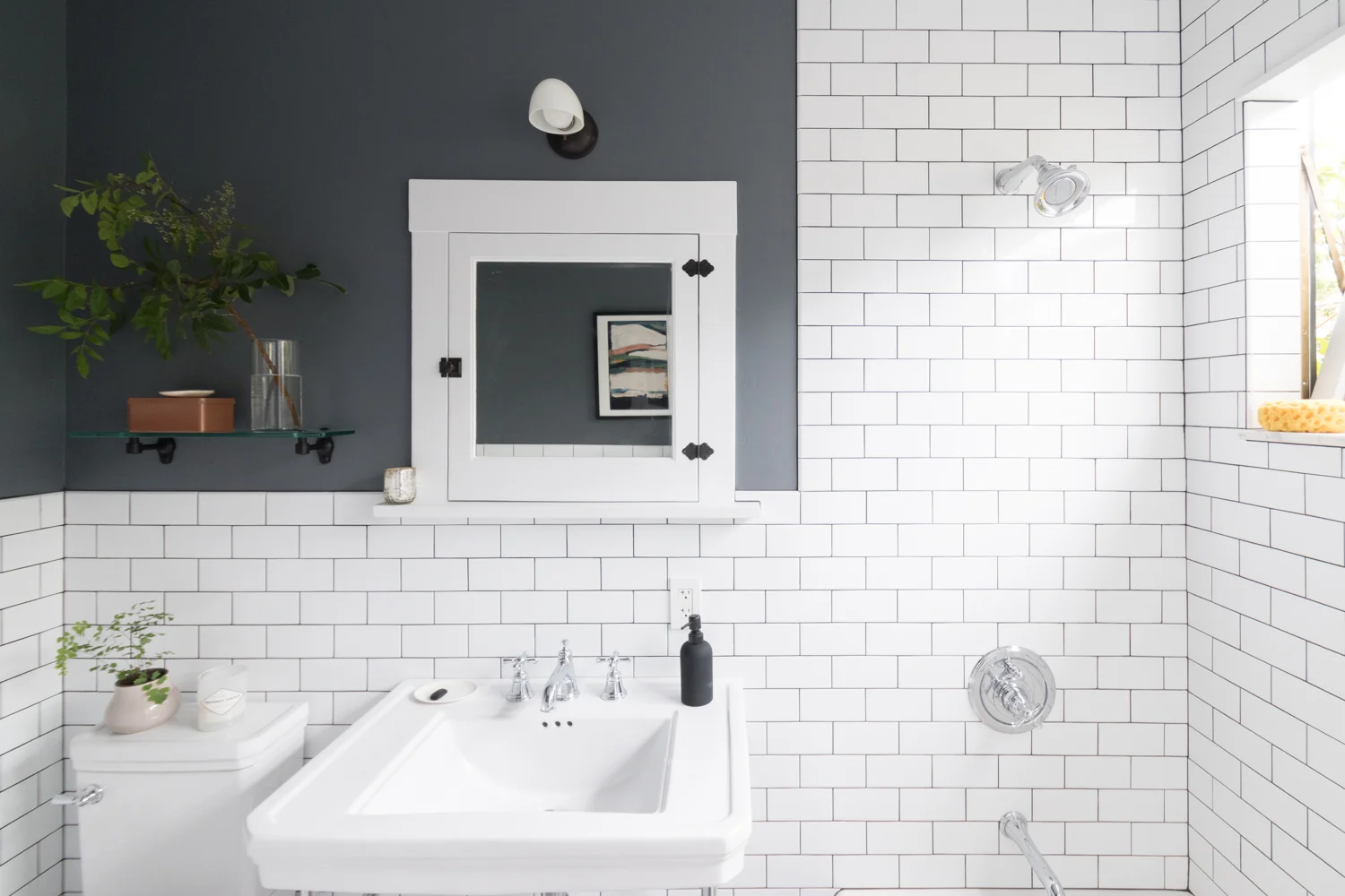
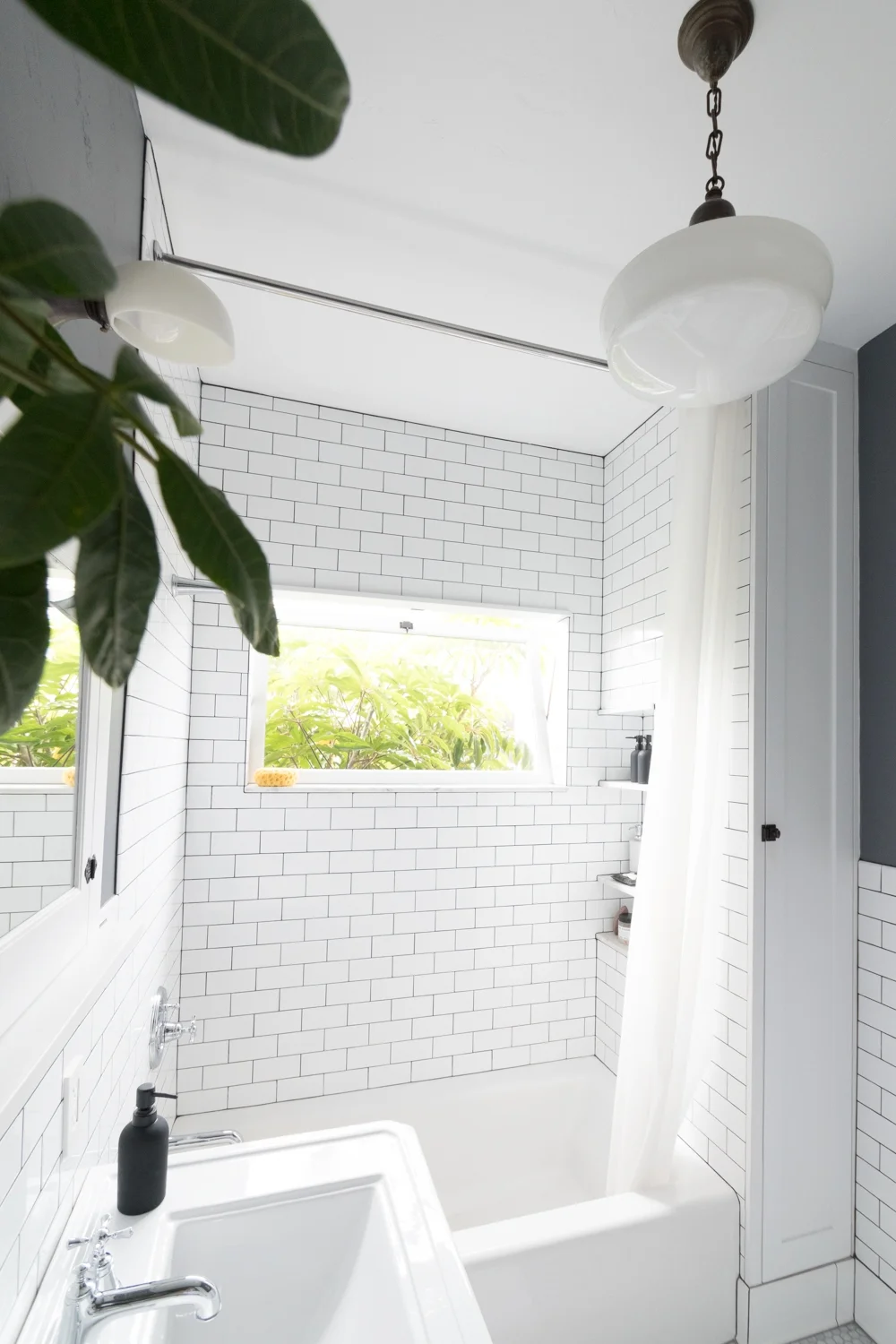
I'm definitely a fan of mixed metals. We did chrome throughout with black accents. The light fixtures are both vintage brass that have earned a dark patina after years of aging. The window hinges are brass and will continue to patina over time.
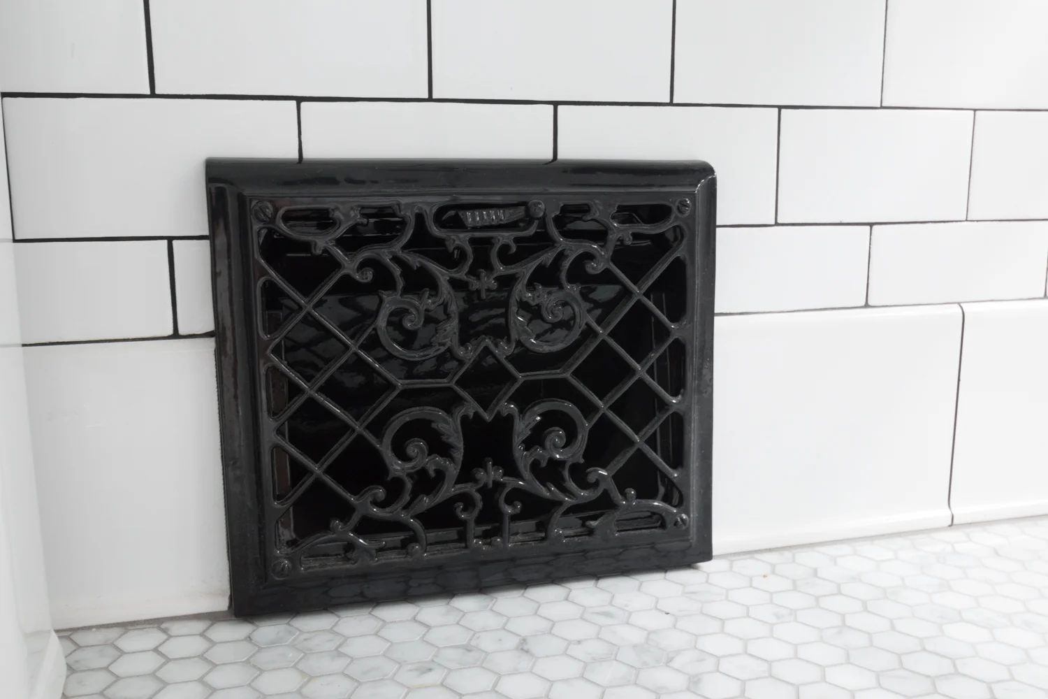
The bathroom previously didn't have an air vent, so when we decided to add one, I wanted an old vent with some pizzazz. I found this wall vent at a local architectural salvage shop covered in paint and rust. After a trip to the powder coater it came back with the most glossy black finish.

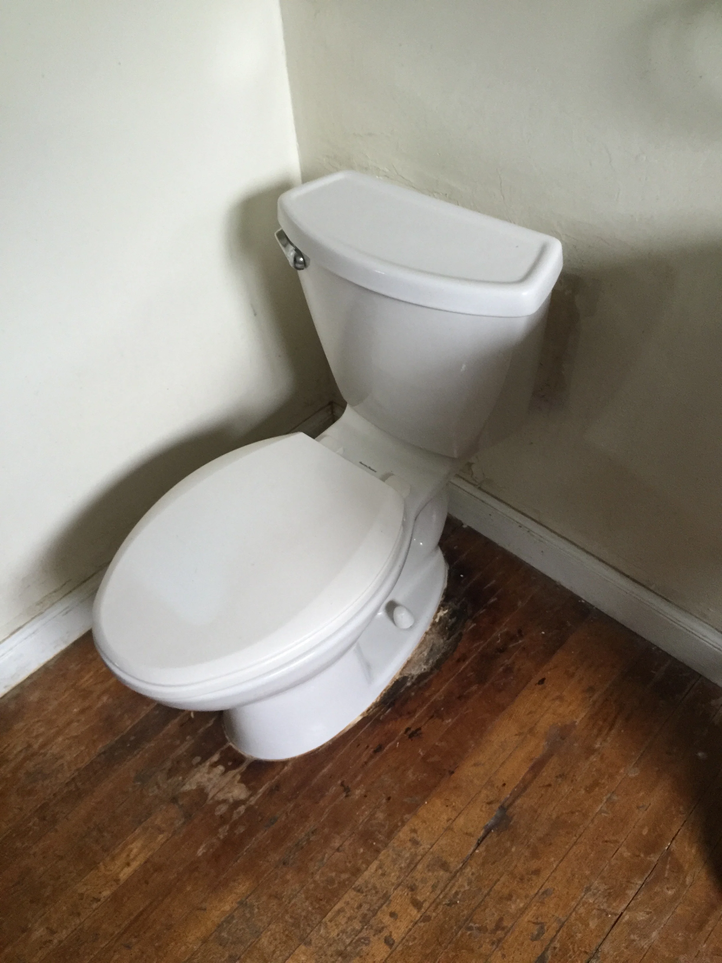
Notice on the side of the toilet that you don't see the curvy shape defining the route of all of your flushed items? We went with a skirted (or concealed trapway) toilet which makes such a visual difference.
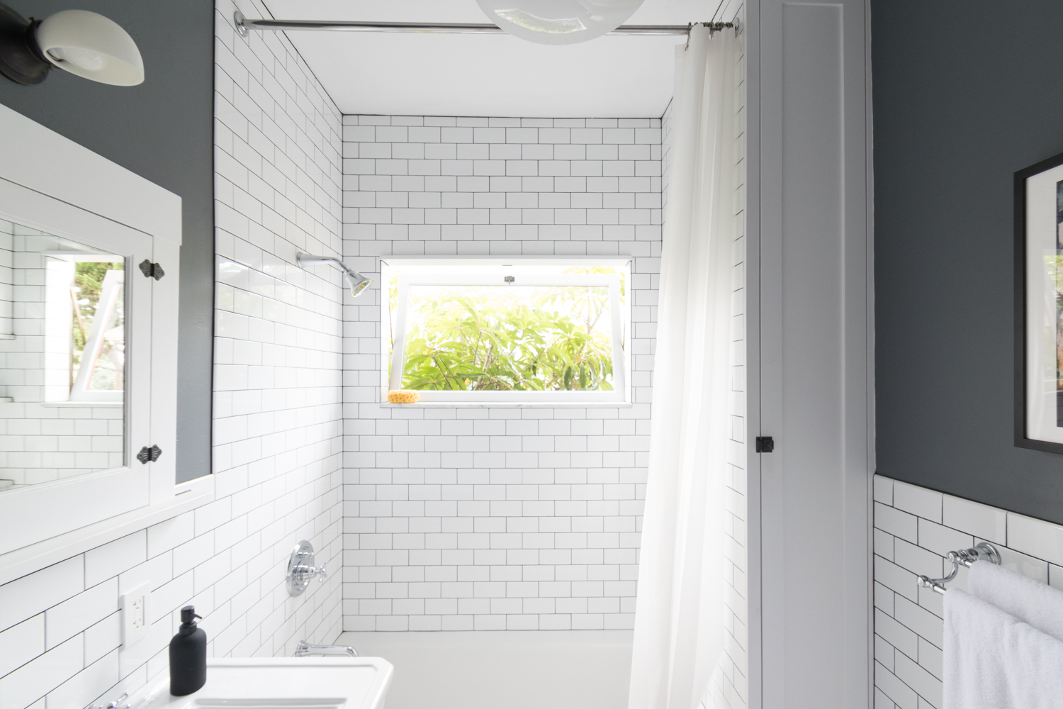
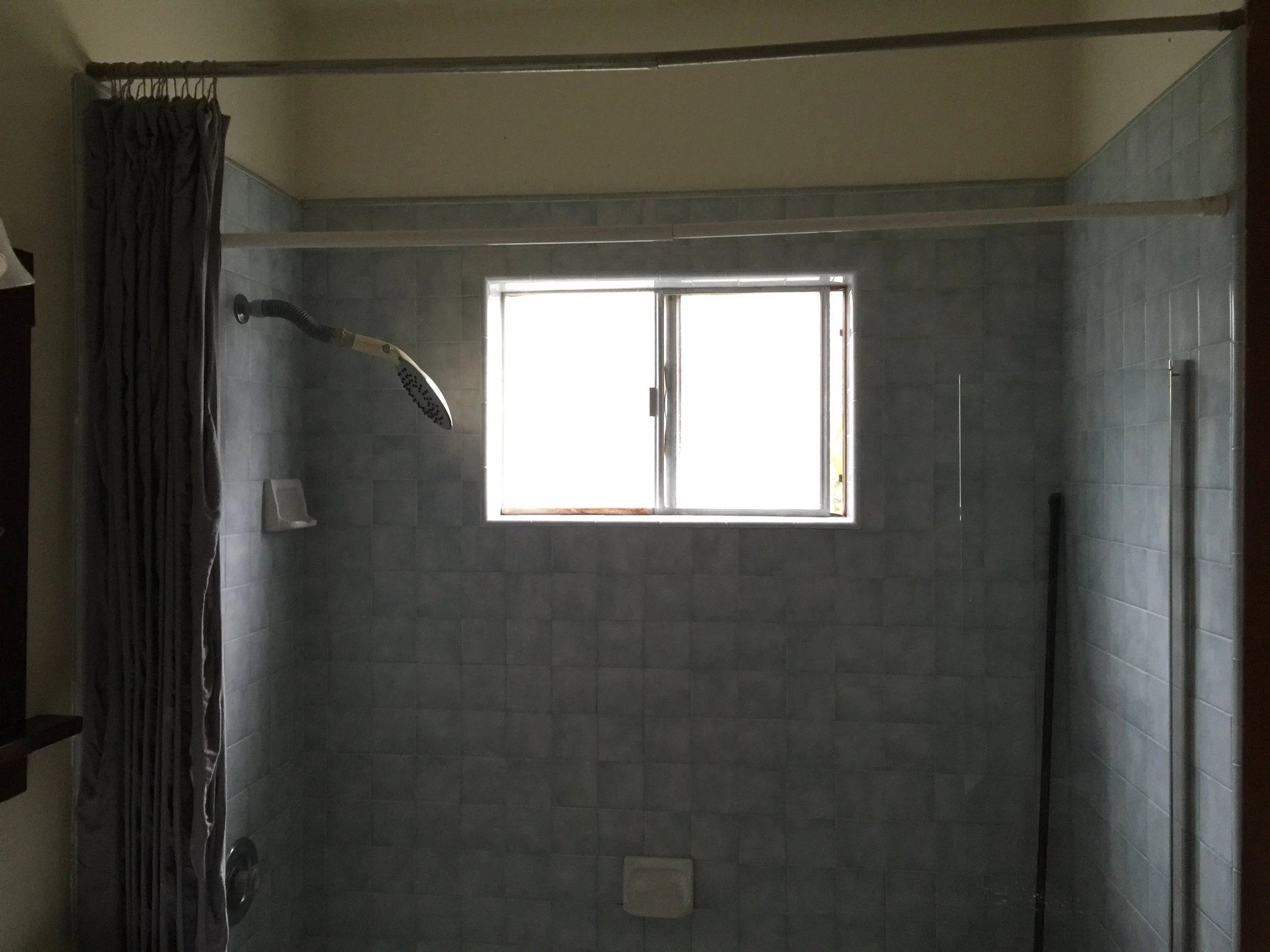
Can we talk about that window for a second? The previous bathroom had a lil' frosted glass one with an aluminum frame that was corroded and didn't open. This 45"x26" custom wood window brings in so much light and lets out all of the steam and moisture after a hot shower. The oversized window with a transom-style opening is one of my favorite features of the whole bathroom.

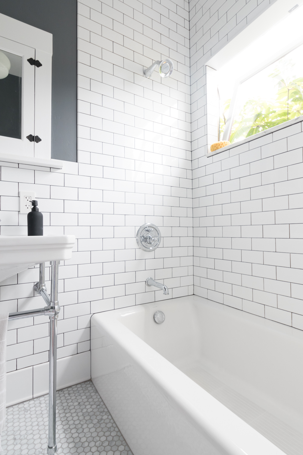
We opted for a cast iron tub from Kohler (as opposed to acrylic) and I love how solid it feels. There's no flex underfoot, it keeps tub water warm longer, and it's the right material for our old home. This particular tub is a favorite because of the flat apron which was hard to come by within our budget.

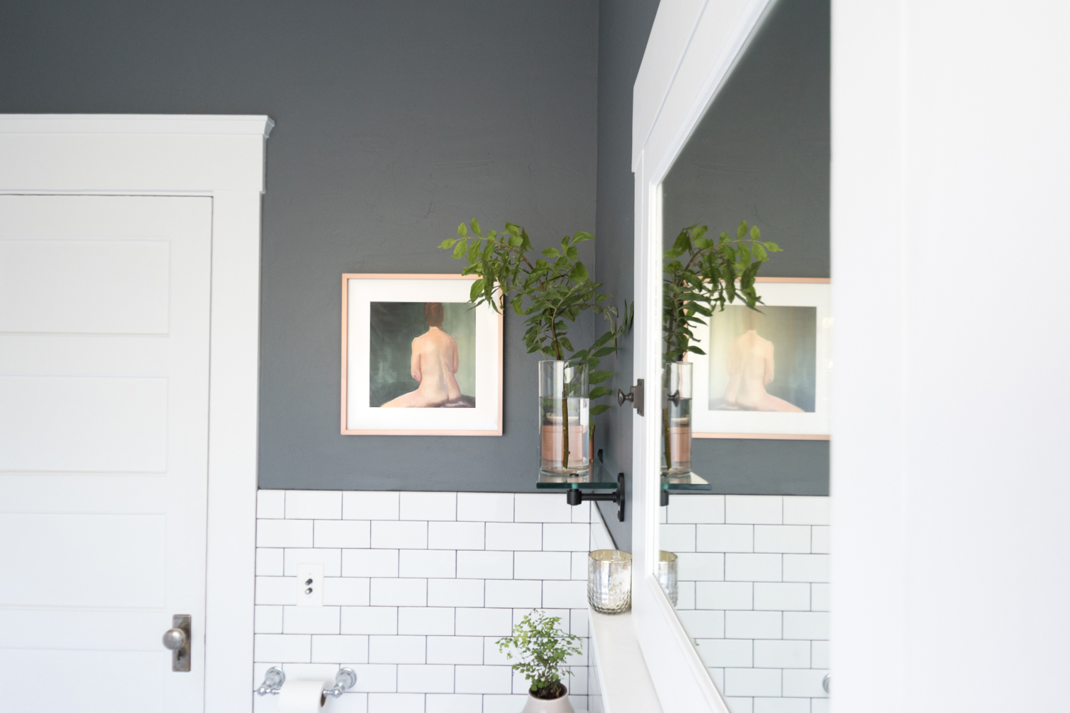
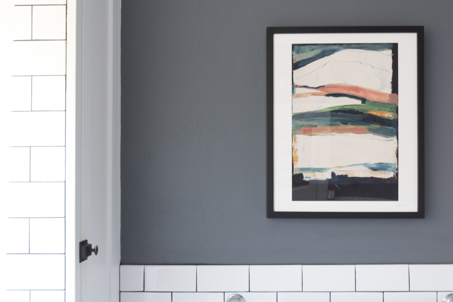
How about that artwork? I feel like it was painted just for this bathroom.

I really could go on and on about this space! For all of the posts about the bathroom, click here. And to shop the room, click on the product images below!

Note that a few of the pieces in our bathroom are vintage, so I linked to similar ones.
If you saw my post about the bathroom inspiration, you'll remember that it was chock full of classic vintage vibes complete with subway tile, marble, and contrast grout. Thus, that's exactly what we went with when we gutted and remodeled the bathroom two years ago.
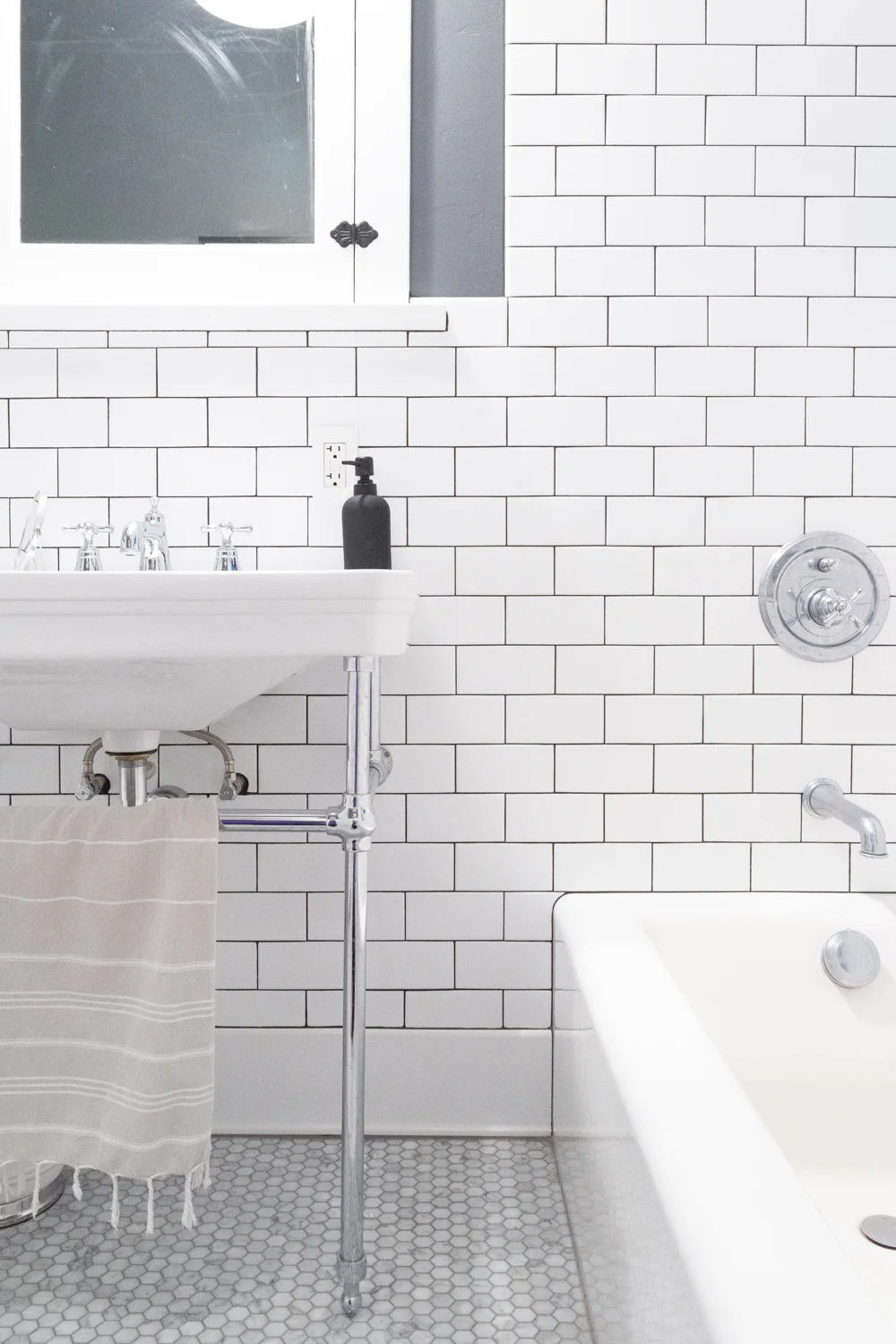
I already knew I wanted subway tile, and even considered crackled, textured, and irregular styles before ultimately deciding on these crisp white ones from the Tile Shop (which are currently on sale). But, it's not as simple as just picking the tile. Below I'm sharing our thought process for tile design.
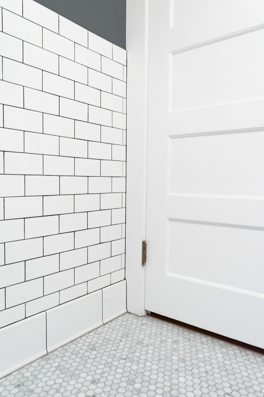
We did a simple running bond pattern throughout. There are actually several ways to lay a subway tile in a subway kinda way. Check out the examples here. Since we were going with a dark grout, I chose a pattern that didn't have as much movement as say the 1/3 offset.
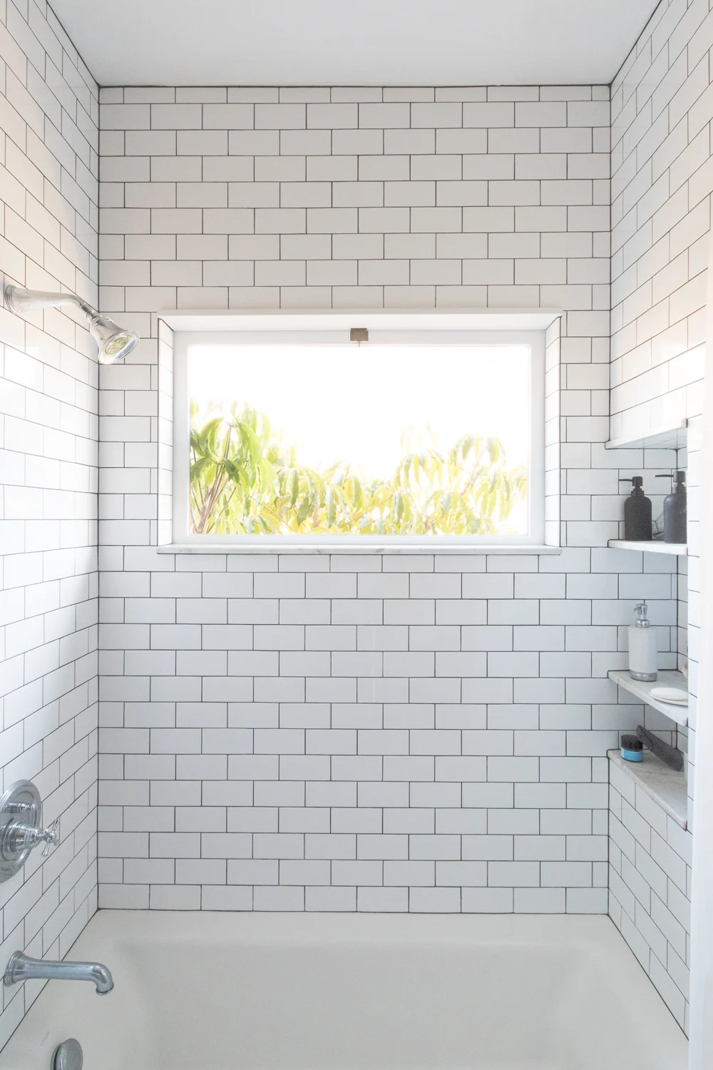
I can't stand when tile doesn't go to the ceiling in a shower. I know, it isn't necessary. It can be a waste of money to tile 3 feet above your head where no water will splash, but I really am a sucker for fully tiled showers.

Since I was already going for lots-o-tile in the shower, we decided to surround the rest of the bathroom walls mid-way to a chair rail height. This look helps me to feel like I'm living in The Knick. The medicine cabinet determined how high we would go, since I didn't want it floating above the tile, nor drowning in it. For reference, the tile stops 50" up the wall.
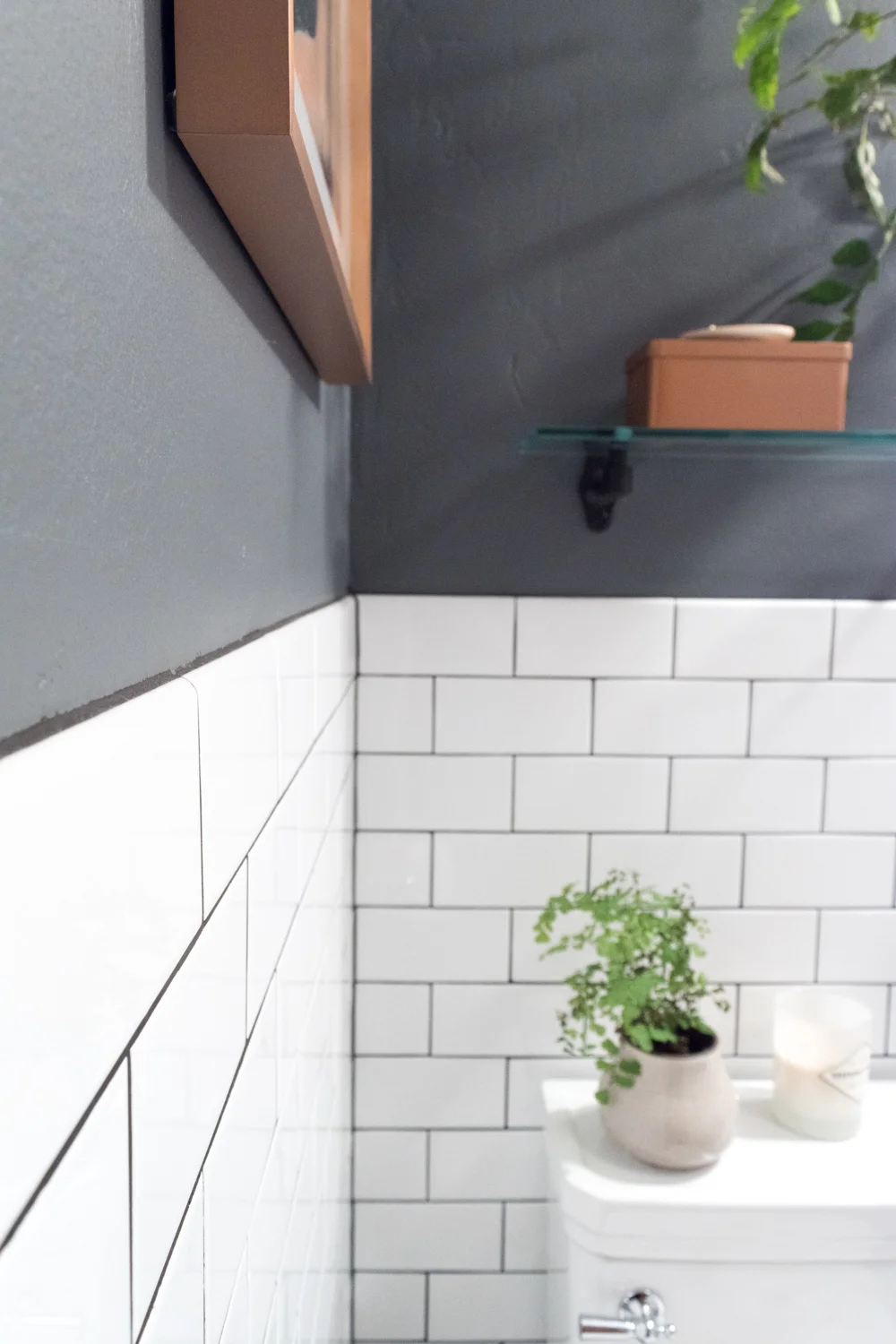
We nearly did a decorative cap around the top of the chair rail, but ultimately nixed it when we didn't like how it terminated at the edges. So, we did a simple bullnose along the top edge of the same-sized tile as the field tiles. I like that this modernizes some of the other vintagey-vibes in the room. For the base, I went with a baseboard skirting that finishes off the space with just a lil' bit of detail.
Contrast was the name of the game with the wall tile, so we did a deep charcoal to make the pattern pop. Also, dark grout doesn't run the risk of looking dingy. Win!
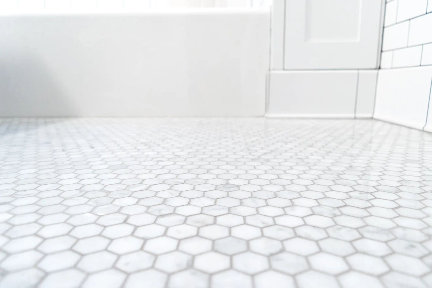
The flooring had lots of texture in its marble veining and hexagon shape, so we went with a gray that would neutralize the pattern. We went with Delorean Gray.
For the window ledge and the niche shelves, we installed a few pieces of marble slabs. They are gorgeous and the perfect material for a solid surface to rest our toiletries atop of. Plus, they tie in to the marble floor.
There are so many details that go into laying tile and ensuring that you're forever happy with the pattern, but I opted to keep this post pretty simple. If you want the specifics, let me know!
For more on the bathroom renovation progress click here! And to get all of the sources and see the full reveal, click here.
There's no doubt that the artwork you pick for your home can make a big difference in the feeling of your space. Choosing the right combination of pieces can be difficult, but luckily there's help!
This post is in partnership with Minted!
Even the design-blogger-and-art-school-graduate can have a hard time finding just the right pieces. I struggled for months with sourcing the art for the bathroom walls.
Here's what I was working with:
1. The all-white space with oodles of tile can come off as sterile and cold. The room yearned for artwork that would add some warmth but would maintain the dark moody vibe of the wall's paint color.
2. Since I had two adjacent walls to fill, the art needed to complement each other without being too matchy matchy.
3. We wanted pieces that felt special but not so in-your-face-dramatic that we'd grow tired of them.
I played with some dark landscapes, several abstract shapes, and a few portraits but wasn't in love with any combos. Luckily, my friends at Minted stepped in to help me out. And they can help you, too!
In addition to selling beautiful printed and custom art, Minted has a great team of designers that listen to all of your needs and wishes, and then translate the vision into proposed artwork and a mockup of your space. Their styling services were particularly helpful for me when I was looking for two pieces that would work well together on adjacent walls.
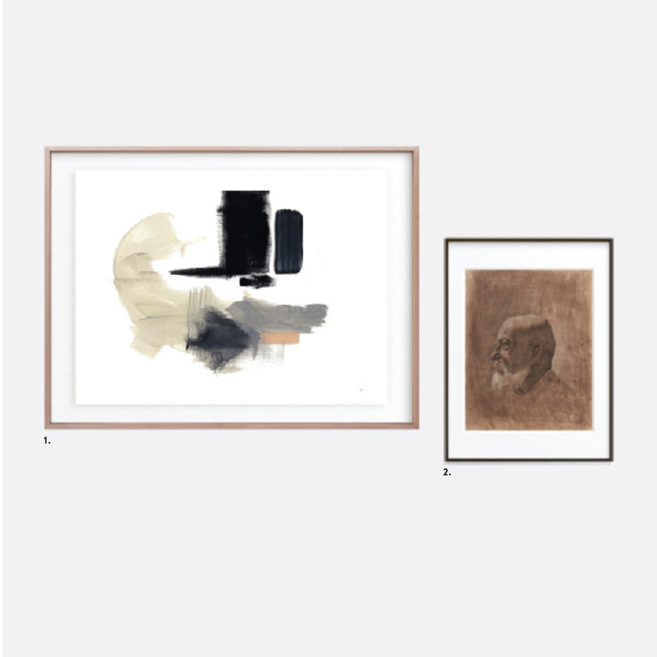
Here's what they proposed for our bathroom after I outlined my wishes:

1. Embrace by R studio
standard format in rich black wood frame
2. Sitting Still by Jennifer Daily
standard format in matte brass frame

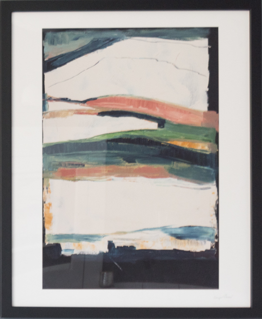
1. Melting Glacier by Caryn Owen
white border in rich black wood frame
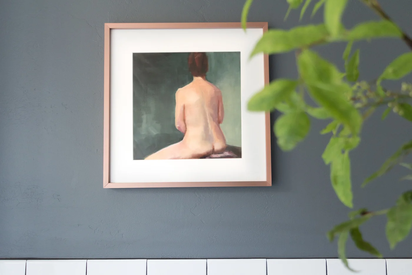
2. Bath by Sue Prue
matted in matte copper frame

1. Tahitian Pearl No. 3 by Julia Contacessi
white border in matte brass frame
2. Arches by Ilze Lucero
float mounted in matte brass frame

1. Imbue by Lindsay Megahed
matted in matte brass frame
2. Black 03 by Catilustre
standard format in matte black frame
1. Untitled 2 by Jaime Derringer
float mounted in matte copper frame
2. Human One: Anton by Colin Stuart
standard format in matte black frame
Aren't those combos great? I narrowed the options down to #1, #2, and #5 pretty quickly, but got hung up on the decision for a few days. Sitting Still, in #1 is just so perfectly dark and Human One: Anton in #5 is so striking! I think I need to find a spot for Anton somewhere else in my house.

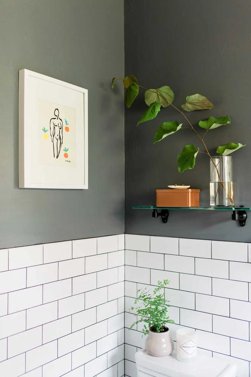
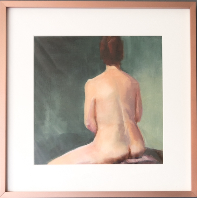
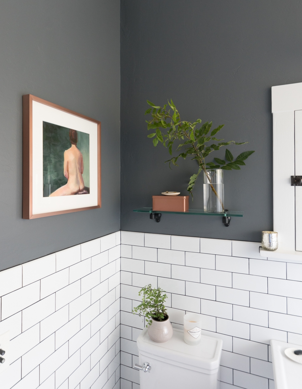
We ultimately went with option 3: moody. I am just so tickled with Bath by Sue Prue! I already love pretty lady artwork so this nude was the perfect addition to the collection. The background feels like it was made for my walls.
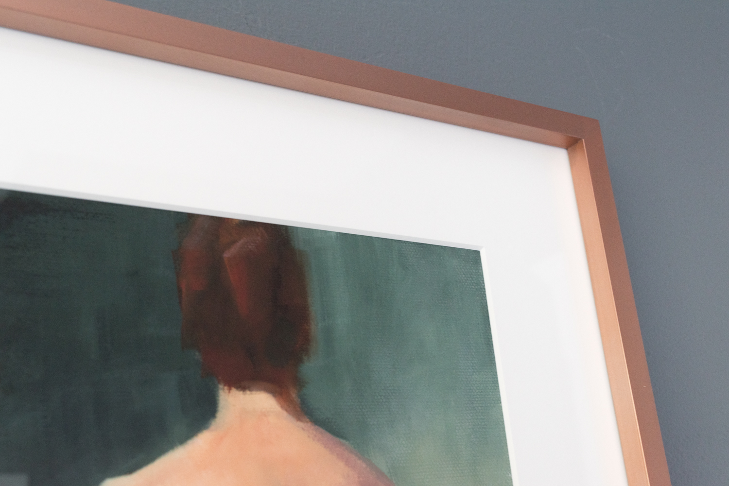
And that frame! I really don't think I would have ever selected the copper frame, but I'm so glad Minted did the decision making for me. I'm smitten with the warmth it adds to the room and how it brings out the skin tones in the painting.
It also magically matches my copper tin that I previously planned to replace with a wooden one. Not anymore!
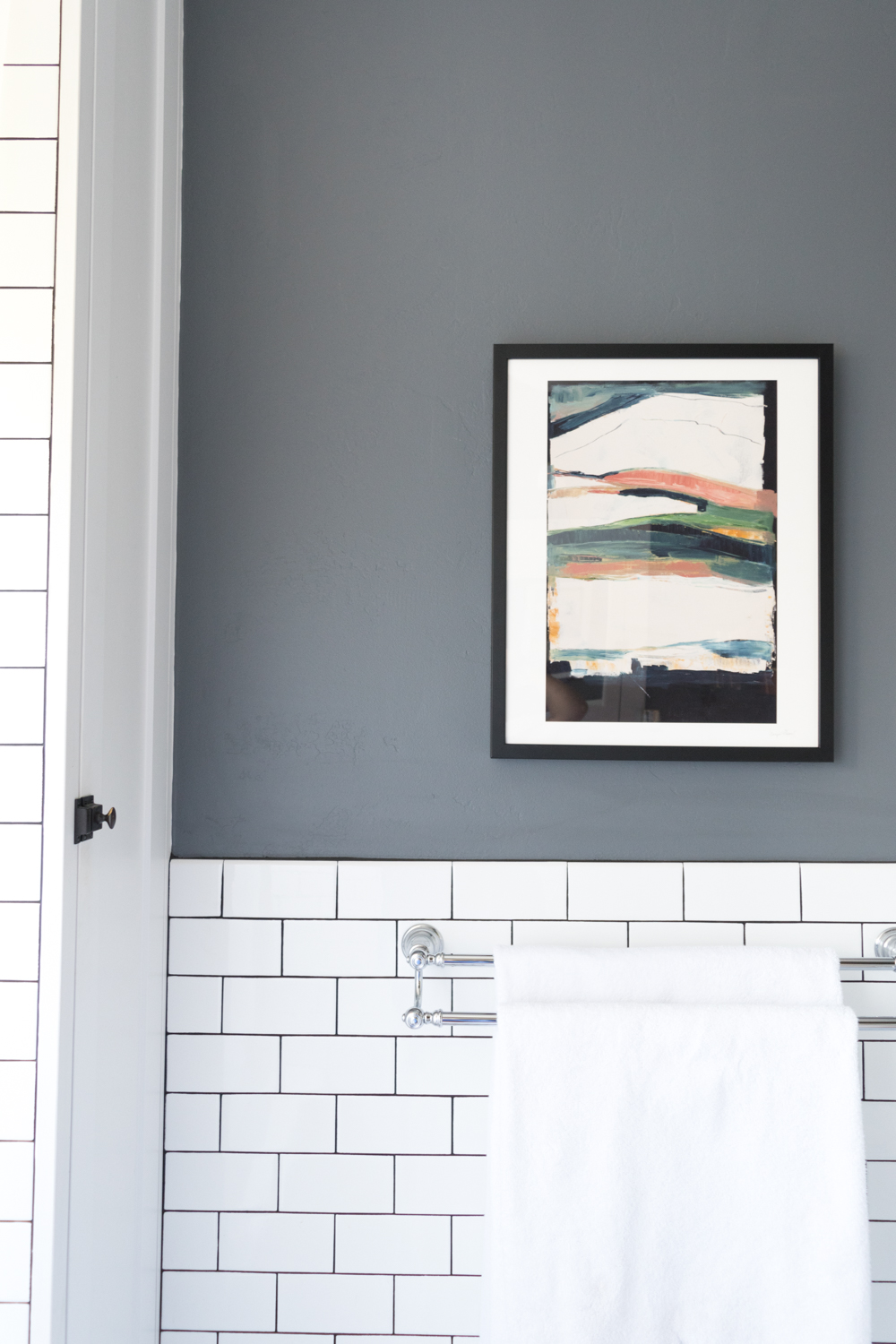
Speaking of matching elements, both the warm tones in the frame and deep blues of Bath are seen in Melting Glacier by Caryn Owen. Again, aren't those blue-green-greys perfect for the walls? Minted really knows what they're doing.
The view from the shower is the best for admiring the two prints at the same time. They are different subject matters, by different artists, and in different frames, yet they feel like they are friends.
I scanned Minted's website for hours but never would have come up with this art print and frame combo. If you want help from a professional designer, I highly recommend you check out Minted's styling services that start at $75. It includes not only a design plan but also a discount on your art order!
Are you an indecisive design professional, stylist, or home renovation professional like me? The art trade program is a great resource for complimentary design help and discounts on art products for your professional projects.

Happy art hunting! And, don't forget this important art hanging PSA from Emily Henderson.
I've collected bunches of Labor Day sales so you don't have to! Enjoy this roundup of retailers that are discounting their goodies like woah. After you save some money, please consider donating some of it to folks that could really use the help.
Almost everything in the den is on sale!
P.F. Candle Co. has candles up to 30% off this weekend. No code needed! I'm currently enjoying No. 11: Amber & Moss which is $21 for 14oz.
eCarpetGallery has rugs for 50% off + Extra 30% off with the Code: LABOR30. The rug in the den is from these folks.
Etsy is having their first-ever Labor Day Sale! A perfect opportunity to snag some handmade goodies at a discount!
A House in the Hills is offering 10% off and they are sending 15% off the proceeds to Houston Food Bank with code LABORDAY17.
Interior Define discounts their custom chairs and sofas only once a year. And that time is now!
World Market has lots of sales, but you can get another 10% off and free shipping with code LABORDAYDEALS. Including this chunky lamp base that we have in the living room.
Scandinavian Designs has a buy more save more sale on everything including my favorite chair.
The Container Store is selling their Elfa closet system for 25% off! We have this in our master closet and love it.
Minda Living has discounted their site by 15% and they are giving 15% of sales to support the relief efforts for those impacted by Hurricane Harvey. Use code SHARETHELOVE. I have their long ottoman in the den.
Alexis Renée Sassard is donating 50% of the proceeds from sales in her curated capsule shop to the Hurricane Harvey Relief Fund.
Crate&Barrel is 15% off this weekend with code SAVE15.
House of Antique Hardware is discounting their entire site by 25% with code LD1725. This is where I get our push-button light switches.
CB2 has 15% off sales - even on furniture! - with code SAVE15.
Murchison-Hume's plant-based cleaning products are 20% off with code LABORDAY20. My favorite is their hand soap in Original Fig.
Select Blinds is selling our solar shades and everything else for 45% off plus buy three get one free.
Artifact Uprising has discounted their custom photo books and prints by 10% with code LONGWEEKEND. I have several of their books and I'm due to order more.
Artfully Walls is discounting their art prints by 20% off with code LABORDAY2017. This includes one of my favorite artists.
Anthropologie is taking another 40% off sale items.
THINX just released cotton period underwear, and they are giving $5 to the Hurricane Harvey Relief Fund with code HARVEY. Click here to also get $10 off your first pair.
Rejuvenation has 20% off pendants, chandeliers, and dining furniture. Plus, it all ships free with code FREESHIP. I would be happy to own literally anything they sell.
Minted is offering 15% off kid and baby prints with code LABORDAY17.
Article has select pieces of their furniture for 20% off. We all know I'm a big fan of Article.
Society6 art prints are 20% off and ship free this weekend. This includes the ones I put in the den and many others I rounded up here.
Framebridge custom framing is 15% off with code LDW2017. We have several of our favorite memories in frames by these folks.
Artist Tuesday Bassen is taking 20% off with code LABORDAY.
The Vintage Rug Shop is discounted 20% off sitewide with code LABORDAY20. If you aren't following Brittany's blog, you're missing out.
Williams-Sonoma Home is 20% off with code FALL.
AllModern is 20% off with code WAVY including our master bedroom sconces.
Lumens is selling lighting for 40% off this weekend with code LABORDAY17.
Target has deals on home furnishing with code LABORDAY.
West Elm is doing a buy more, save more sale with code HUGESALE.
PBTeen isn't only for teens. Their goodies ship free and are discounted the more you spend with code SAVEMORE.
Light & Dwell is selling their pillows for 20% off with code LABORDAY20.
Tessa Neustadt is offering her photo prints for 40% off with code LABORDAY.
Don't forget to consider supporting Hurricane Harvey victims (or anyone else you want to help) by donating some of your savings!
I had been struggling for two years to find the right living room chairs. I put hours into testing seats, photoshopping mock-ups, and browsing styles online, and I even tried a few in the room before returning them. I was dealing with clashing elements in the space that kept dictating what kinds of chairs would be a good fit.
This post is in partnership with Article!
The blue velvet couch that now lives in the den was previously in the living room. The bright color, the velvet fabric, and the tufting steered me away from any other seating that had those elements. I just didn't want a room full of tufted upholstery or oodles of color. The living room's woodwork has orange tones that kept me from any of the camel colored hues or natural wood hues. Even though I wanted a chair like this, it simply would have been too much.

We lived with that super clashy teal chair and the wooden dining chair for a couple of years while I hunted for the right ones. These two were leftovers from our old house and they were probably the worst chairs for the space - oy.
I was on the lookout for neutral colors, with simple lines, that were neither bold nor boring. It was a tricky thing to do! I was looking at traditional designs, modern wingbacks, casual cushions, swiveling bases, and so so so many more.
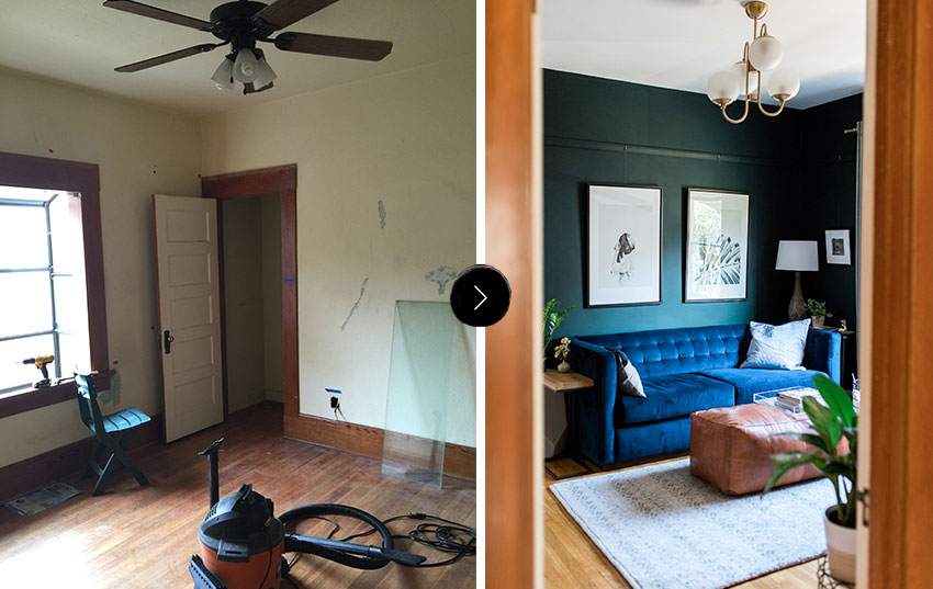
But then, the blue couch and the existing teal chair moved to the den when I transformed that space for the One Room Challenge earlier this year. And my world opened up! I moved the grey sofa into the living room and it instantly neutralized the space. I still plan to replace it with another piece without tufting and a lighter color, but I'm happy to have it for now as it lets the chairs be the center of attention rather than the big couch.
Through the swapping of furniture, I learned that I prefer a simple couch to ground the space, with accent chairs to add the personality. I also came to the realization that I wanted to find ways to make the living room feel more casual. The traditional woodwork, my affinity for velvet (more on that later), and the fact that the space is free of a TV, makes the room feel quite formal. An easy way to make a space feel less formal is to not go super matchy matchy. Some may disagree, but I decided I'd get two accent chairs that didn't match.
So, I started my search over from scratch and this time I could source pieces that had color, texture, tufting, and leg designs that would complement a future couch. I could also pick two favorites instead of narrowing it down to one!
I'll quit my ramblings and just show you which beauties I picked out from one of my favorite online retailers, Article.
Aren't they the bee's knees?
Surprise surprise, I got another blue velvet piece! I just love the texture, and so does the cat! We've learned that velvet is the best material for avoiding cat scratches. Mabel does her fair share of scratching on rugs and furniture around the house (and I follow right behind her with a spray bottle attempting to dissuade the behavior). It's super frustrating and I've tried all the tricks to get her to stop, but velvet is by far the best material for holding up to the cat's natural tendencies.
That texture is simply irresistible to me and the cat. She spends HOURS lounging on this chair, it's her new favorite spot.
I fell for the Matrix's color and fabric, but its scale fits the room just as nicely. In my heart of hearts I wanted a big wingback that I could curl up in while wearing a smoking jacket and plaid house shoes as I peruse my collection of leather bound books that are so aplenty that they are only accessible from a library ladder. But, literally none of that applies to my daily life, so I'll have to save that scenario for my dreams. This real life room needed something smaller scale to maintain sight lines to the adjoining dining room, and narrow enough that the walkway wasn't blocked. Matrix is a perfect fit with its compact size.
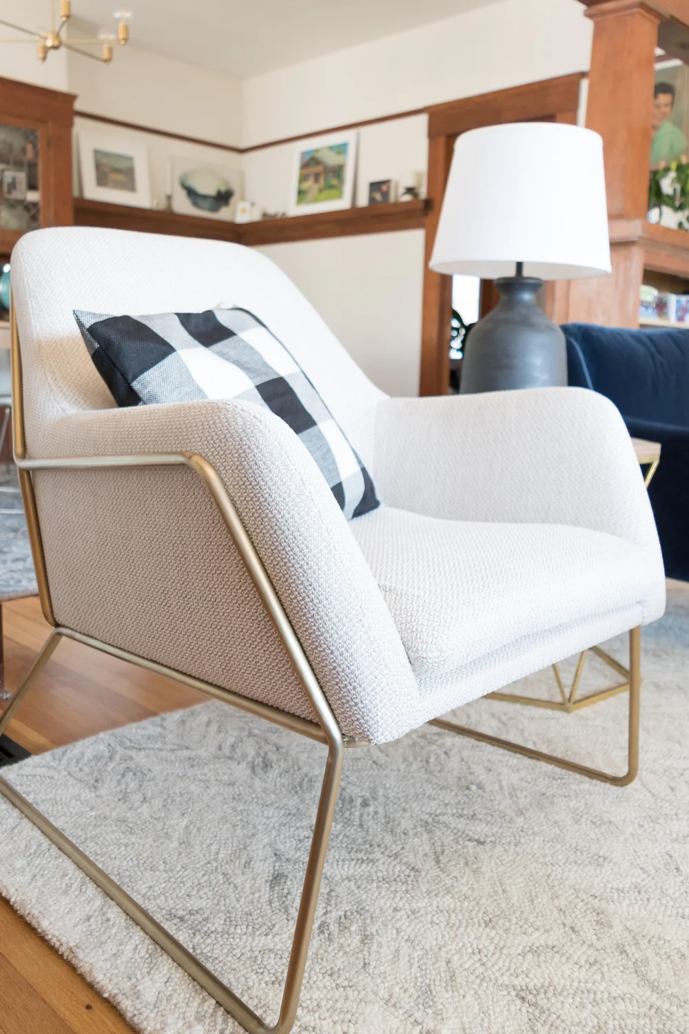
Now the Forma chair. What a beaut! The fabric texture adds just the right amount of detail without distracting from the pretty shape. With all of the chunky woodwork in the room, I wanted something that had soft curves and sleek legs that added visual lightness and this chair fit the bill.
Check out the back detail! Since the chairs float between two rooms, the backsides are just as important.
Ordering chairs online can be worrisome if you don't have the chance to try them out beforehand. Our home's chair critic (Ross) was wary, but he absolutely adores the comfort factor. He's the kind of seating judge that if he says "it's fine" then you're winning. It's a multi-layered evaluation that I don't fully understand myself. But after I found him quietly sitting in the Forma chair for ten minutes, I asked his opinion and without skipping a beat he said, "I love it." Victory! He had the same feelings about Matrix, but he had to wait until the cat got out of that seat before he could indulge.
It's so great to walk into the house with these chairs on the welcoming committee. Now, I need to get a new side table and a new couch to really let these beauties shine.
Be sure to check out the other beautiful chairs from Article, including this perfect caramel wingback, and this one that looks great in blue velvet, too. They also carry lots of other modern furniture pieces, all for a flat shipping fee of $49. Plus, the Article team is just so darn nice!
I wasn't kidding when I said that Mabel loves the Matrix chair. I tried to remove her for the sake of these photos, but she kept jumping back into her spot.
Tell me, am I pushing it with the blue velvet furniture in my house? Would you do non-matching chairs? Which cat scratching remedies are effective for you? Who is the biggest chair critic in your family? Which Article chairs do you fancy? Share away!
Where I’ve been, shooting on film, my dream house, retro costume inspiration, energy rebates, a magic cake, textiles I don’t need but want, a lampshade DIY, my best defense against mosquitos, a new podcast, what’s killing home remodelers, best decision-making advice, overheard parenting, Little Women on acid home tour, best marble etch remover, and more.
If you like florals and color, this bathroom is for you. If you don’t, well, maybe scroll through and you’ll be converted? Or not? Either way, here’s the reveal of a bathroom addition that’s finally here - after a whole three years of construction.
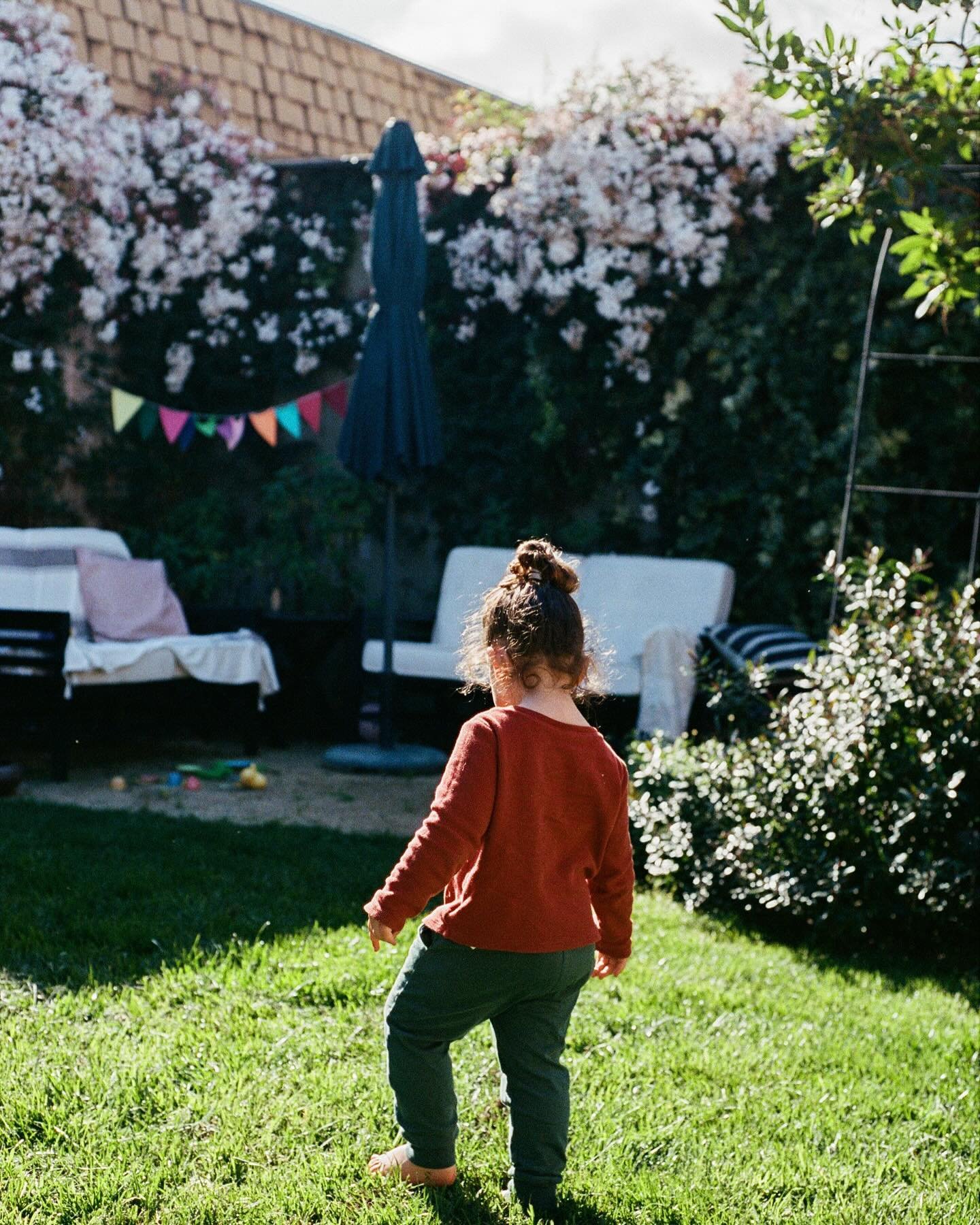
My baby is two! Time’s flying… we wish we could slow down these years… I can’t believe she’s two… and all those other cliché things to say. We celebrated her second trip around the sun in our backyard with a small gathering of friends.
What I’m binge watching, the things I ordered for summertime fun, an incredible legacy, ranking films, a dozen things to say to your kids daily, design decisions, sibling bonds, and more.
I have such love for my historic house, but I’ve shamefully been neglecting the exterior paint. The tired finish was peeling and the faded colors did no justice to the architectural beauty of my 1915 craftsman bungalow. It was time for a change - a transformation that would honor the home's history while infusing it with fresh energy.
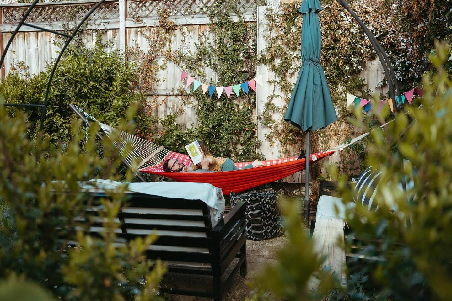
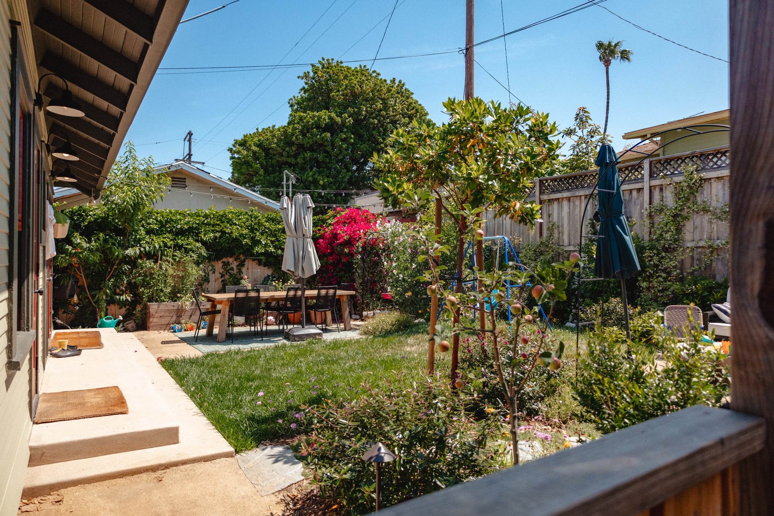
The thrill of renovating outdoor spaces is they always get better with age. We overhauled our backyard last year and the plant growth during this last trip around the sun is wild! Get ready for lots o’ photos.
We overhauled our backyard it’s my new favorite “room” at our house. Here’s what it cost to completely transform the space.
Ashley has been restoring her craftsman bungalow since early 2015. The Gold Hive chronicles the journey of DIYs, restorations, renovations, and stories.
I'm Ashley, a type-A homebody fixing up my historic home at a snail’s pace in California. I share home improvement DIYs, tips for sustainable living, and renovation stories - all while aiming to add more color and present real, lived-in spaces.


© 2024 Ashley Goldman / All Rights Reserved
Please do not use any images without proper credit (a link back to my site/social channels within the first 120 characters).
The Gold Hive contains affiliate links in sidebar banners, in images on the Shop The House page, and as text in select posts. This means that I may earn a small commission if you purchase something I recommended. Sponsored posts or gifted products are noted as such. All opinions are my own. Thank you for supporting bloggers and creators.


Hammocks, cookbooks, gardening, sewing, and the other things I’ve been up to on my impromptu break, and more.