Dark Walls and Unpainted Woodwork - Thinking About Painting My Dining Room
/I shared a couple of weeks ago that I was inspired to paint my dining room a super dark moody color. So, in an effort to write more popping-in-to-share-inspiration-and-thoughts-blog-posts I wanted to well, pop in to share inspiration and thoughts about giving my dining room a dark hue.
First, the inspiration.

My pal Alison (who happened to have been visiting me when I first started writing this post) has an amazing dining room with original wood built-ins, trim, and just gorgeousness. She’s been major inspo for my idea to go dark in the dining room. She balances it with a light table and white drapery. It’s also worth noting that my home has much more orange-y wood tones. Hers are the perfect chocolate color.

The Filomena kills me. Absolutely kills me. I just let out a big sigh unintentionally as I posted this photo from sheer love I have for this room. My house is lacking in the wood ceilings and overall grandeur of this space, but those dark walls are still major inspo.
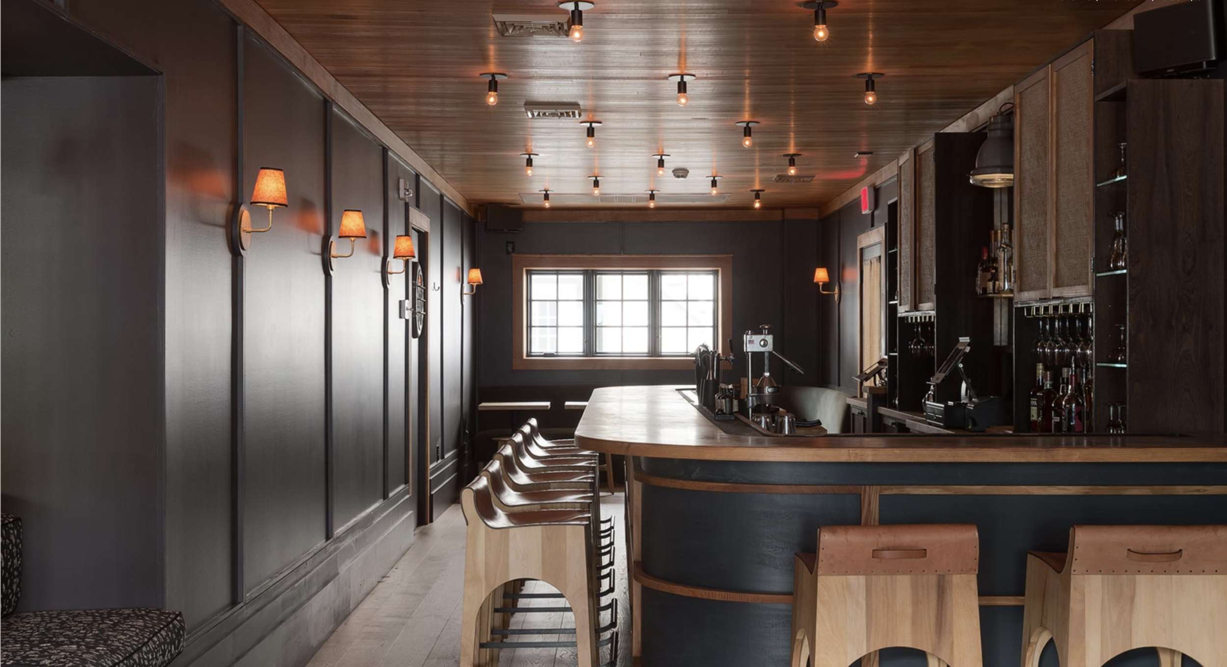
I’ve had the pleasure of visiting this restaurant each winter for the past two years. I adore this tavern, the hotel it’s attached to, and the designers that put the whole thing together. I even got fan-girly when one of the designers stepped in for a drink the last time I was there - I played it cool though. ANYWAY. Dark walls, unpainted wood, swoon.

I love the soft, kinda brown walls as they compliment the paneling, floors, and furnishings. My wood shares in the orange-y tones of this woodwork. (source)

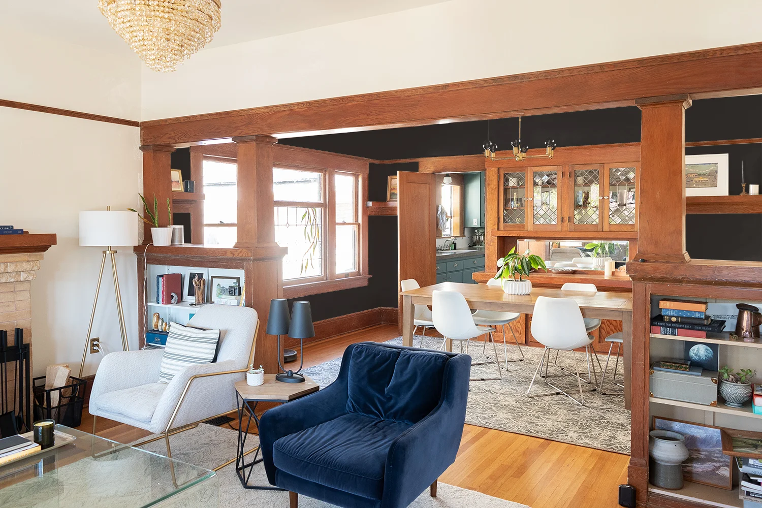
Nicole’s living room is such a deep shade, yet it still feels so bright and lovely inside. I had the pleasure of seeing it in person, and it truly is just as pretty as it is here. Notice how the dark room opens up onto a lighter painted room - hold that thought until the end of this post.

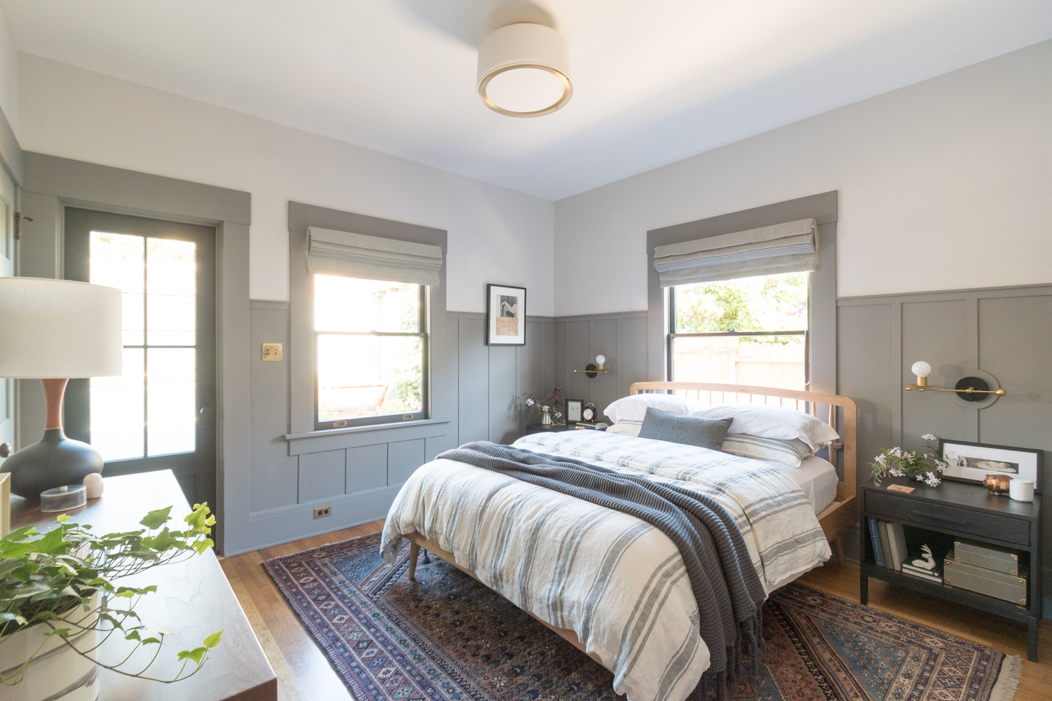
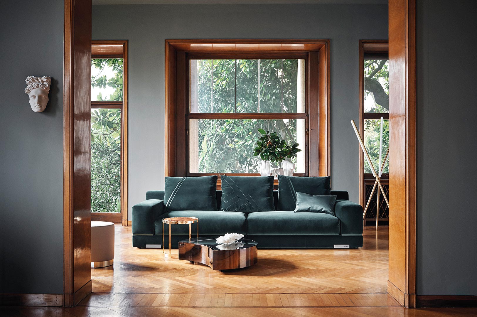
This living room was recently painted this jewel tone by the cutie homeowners David and Stephen in Boston, our fair city, MA. (Car Talk fans, are you out there?) I love the deep teal colors and all that molding - it makes that mantel pop! I have so much woodwork, that I want it to less pop and more recede, so I think I need a muddier and darker hue.

If you like moody spaces and Maximalism, give Wendy a follow! I lean a little closer to the minimalism spectrum, but her woodwork and dark paint is a stunner.

This is a much more muted, and muddy color, but still dark, nonetheless! My trim is equally as orange as this home’s woodwork.

I just found this room after publishing this post and had to run back here to add it to the list of inspo. That deep blue (Dark Note by Benjamin Moore) would look great with painted or unpainted trim in my opinion.
Lastly, we have this deep gray and orange-y woodwork in a beautiful home.
So there’s the inspiration! I haven’t nailed down the hue of preference, but I like the idea of dark, and I always gravitate towards moody blues and greens. BUT, since the woodwork is the star of the show, I’ll let it dictate the direction I go.

Photograph By Sara Tramp for Emily Henderson
Here’s my dining room as it is today. I’ve always liked the light, bright walls, but then I Photoshopped it to be dark and moody. And woah.

Sold. I love it. This is a placeholder color, but I already dig it.
The only “issue” is I want the dining room to play nicely with the living room because they are basically one big room and are currently painted the same hue.

Here’s those two spaces with pretty accurate daily lighting. We get some great west-facing sunshine so when it illuminates this room, it tends to be magic-hour amber hues. The paint is also a creamy white so it feels warm in here. To get an idea of a brighter white, that bookcase on the left is painted Benjamin Moore’s Simply White. The one on the right hasn’t been painted because I’m a procrastinator.
From this view, I don’t love the dark dining room as much. Maybe I need to repaint the living room a brighter white, or alter the undertones of the dining room, or make it less dark.
I also started thinking of wallpaper, which likely adorned the top portion of the walls at some point in my house’s time. I started playing with just a couple of different designs to get my brain thinkin’.

This paper is made by Trustworth who make beautiful papers that have that old-school vibe, but a little punch of something extra. This motif features bats and poppies.
I love the subject matter but I don’t really love the way this looks. The pattern is too busy for me so I likely won’t do wallpaper. But, I share this to give you insight into my process. And I told you I’d bring you along on my journey of my thought process. So here you are. This is how my brain works.
Anyway, once I made the walls match the wallpaper, I kinda dug the muddy taupey swampy color.
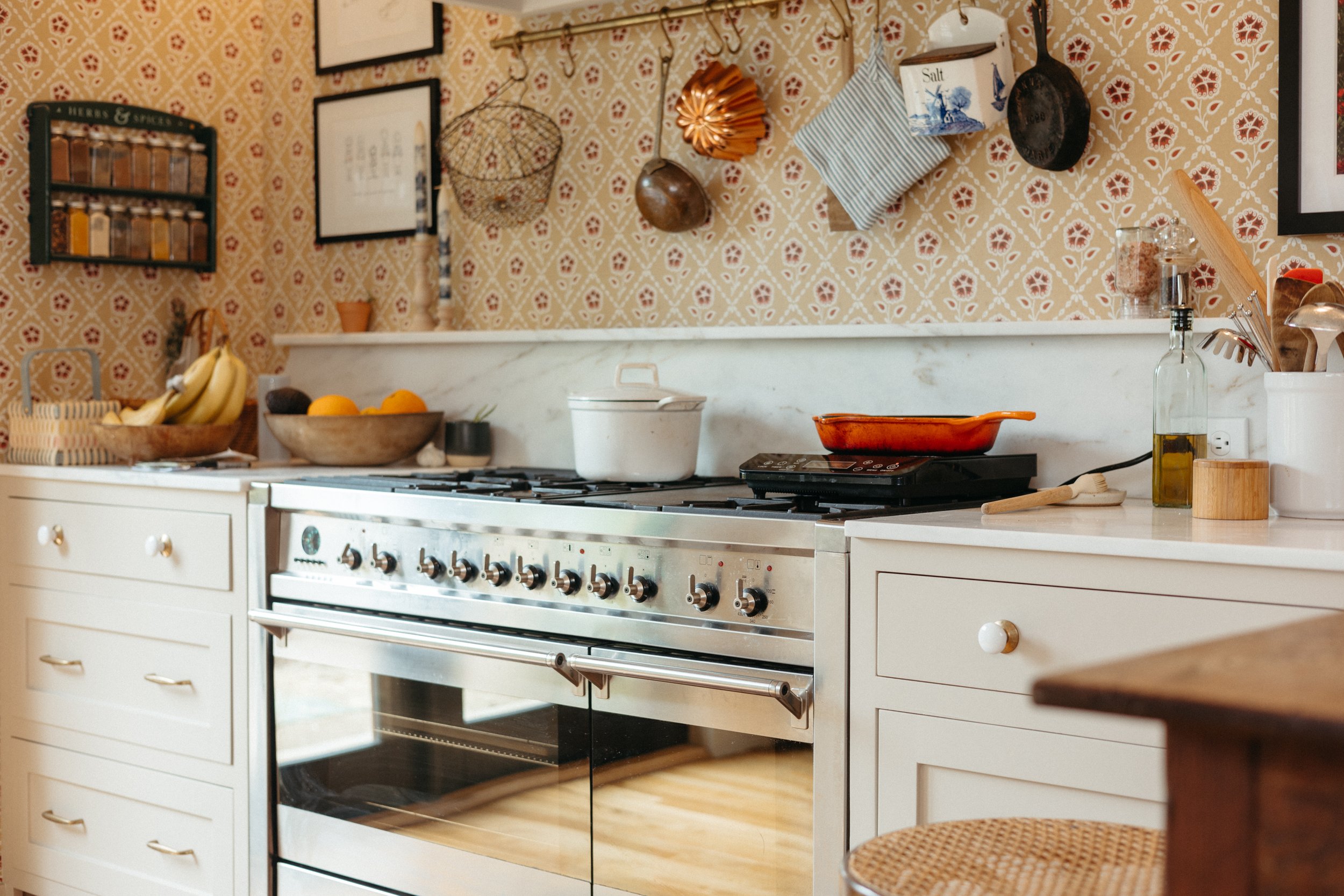
It’s worth noting that this blue/green kitchen cabinets aren’t staying, so you can ignore that color. We’re going more neutral for the kitchen cabs.

Anyway, if you’re into that muddy green color, here it is without the wallpaper and in the full living/dining room. I also toned down the kitchen cabinets so they’re less distracting.
This is when I remembered that the dining room used to be painted a dark red. Lemme getchu a photo of that.

Thank you but no. I will say that the red helps blend the woodwork all together instead of making it pop out into your face, so I feel like a red undertone might be nice with the woodwork. But I don’t like the saturation of that red, and don’t like that it cuts off the height of the room by stopping at the picture rail. Also, can we take a moment of silence for that thick layer of filth in the corner over there?
Here’s a gif of a bunch of the different color options as I slide Photoshop’s Hue slider. This my friends, is the magic of undertones and why they’re so important. Gray is never just grey, white is never white, black is never black. Any neutral is always going to have a hint of pink or blue or mint or yellow or any other color. (click through if you don’t see the animation)

I could watch that animation all day. I feel like the blues and greens are colors I would naturally gravitate towards (obvi), but I feel like the warm chocolatey brown works best with the woodwork. I never thought I’d paint my house, brown though.

What do you think? Dark? Muddy? Warm? Cool? Or just leave it alone and make some stinking decisions about the kitchen already? I’ll obvi do whatever I please, but I do like this survey feature, so I will ask your opinions.
VOTE:
Tell me more in the comments! Also, tell me if you wanna know how to change your wall colors in Photoshop. I’m happy to do a tutorial but I don’t know how many of you have the interest AND have the software to make it happen - just let me know.
I hope you enjoy these popping-in-to-share-inspiration-and-thoughts-blog-posts. Its nice to write a blog post about something on my mind that isn’t a full on how-to guide or super comprehensive start-to-finish room renovation.