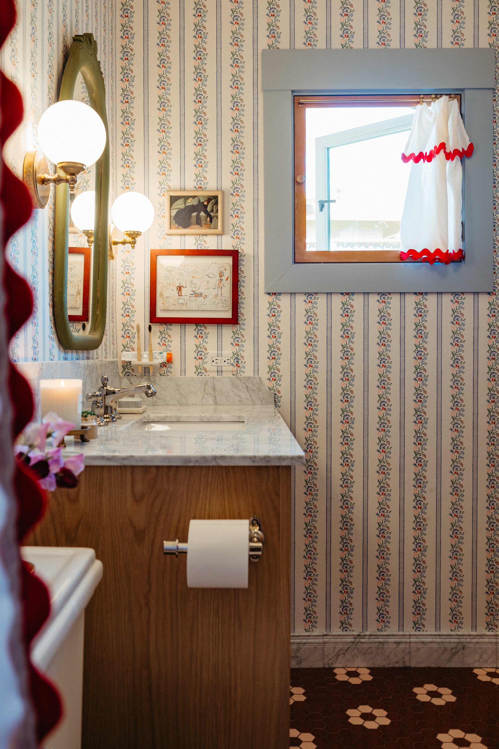
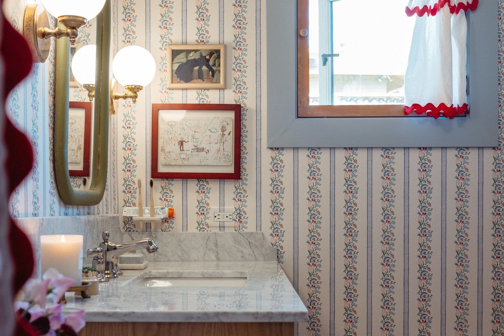
All About The Colorful Tile in the Primary Bathroom!
/We have tile, folks! And not just any tile - it’s colorful, custom designed, a bit historic, and a bit funky. I overthought the colors, layout, and grout colors to the umpteenth degree but it’s all paid off.

This post is sponsored by The Tile Shop. As always, all opinions are my own, and the tile selection was entirely mine.

Holy smokes, I can’t get over how pretty these primary bathroom tiles are!
Over the years, I’ve been finding myself scared of going for bold permanent (or costly) choices - I was afraid of commitment. “It’s so much easier to change the paint color!,” I’d say. Yet I found myself never repainting, and always wishing I went for more color, never less. So I told myself, “not this time!” I decided to push myself to use color instead of defaulting to neutrals. And with this red, pink, and blue bathroom, I think it’s safe to say I did it.
On the floors, I used 2” Imperial hexagons in Sienna and Pink. The walls are 3x6” Imperial subway tile in Denim along with the accompanying short edge bullnose. I wrapped the curb and made the shelves out of ½” thick Bianco Carrara. All of it is from The Tile Shop.
When I renovated our other bathroom seven(!) years ago, I used all The Tile Shop products and have been super happy them, so it was a no brainer to start my tile hunt there. Since I severely procrastinated on this project, I was in a big rush to source beautiful, unique, high-quality tile and trim pieces on a tight timeline. Luckily The Tile Shop’s large assortment of available tiles meant my shipment arrived a mere eight days after placing the order!
I did all of my shopping online by ordering samples (a must!), but there are oodles of The Tile Shop stores all over the country if you want to see the selection of tiles in person.
With tons of tile options to chose from, I kept it classic with a hexagon floor and 3”x6” subway tiles. They’re a match made in heaven, so why try anything else? Picking the colors was a challenge for indecisive me, but I was in for a surprise when I had to pick a layout for the mosaic pattern - so many options!
I tested out a bunch of layouts (and could have done more if nap time lasted longer!) before ultimately deciding on a rosette pattern with three tile spaces in between. It was the perfect design for my space.
There were several things I was a stickler about when it came to deciding on a floor pattern. I wanted…
the shower drain incorporated in the design rather than a blemish in the pattern
the pattern centered on the toilet
no slivers of pink tiles along the edges of the walls, the sides of the toilet, or the vanity. (halves of flowers were okay, and actually preferred!)
nothing too busy nor too sparse
something that had a nod to the historic house

So, after a few hours of playing with the tiles, a couple of nights sleeping on it, and a few hours staring and measuring, I had a pattern! It’s funny that I landed on a pattern I was sure I wasn’t going to do. I actually planned on a border around the room with a diamond pattern before the tile arrived. But I nixed it when I saw how it didn’t lay out just perfectly. It’s wild how much the design is dictated by the room - and just a few inches and be a game changer. I highly recommend laying out the pattern in situ!
If you’re interested in seeing a bunch of other mosaic flooring patterns that I considered, check them out on my Pinterest board here. Note that many of these designs use 1” tiles, but I went with 2” hexagons.
Next up on the tile decision docket was grout. Oh-so-important grout can really make or break the design that I spent hours brainstorming. I turned to Photoshop to visualize the grout options.

If you squint you can really see the difference grout colors make. On the left, the grout blends the burgundy tiles into a solid color and makes the flower tiles pop. On the far right, the light grout blends in the flower making the rosette appear like a solid circle and the red tiles become dramatically outlined. Neither of these were the look I was going for. I wanted a grout that didn’t blend in with the tiles, but rather showed off the individual mosaic tiles without being too high-contrast. The middle color was the clear winner.
I was sold on the medium brown hue but it wasn’t sold in stores and I didn’t have time to order it. With my ideal grout hue unavailable, I briefly considered doing a medium gray, or a light brown, but I just couldn’t shake how much I liked the middle image above. So, I bought a dark brown and a light brown grout, and mixed them together to form a custom medium brown grout color.
Now, I should have just bought grout when I ordered my tiles (I would have done this color) but I like to make it more difficult on myself by waiting until grout day to decide on a color. Berg!
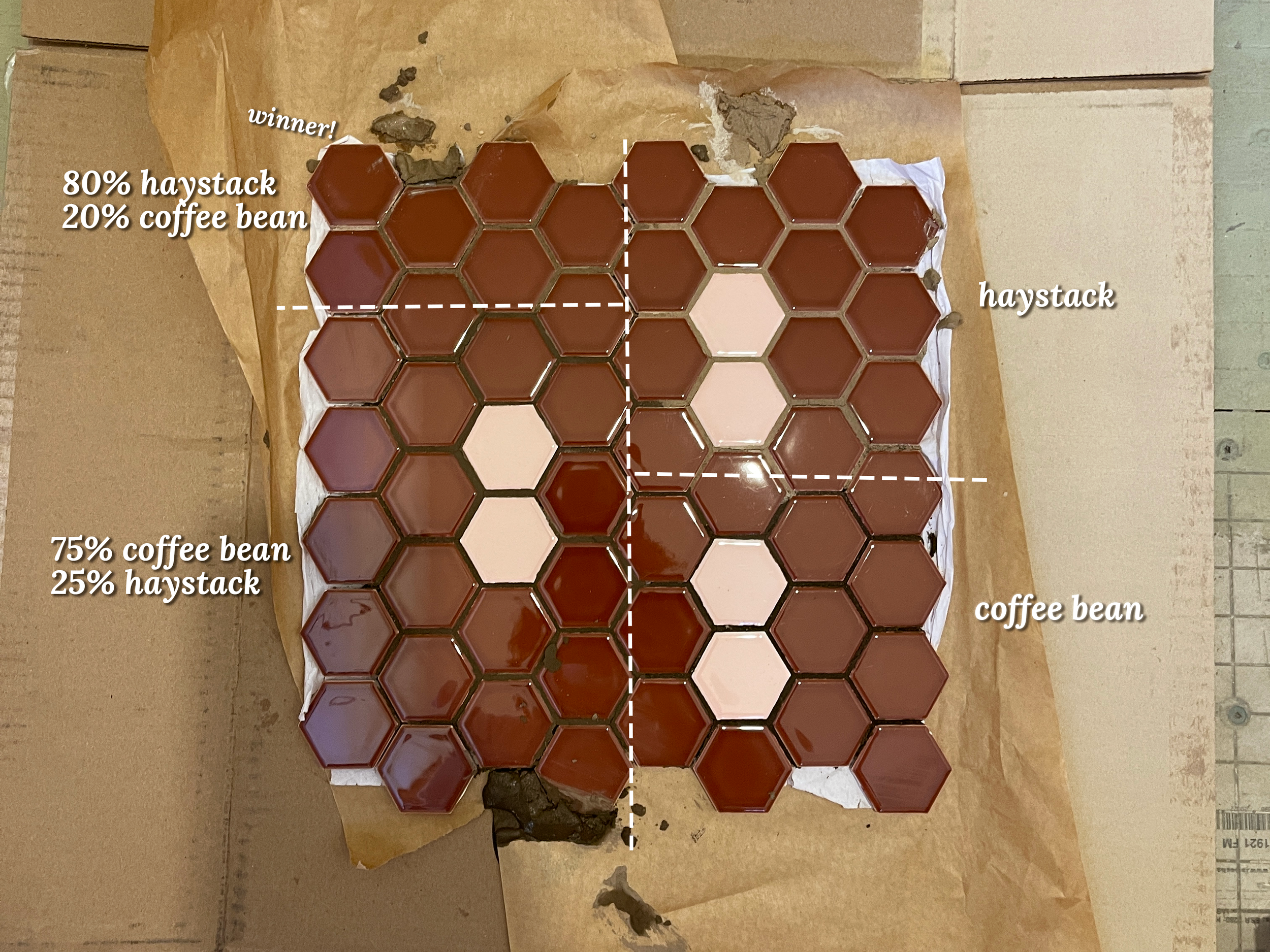
I went with the upper left corner and I think it looks great - just like my Photoshop color!

Check out the way the pattern meets the drain - I love that it’s integrated into the design! I could have gone with a special drain can be tiled upon so it blends in more, but I actually really like the way this turned out.
The one disclaimer to give about mixing a custom grout colors is that there isn’t matching caulk for the custom color. So, I recommend either using grout at the seams and hope it won’t crack, or chose caulking in one of the two mixed colors, or use caulking in the color of whatever seam it’s next to (baseboards, wall tile, etc.)

Next, shower wall tile!
I chose this blue-grey color (Denim) for the shower walls. A close contender was Slate Blue but it felt like the more saturated hue would compete with the colorful floor tile, so I wanted a lighter hue on the walls. I almost did a combination of the two colors using the London trim piece and the skirting in Slate Blue because they look so pretty together, and I love a nice tile detail! Yet for this particular bathroom, I decided to stick with simple field tile. If I had done a tile wainscoting, or if the shower were in an alcove, or if the room had corners, I would have definitely used the trim pieces! As I type this I kind of regret not using them because they’re so nice and really finish off a room. But no, I loooove the direction I went in! Instead of using trim pieces, I went with the simple short-edge bullnose to terminate the wall tile. You can see them stacked in the image above - see the way the edge is rounded?

Here it is installed. I think the bullnose is the perfect vertical termination for a wall tile. Commonly used is a thin piece of metal that covers up the raw edge of the field tile. This is necessary to use if the tile doesn’t come with a bullnose option, if the tile doesn’t terminate into a wall, or if there isn’t a decorative finish piece (like these). It’s fiiiiiine, but I much prefer the more intentional bullnose transition.
I’ll note that you do want to talk to your contractor if you’re planning to use a bullnose transition so everything is prepped. It’s common for many tilers to use a cement technique that ads a lot of thickness to the shower walls, which would make the bullnose float away from the main bathroom walls. Instead of doing this, we used thin sheets of backerboard to make the shower walls flush with the main bathroom walls. This is a perfectly fine solution if using ceramic tiles (not stone) but not all tile folks use this technique.

We also used the bullnose on the vertical edges of the niche. Or, as my contractor likes to spell it, “boool naz.” Due to the size of the wall with the niche, we decided to put the bullnose on the inside of the shelves facing out. I would have preferred the bullnose on the face of the shower walls, but it would have meant we’d have slivers of tiles in the corners, and I certainly didn’t want that.
Subway tiles are known for being simple and easy to install. They are, but they still deserve a lot of thoughtful planning to space them out just right. It takes some extra time laying them out and measuring how they’ll terminate in the corners, but it’s worth it to avoid a weird cut half-way through the tiling process.

Another time-consuming-yet-worth-it-step was smoothing the cut edges of the tiles. This isn’t necessary, but since the cut edges of the tiles would be visible on the front of the niche, we decided to grind the cut edges smooth. Seen above is the before and after using a grinder to smooth the cuts.
The shower walls are grouted in Snow White (unsanded) and they give just the right amount of highlight to the tiles.

Lastly, the shower curb and shelves got marble. Oh so pretty Bianco Carrara marble, to be exact.
My shower curb is 5’ wide, and as luck would have it, The Tile Shop sells a 60” long piece of marble for the very purpose. We wrapped each side of the curb, using three pieces of stone. The top piece is the 6.5” that is came in, but the other two were cut to fit the proper height.

The scrap marble that was cut from the curb went to the shelves in the niche. They stick out about ¼” proud from the wall tile, for shallow little spots to hold our shower goodies. They’re installed by resting them on top of the tiles on the sides of the niche, and grouted into place. This is the same technique used in our other bathroom and it’s held up perfectly.

And there you have it! I’m so so smitten with the tile and can’t wait to add fixtures, wallpaper, a shower curtain, the vanity, and all of the accessories to bring it together. Stay tuned!

Sources:
Floors:
2” Imperial hexagons in Sienna
Grout: mix of Haystack and Coffee Bean (sanded)
Walls:
3x6” Imperial subway tile in Denim
Accompanying short edge bullnose in Denim
Grout: Snow White (unsanded)
Curb and Shelves:
6.5” x 60” x 0.5” Bianco Carrara curb
Baseboards (not yet pictured):
The Tile Shop sells more than just tile! They offer grout (which I should have ordered to save me the headache!), preparation products, finish pieces, thresholds and transitions, tools, and more! They even offer marble switch plates! Hubba hubba.