Reveal of My Craftsman Bungalow Repaint!
/I have such love for my historic house, but I’ve shamefully been neglecting the exterior paint. The tired finish was peeling and the faded colors did no justice to the architectural beauty of my 1915 craftsman bungalow. It was time for a change - a transformation that would honor the home's history while infusing it with fresh energy.

This post is sponsored by CertaPro Painters who were the first paint company to truly impress me during my initial consultation (I interviewed five others!) As always, all words and opinions are my own. Also a big thanks to Gillie Cavan Color & Design for gifting the time of helping me select paint colors.


Enter CertaPro Painters, the paint wizards who managed to strike the perfect balance between preserving the historical charm and giving my home a fresh coat of modern magic.


Prep work was their focus in the initial stage and they took zero shortcuts. They meticulously scraped away the old paint, filled imperfections, and primed every surface to encapsulate remaining lead-based paint. It was like watching a masterclass in home painting. I outlined all of the prep work and detailed how they took all precautions on lead safety here. I can’t stress enough how hazardous lead paint is and the importance of working with an expert team that cares about the safety of our families and communities.


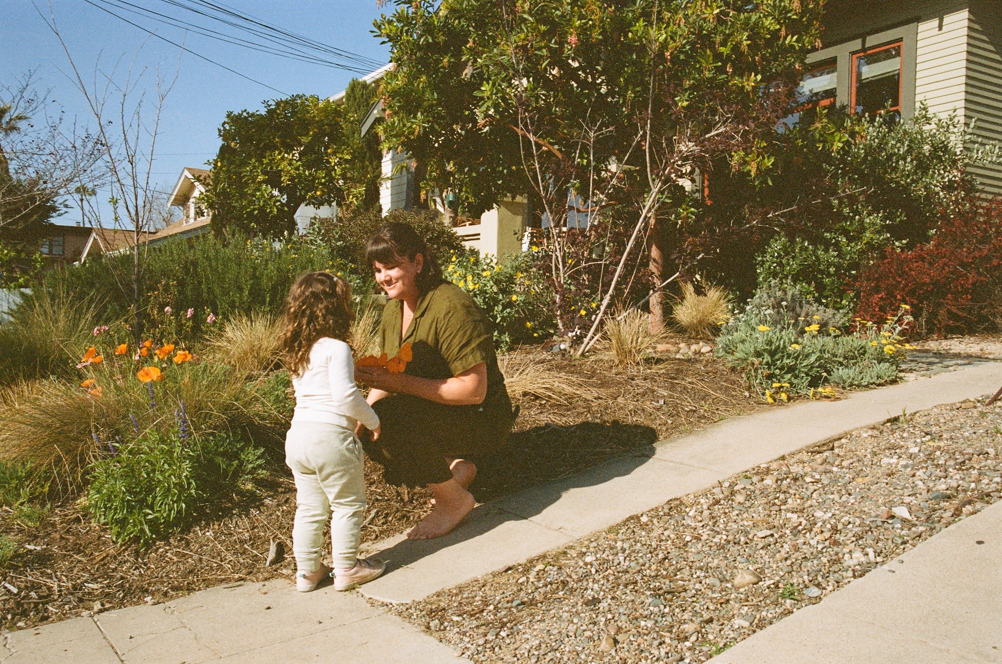
When it came to color choices, I struggled to decide - surprise surprise! I’m currently in a phase of craving color - contrasting hues and pops of cheery warm tones. Yet, I wanted my century-old house to be painted in colors that honor its history. A classic craftsman palette is inspired by nature - earthy tones and muted hues. Sure, craftsmans can handle cheery yellow cottage vibes with bright whites, but I had muted greens on the mind.
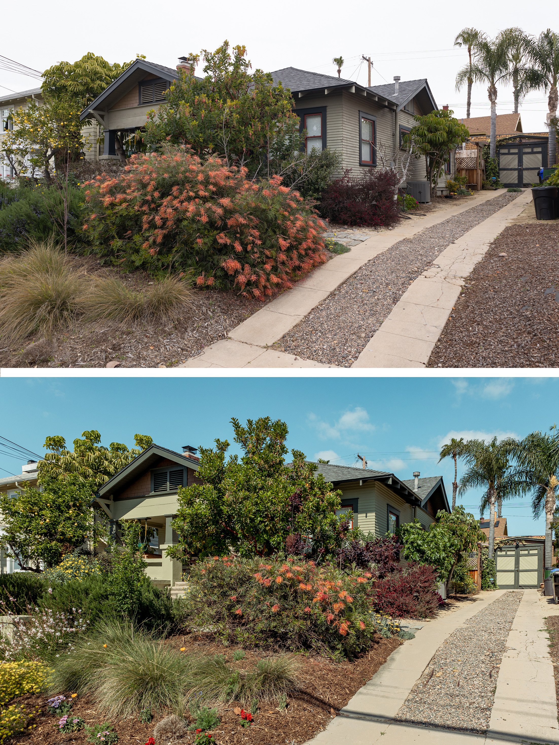
I toyed with a few different palettes here, but felt drawn to a green-on-green scheme with a pop of red. I always thought my house already was green on green, but now that I’m comparing the old photos to the new, I was just willing myself into thinking it was green! What color even was it? Is it beige/grey with blue trim? I’m so confused now!

While I had a rough idea of the direction to go in, I struggled to nail down the exact color and wanted to avoid my persistent decision fatigue, so I enlisted the help of Erin Cavanaugh, a color consultant whose specialty is in historic homes. When I say she knows all of the Sherwin Williams colors like the back of her hand, I mean it.
Erin and I did a FaceTime call while I walked her around my home, showed her neighboring houses, talked about my goals, and then she mailed me a collection of 8x10” color card samples (which are always better than those tiny 1” sample cards). Erin gifted her time to me and I’m so grateful. She did all the color sourcing for me so I didn’t end up with 80 samples on the house (if you know, you know). She does virtual color consultations, so if you’re in a paint selection pickle yourself, reach out!
After much deliberation we settled on the below colors:

Primer: SW PrepRite ProBlock tinted to the siding color
Siding and Stucco: Colonial Revival Green Stone in SW Duration Exterior Acrylic Latex Flat
Accent: Roycroft Bronze Green (I lovingly call RBG) in SW Duration Exterior Acrylic Latex Flat
Door/Window Trim: Roycroft Bronze Green (I lovingly call RBG) in SW Pro Industrial Waterbased Alkyd Urethane Low Sheen
Window Sashes and Doors: Roycroft Copper Red in SW Pro Industrial Waterbased Alkyd Urethane Low Sheen
Gable Shingles: Rookwood Brown in SW Duration Exterior Acrylic Latex Flat.
All of these are Sherwin Williams colors from their Historic Collection.

Timeline:
Days 1-5: scraping and disposing old loose paint
Day 6: gentle cleaning of dirt and grime
Days 7-9: priming with a tinted primer
Days 10-11: more scraping and re-priming
Days 12-13: caulking and patching
Days 14-15: base coat painting
Days 16-18: accent color painting
Days 19-20: window sash priming and painting
Get all the details on the 13 days of prep here.
On each of those 20 days, the crew of two painters put in 8 hours. That’s 320 hours total to paint the house! I was so impressed with the amount of time they took to ensure the paint finish was perfect. They approached every step of the process with methodical precision, ensuring no stone (nay, paintbrush?) was left unturned.
Every project is different! The timeline, prep work, and pricing is based on a multitude of factors including size of project, prep needed, number of colors, the type of substrate, etc. You can get a free custom bid from your local CertaPro team here.

The CertaPro crew did a beautiful job on the details. Do you see how the side of the window casing was previously painted the color of the siding? When the crew repainted, they wrapped the face and the sides in the trim color, and cut in a perfectly straight line next to the topography of the siding - just how it should be. Chef’s kiss.

To minimize lead exposure, the crew didn’t sand the surfaces - only scraped off loose paint. So, you can definitely see a lot of texture in the finish. I happen to like seeing the texture and history of the painting - after all, the house is over a century old, I don’t want it to look brand new.

While we maintained a pretty similar palette as previously painted, we painted the eaves and rafter tails the color of the fascia and trim accents. It previously was the siding color and it looks so much more rich in the coordinating hue.

I will say that one thing I struggled with was the sheen of the accent color. I (mistakenly) told the crew to paint the fascia and accent pieces in the same paint used on the door and window trim. They used this ultra-durable paint for the high-traffic areas which only comes in “low sheen” (instead of flat which is available in the Duration paint that we used on the body of the house) which has a bit of gloss to it. I wish I did the flat on the accent pieces (fascia, vent, columns) because 1. I prefer flat and 2. The sheen catches too much reflection of the sky, making those parts look more blue - a color I was trying to avoid. We repainted the columns in the flat sheen and it’s wildly improved.

I’ll admit that I’ve had a hard time coming around to the trim color we chose. With an oddly gloomy spring season, the color sometimes reads as more of a grey than a green. I want to embrace more color - not greys - so I have been thinking of having CertaPro come out to paint a different hue. I’ve considered a few options recommended by Erin, but none are better than the color we chose. So I think I just need to let my brain adjust to the new color and see it shift as the season warms up.
Aside from the adjustment period, I’m super pleased with the color palette! I can now say my house is “the green one!”

At the conclusion of the project, a third-party lead testing service came out and took samples from multiple surfaces and the soil. I’m happy to report that we passed the lead test post-painting!

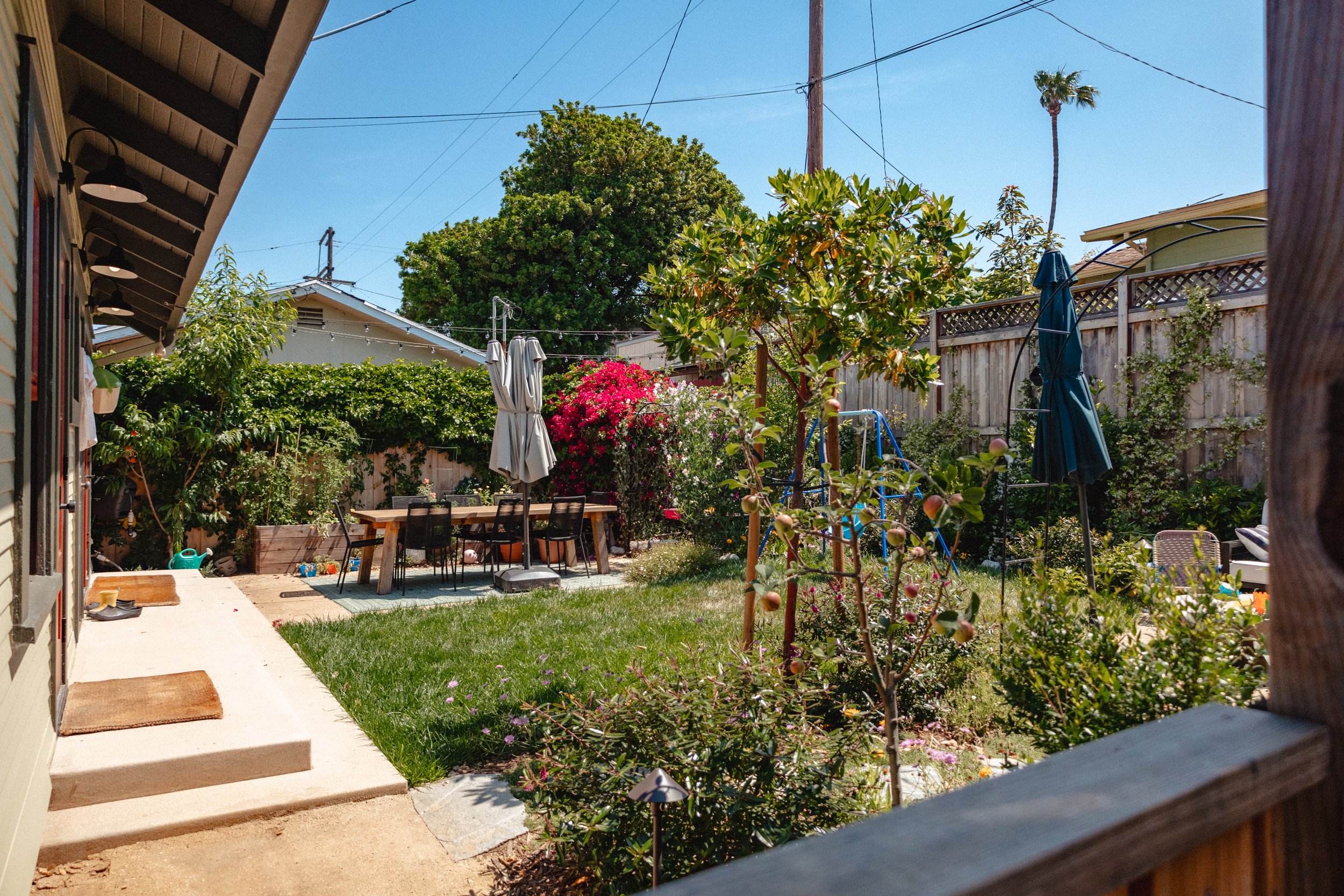
The fresh coat of paint breathed new life into my home, adding depth and character to every nook and cranny. The exterior now stands out in the neighborhood and creates a lovely backdrop for our garden. Not only does the house look better, it’s safer, too.
The craftsmanship of the CertaPro Painters team was evident in every brushstroke, and I couldn't be more thrilled with the work they did. I recommend you reach out to your local CertaPro team if you’re in the market for a full house re-paint! If you’re in San Diego, reach out to the North County team and ask for your crew to include Max or Skylar.