Holiday Sales - Black Friday Edition
/It's the day after Thanksgiving, so you know what that means! Deals, deals, deals! I've taken my inbox full of email promotions for Black Friday and slimmed it all down into this convenient list of deals just for you!
Keep coming back as I'll continue to add more sales as I see them promoted throughout the weekend.

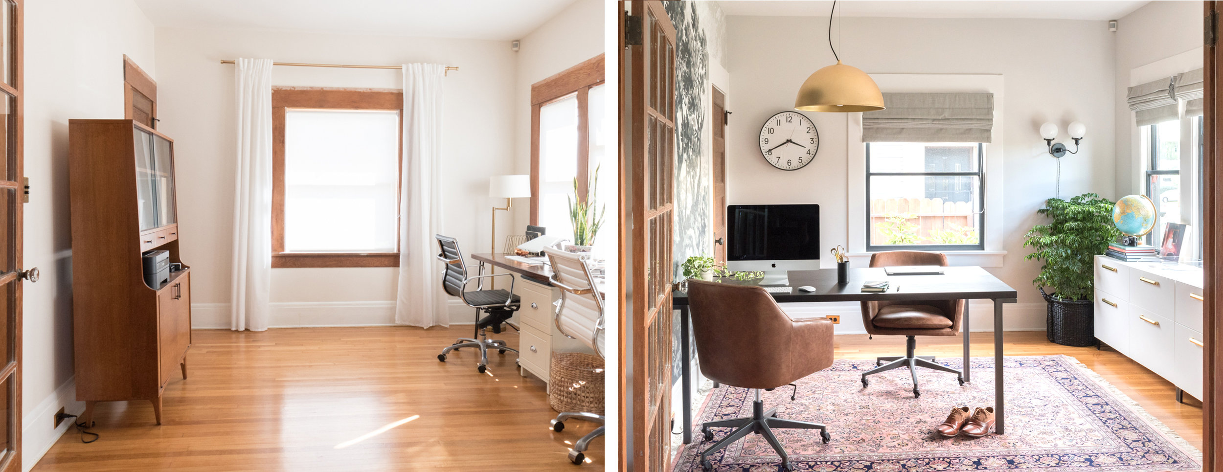
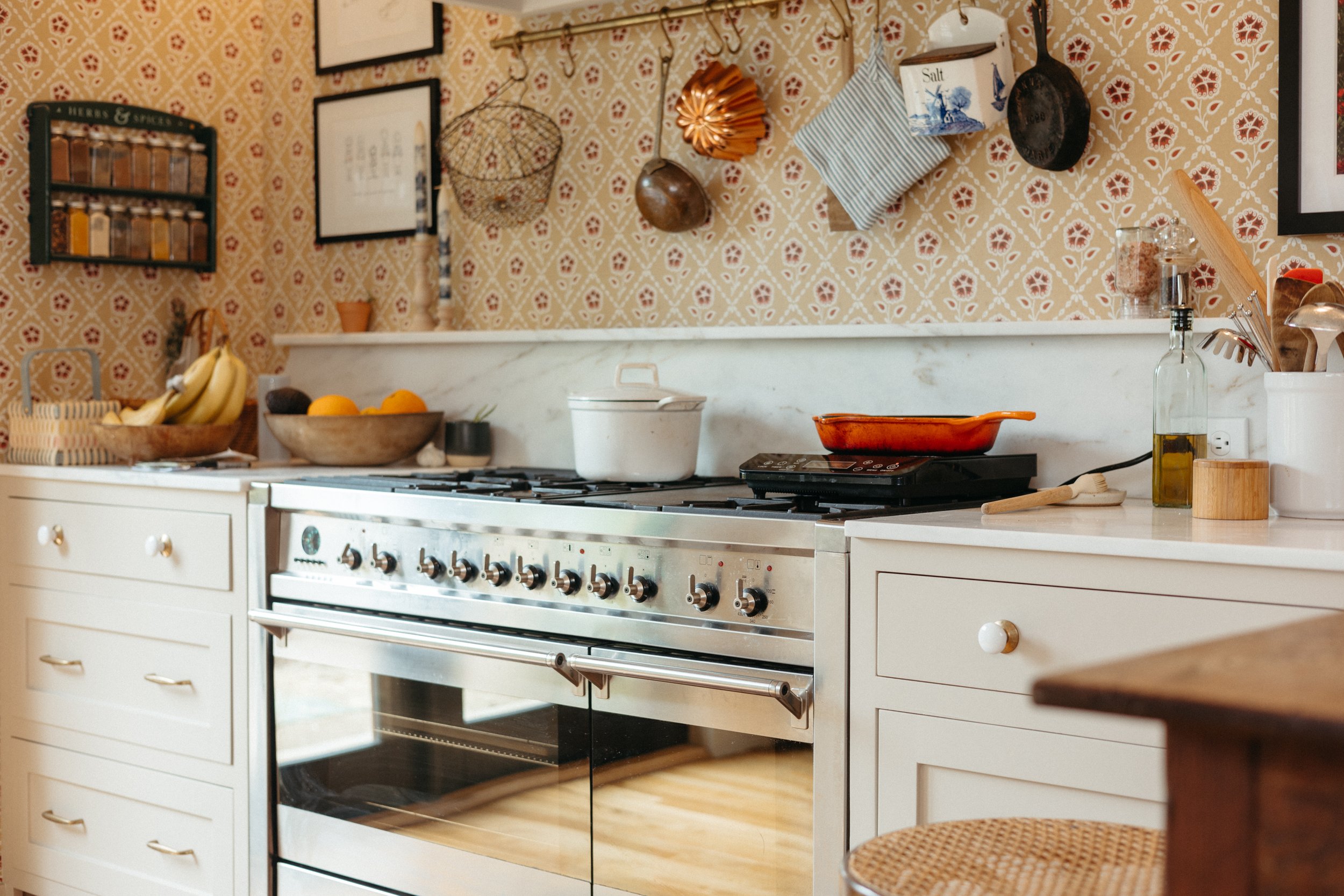
Target is offering up to 40% off home items. Also, we just spent the morning getting my mom a new iPhone 8 Plus which comes with a $250 Target gift card this weekend! The clock we installed in the office is on sale, too!
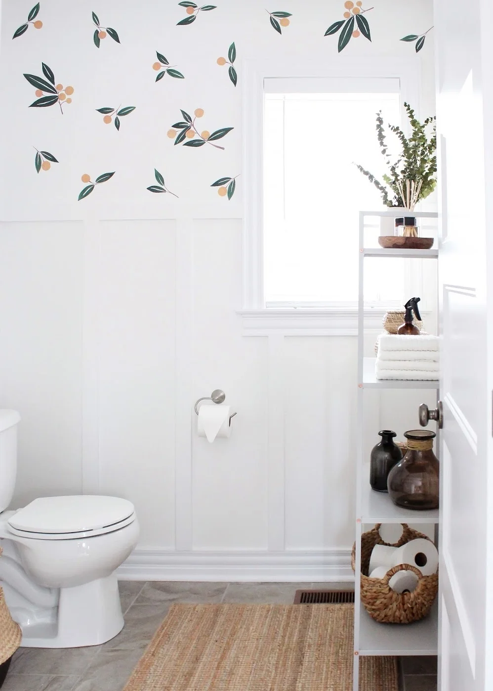
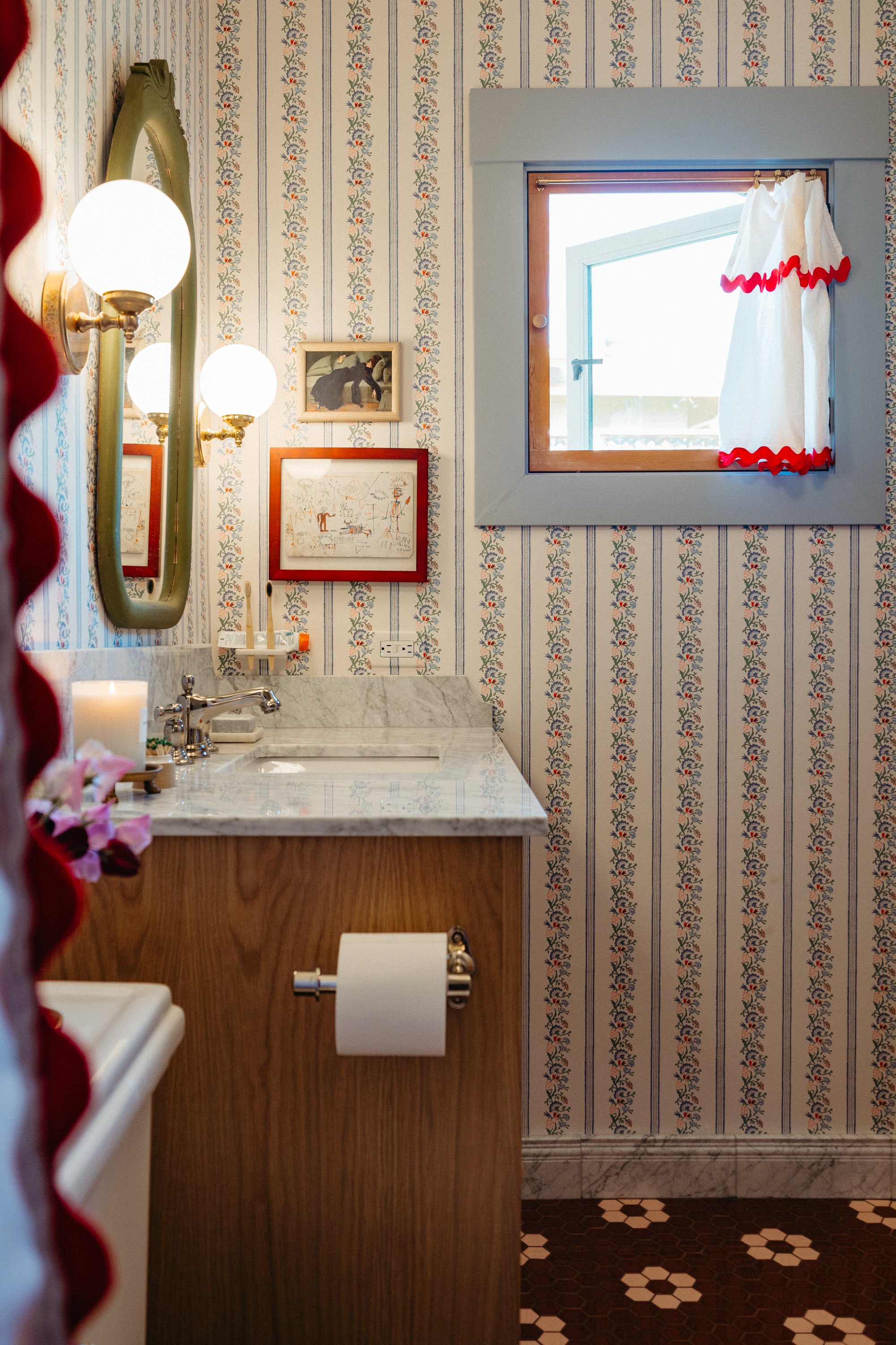
Minted has killer discounts with code BF2017 such as 15% off sitewide, 20% off holiday cards, 20% off fine art, and more. This is where I got our bathroom art a few months ago!
Black frames are 20% off at Framebridge with code BLACK20 Friday through Monday. We used Framebridge to frame this print when I posed for a famous artist!
Select Etsy sellers are offering discounts on handmade and vintage items this weekend.
Artifact Uprising, my favorite place for custom photo books and prints has a buy more save more deal with code BEMERRY. Custom family photos make for great holiday gifts!
Mae Woven's beautiful vintage-textile pillows are 25% off with code COMEINCOZYUP.
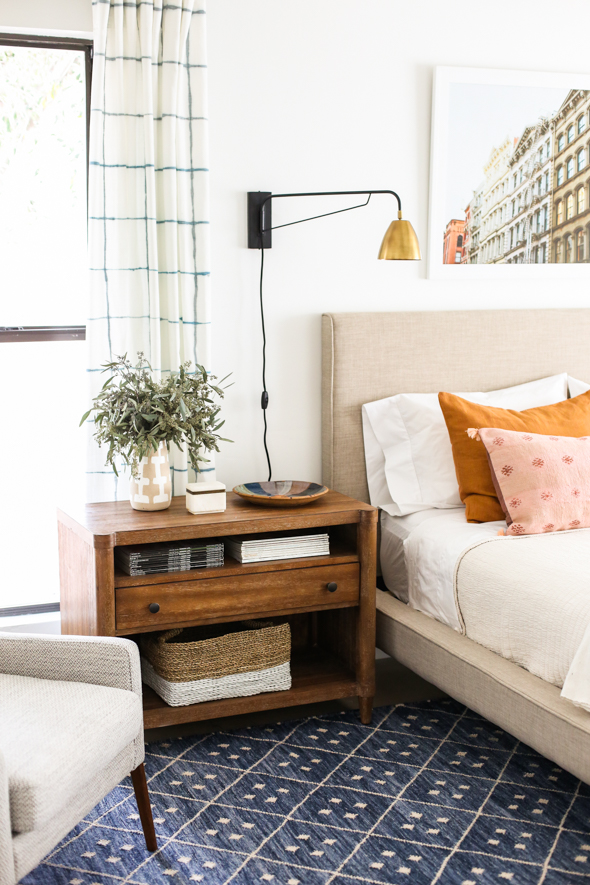
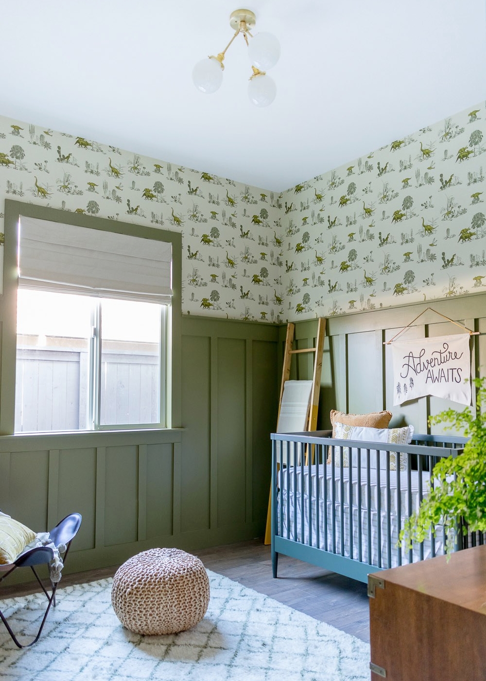
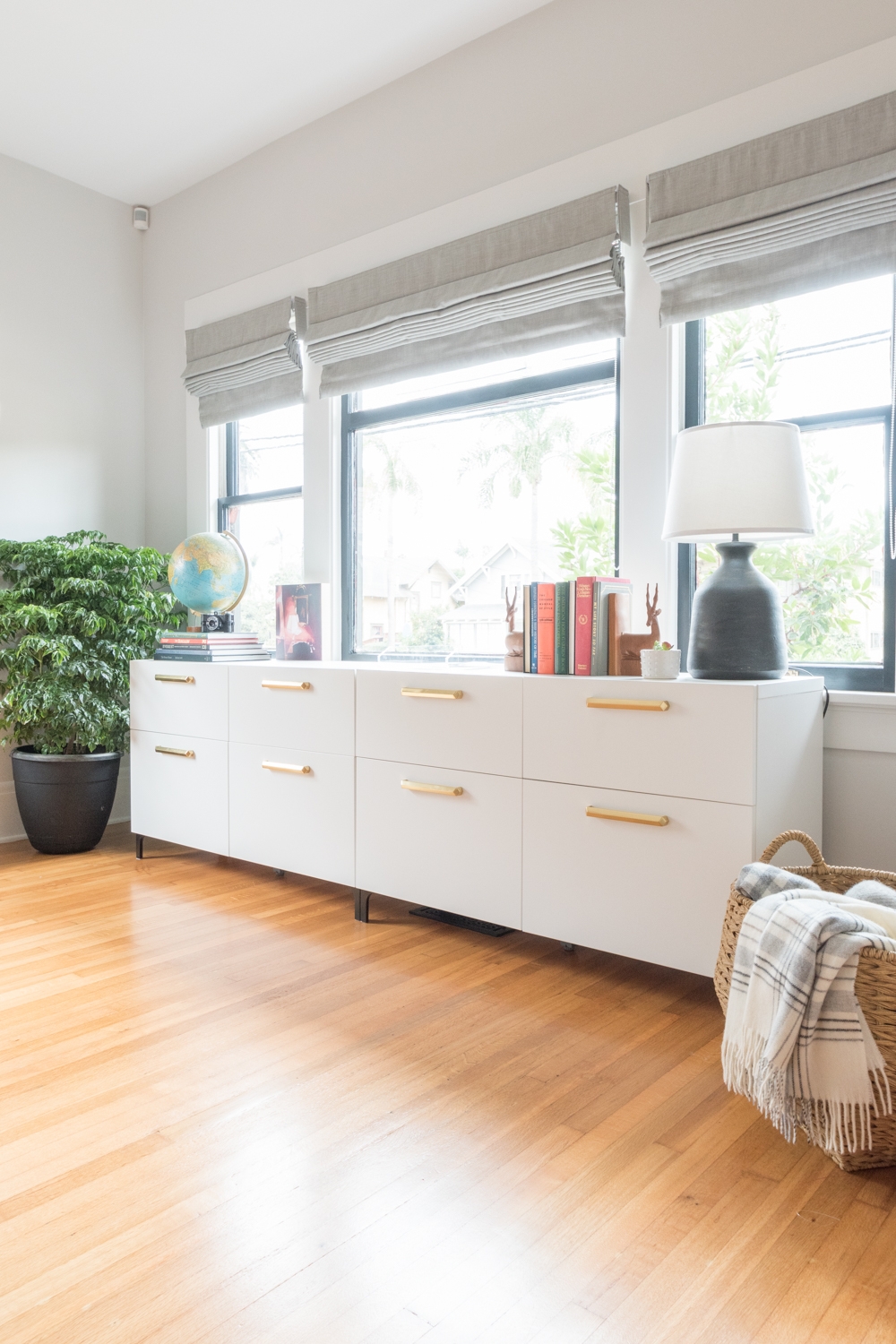
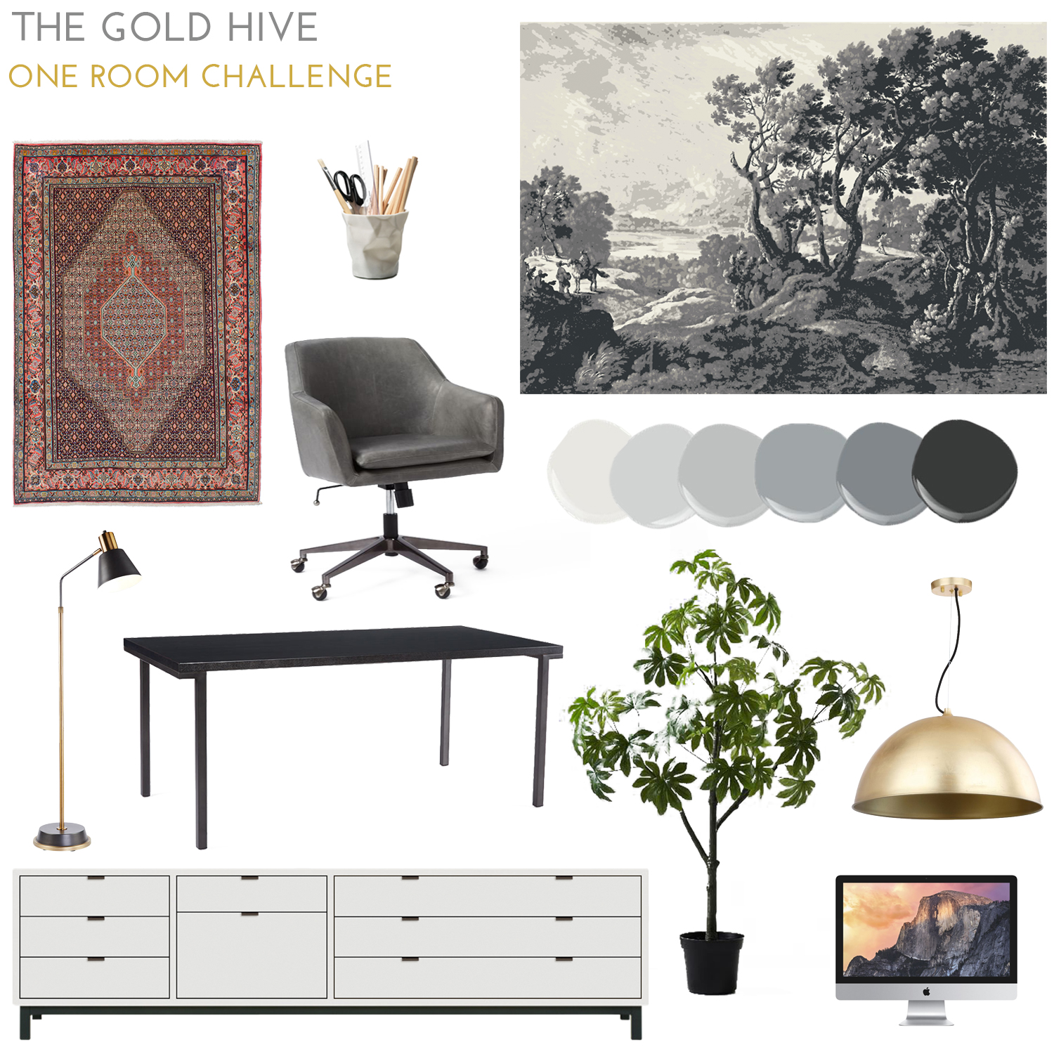
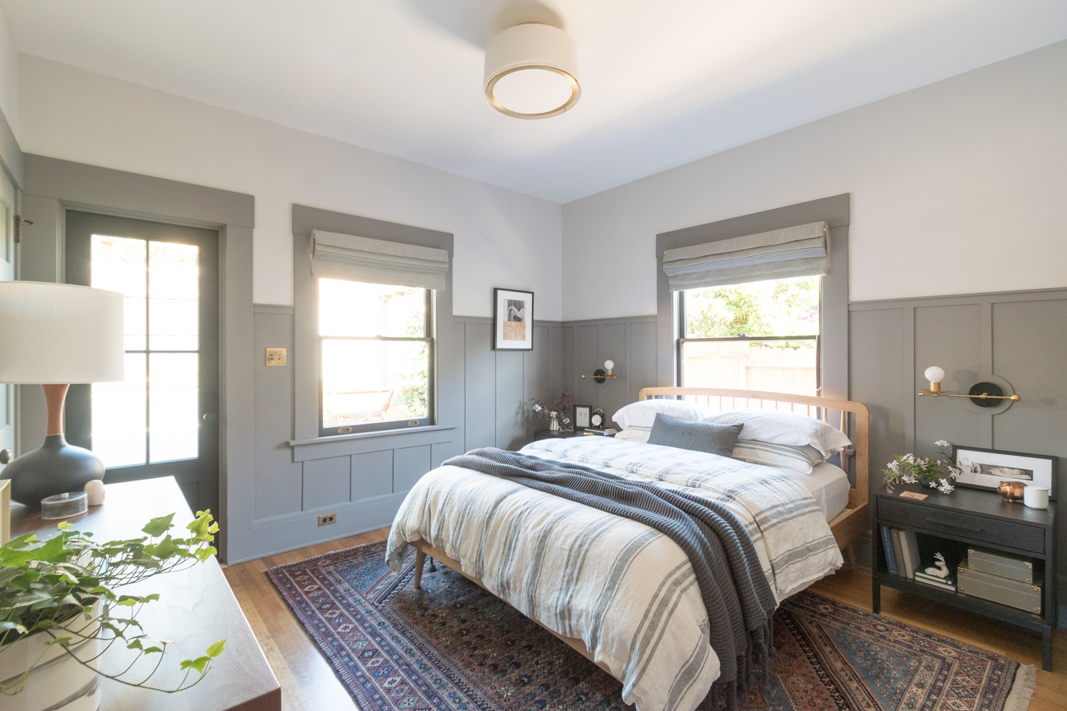
Wayfair and Allmodern have some seriously major deals this weekend! The pendant you all love from my latest ORC is 42% off!
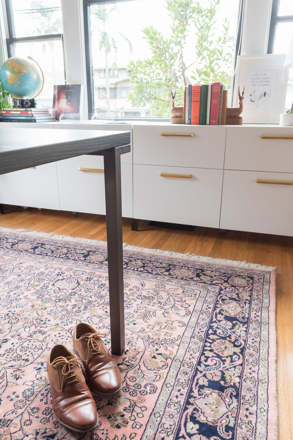
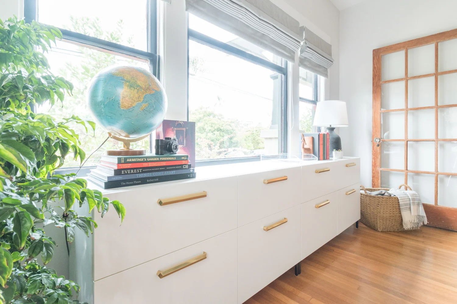
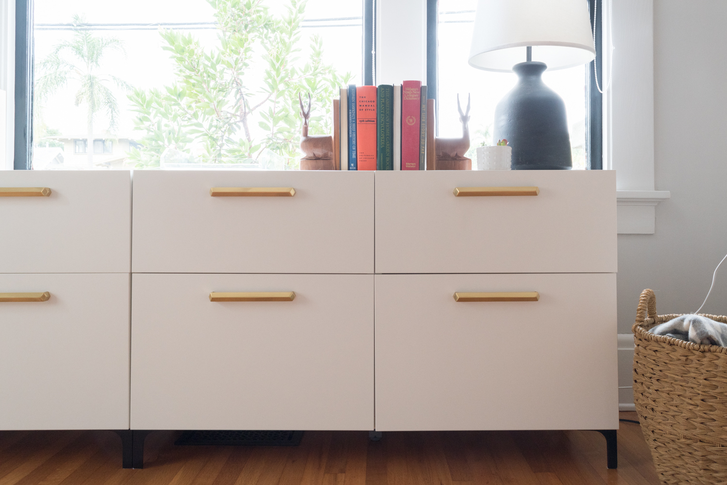
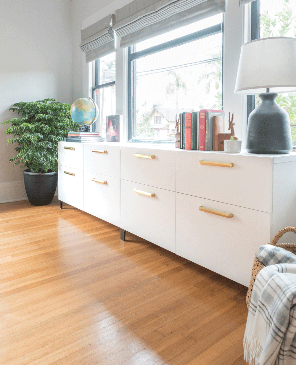
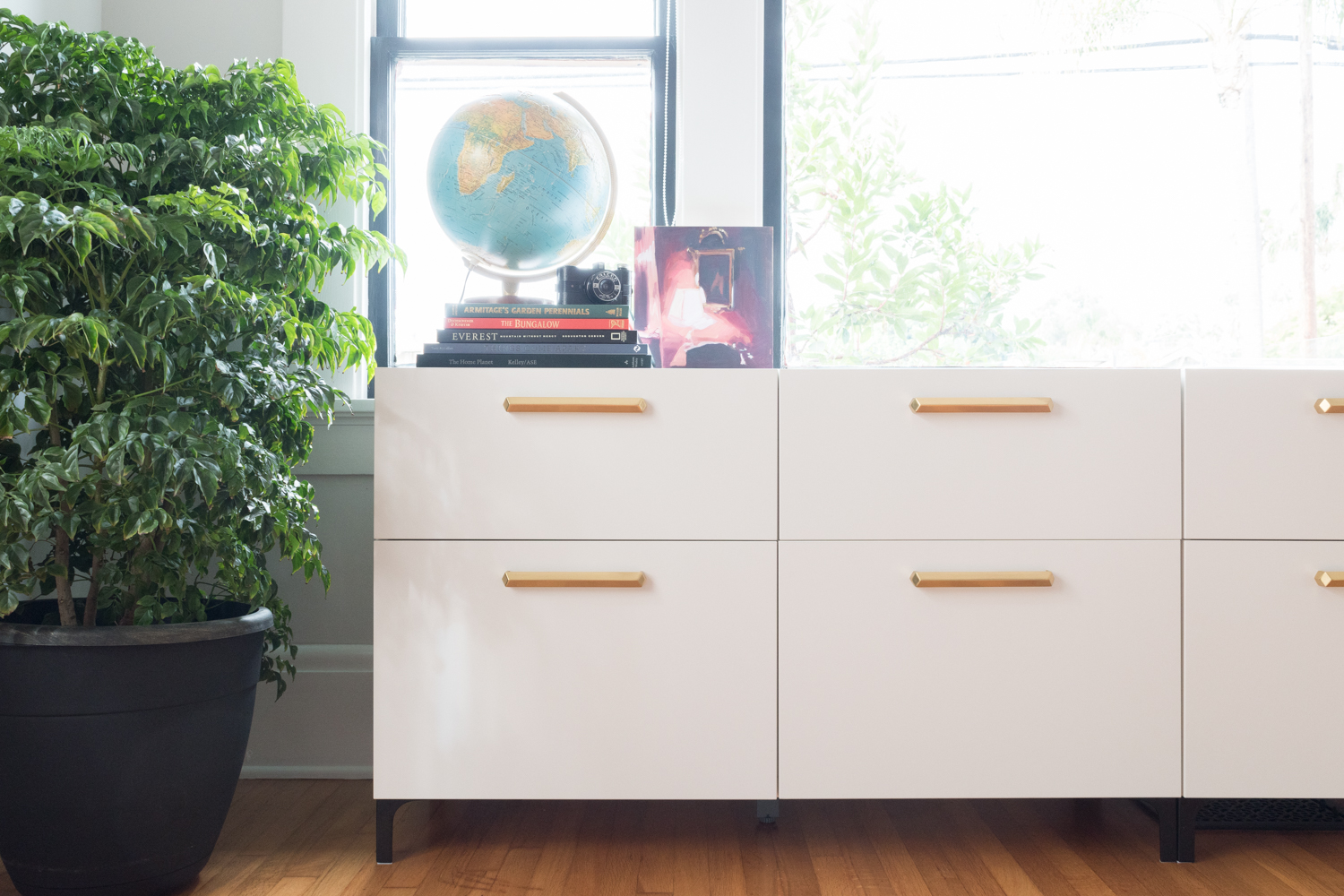
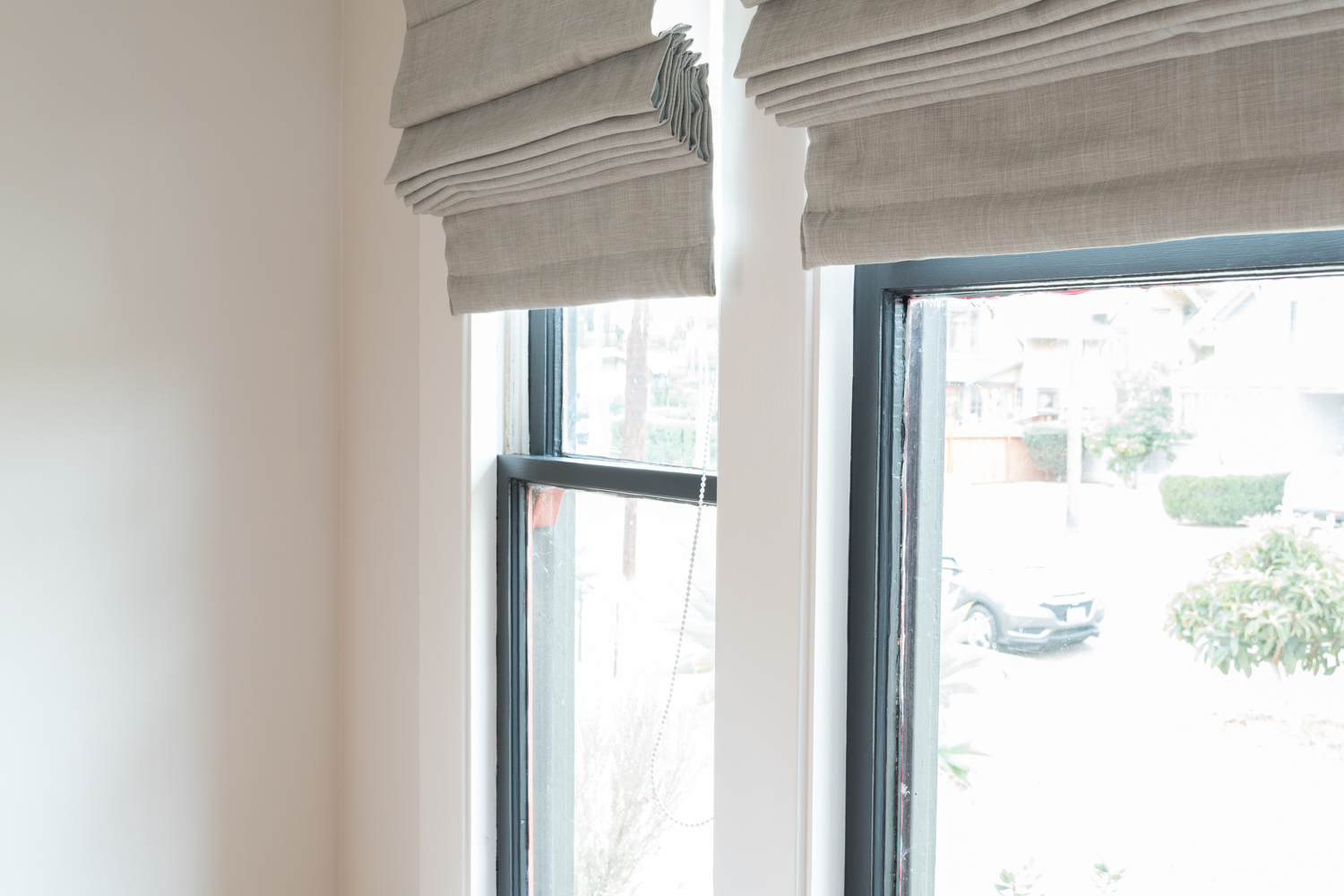
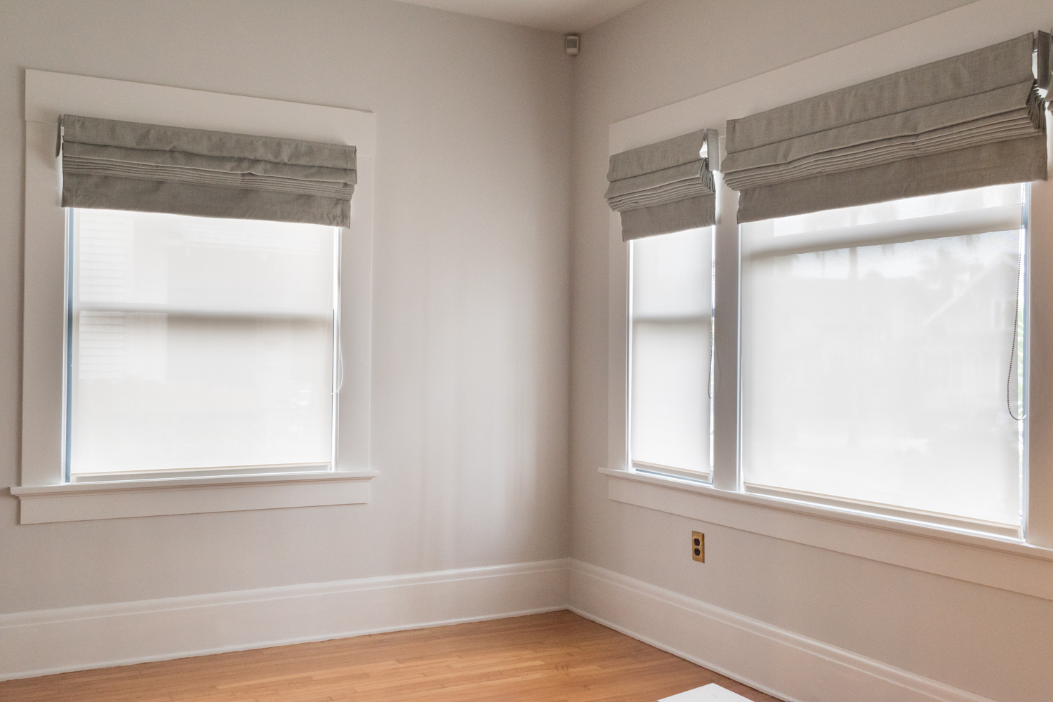
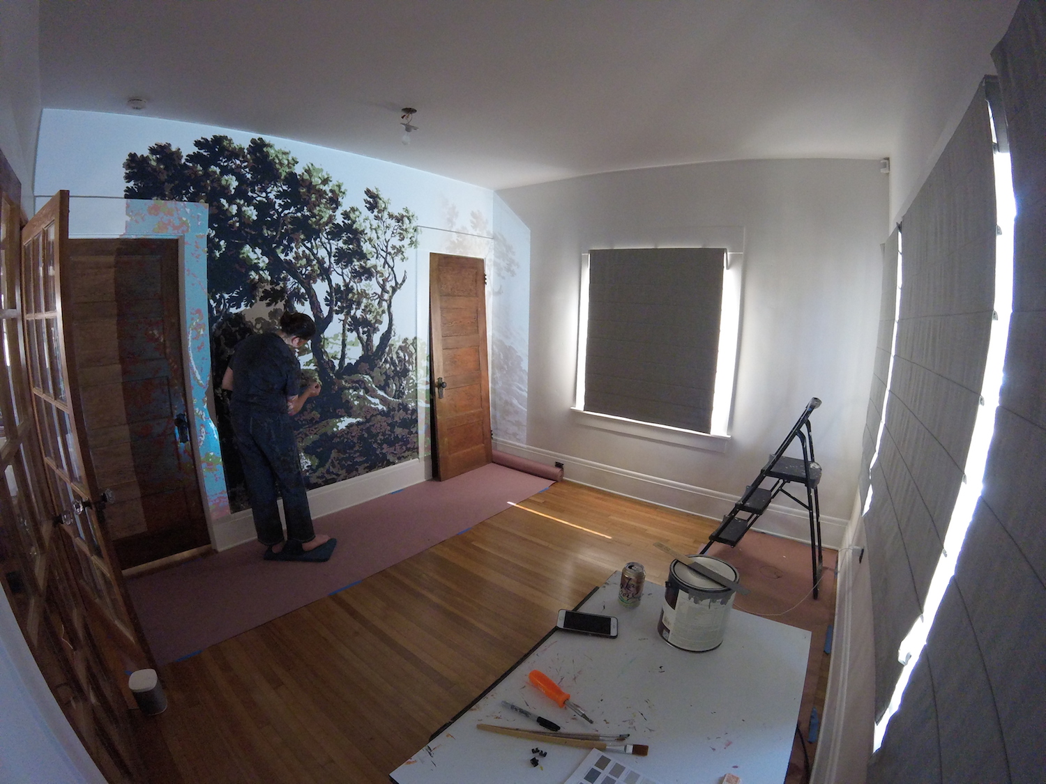
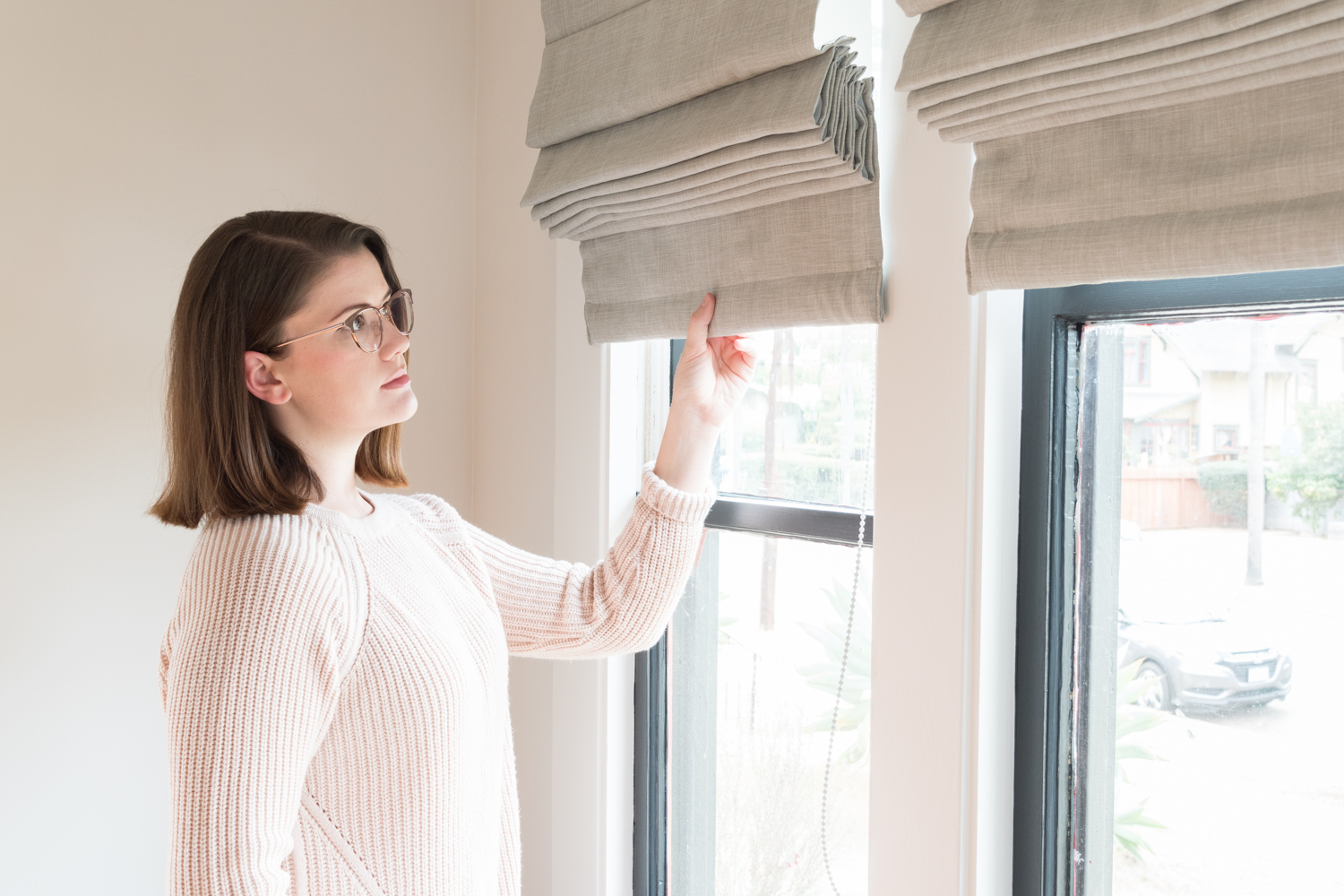
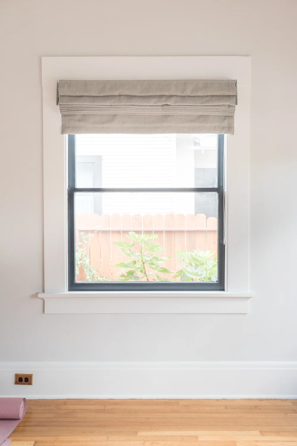
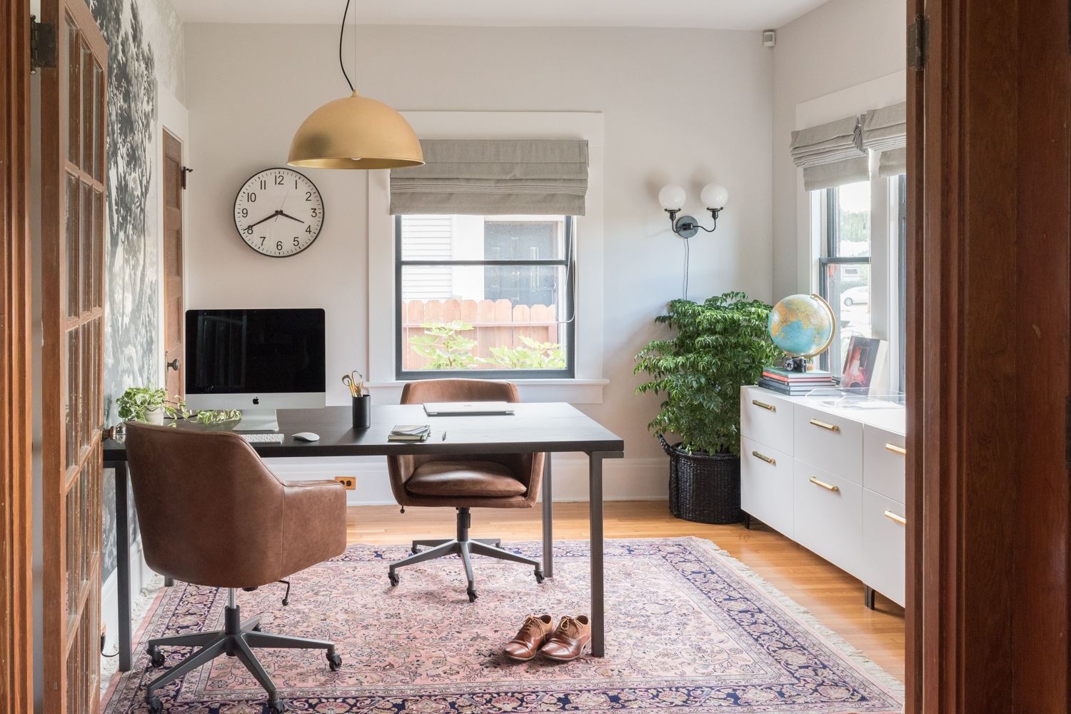
Select Blinds is selling everything at 50% off plus free shipping! If you recall, we have their solar shades and blackout roman shades in our new home office.
World Market has BOGO deals and lots of other offers this weekend.
Brittany is offering 30% off your entire purchase on her rugs and pillows at The Vintage Rug Shop with code YAYBLACKFRIDAY!
The Container Store is offering 30% off a single item in stores and online.
CB2 is giving away free shipping and taking 15% off full priced items through Monday.
Dyson is offering their vacuums for up to $200 off.
Mesa Vintage has vintage rugs discounted this weekend with code TURKEY. Yay for supporting local artisans!
Sonos is offering $50 off their Play One speakers and $100 off their Playbar or Playbase. We exclusively use Sonos as a surround sound system for our house.
Artist ADAMJK discounted his whole shop with no coupon code needed!
Anthropologie has a 30% off everything on sale!
Society6 is where I've purchased several art prints and custom pillows. They have great gifts for the holidays - and all of it is 25% off plus free shipping with code BLACKFRIDAY!
Speaking of art prints, 20x200 is giving away a free tote with the purchase of $100+ of art prints. I have a few pieces of theirs including the Feral House print and I adore them.
If you want more art prints, Artfully Walls has marked everything down 30% with code BLACKFRIDAY2017.Get 20% off your star map with code THANKYOU at The Night Sky.
Both of the rugs I used in the spring and fall One Room Challenges are from eCarpetgallery. They have rugs on sale for up to 85% off!
With code GIVETHANKS you can get 20% off at McGee & Co.
Home Depot has oodles of deals!
iRobot is discounting their Roomba vacuums - some are $100 off! I can't imagine life without ours.
My friend, Erin is selling her Cotton & Flax fabrics, gifts, notebooks, and coasters for 30% off with code THANKFUL. I have this notebook and this pillow.
Everything at House of Antique Hardware is 25% off today with code BF1725! Remember when we installed their picture rail molding?
Parachute bedding is 20% off with code SALE17.
My brother-in-law's graphic design company has some architecture-based prints on sale this weekend at DKNG Studios.
The leather ottoman in our den is 25% off at Minda Living with code THANKFUL25.
Max Wanger is offering 20% off his art prints with code GIVETHANKS.
Article has select furniture pieces for up to 30% off! Unfortunately, my favorite chairs aren't on sale, but so many other gems are!
Amber Interiors is donating 20% of her shop proceeds this weekend to a toy drive. She has some beautiful home decor that's great for holiday gifts - and for a good cause!
West Elm is hosting their buy more save more deals, plus 50% off select furniture!
Artist Stella Maria Baer is offering her gorgeous prints at 25% off with code THANKFUL.
Crate & Barrel is also doing a buy more save more sale, plus 15% off with code SAVE15.
Interior Define rarely ever does sales, but this weekend you can take 15% off their most popular custom furniture designs.
Artist Marine Édith Crosta is selling her gorgeous paintings at 20% off with code BLACKFRIDAY.
Through midnight tonight, Loveseat has vintage furniture and collectibles for 15% off with code ITSBLACKFRIDAY.
Rejuvenation, one of my all time favorite furniture retailers, is doing a buy more save more promo!
Enjoy those deals!


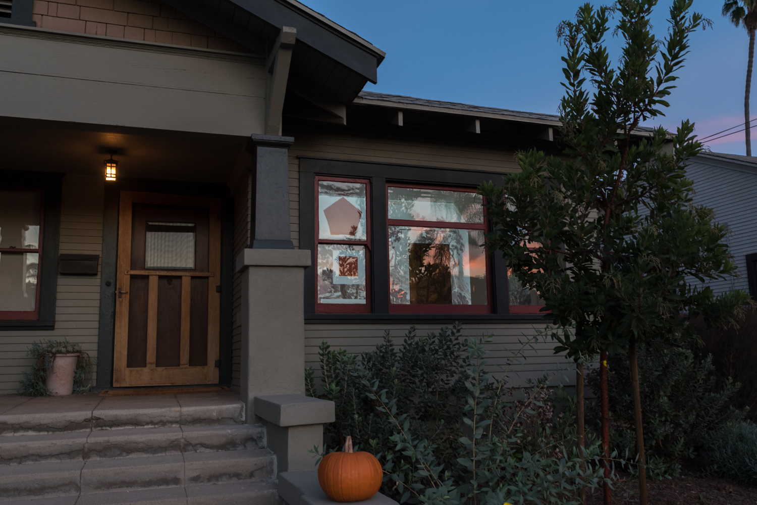


What I’ve been up to - from gardening, to film photography, and the books and shows we’re enjoying. Plus a house tour that requires a closer look, grass seed to always have on hand, cedar shake excitement, historic window screens, and the privilege I’m reminded of daily.