Redesigning the Kitchen Layout... Again! But This Time I May Have A Winner?!?
/If you know me IRL, or if you’ve been here awhile, you may have noticed I’m really indecisive and over think things WAY too much. I’ve been designing my kitchen for nearly FOUR YEARS now. I made minor upgrades to my current kitchen because I thought we’d only live with it for a mere 6 months. Well, here we are 4 years later and I’m still designing the future space. BUT! I think I may have come up with the best layout that makes the fewest compromises and sticks to a more reasonable budget!
Stick with me, it’s kinda a long post but I tried to be super informative and concise. When you make it to the end, there’s a survey to vote for your favorite layout.

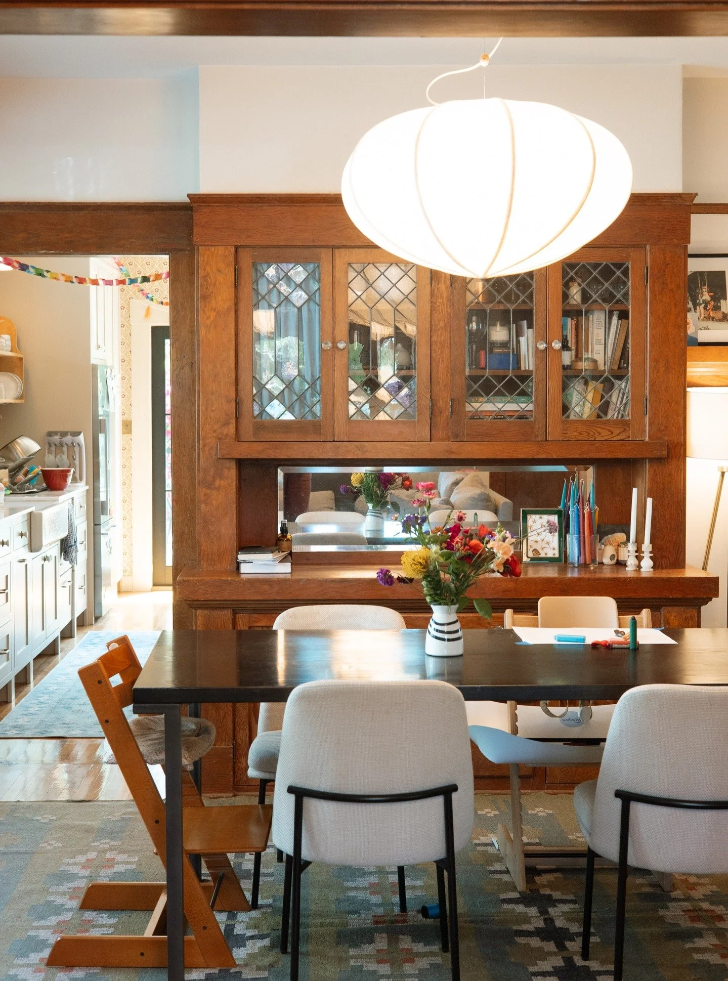
To back up, I shared a blog post all about my very first design. I took you on a video walkthrough of the whole house and shared some 3D renderings of what I had in mind. It’s a helpful introduction to our space and our goals for the future remodeled kitchen and the addition of a bathroom. Below is our current floor plan for context, but be sure to check out that first redesign blog post if you haven’t already, because it gives you context to what I’m toying with.

After I shared my goals and my idea for a new layout, I got a bunch of really great and super creative feedback that I shared in this blog post.

All of these ideas got my wheels turning! Click through to see them each up close and get more insight from my perspective on each one.
But pump the brakes!
Remember how I told you a couple weeks back that our home was historically designated? It’s exciting for our neighborhood, it will save us oodles of money on our property taxes, and it’s just plain cool street cred. BUT, the kicker is that it has limitations on our remodeling plans - meaning many of the proposed ideas will not fly with the City. I was always under the impression that the Historic Board only cared about the front of our house as seen from the street, but they are now pushing back on my plans for the back of the house. To be clear, they aren’t dictating what I do on the interior, but they can dictate what I do to the exterior in terms of door and window openings - which in turn dictates the interior. So those super creative plans that involve shuffling windows and adding doors are total no goes.
The City nixed any plans to add windows in the kitchen, or move the window in the bedroom, but they are open to a little bit of shuffling in the backyard. Emphasis on “a little bit” of shuffling. It’s kinda hard to describe, so here’s a colorful depiction of what we’re working with.

This definitely put a damper on some of my plans, and certainly throws off many of the suggested layouts, too. Sorry, folks - your ideas were great, just not doable. I had our electrical panel (that thing you see on the right behind the pink rectangle) moved to the other side of the house so I could put a door over there. But nope, the City won’t let me use that area for a doorway. I planned on making a big window in the bathroom, but it now needs to be half the width as planned because I need to keep that door highlighted in green. UGH. It’s frustrating, but at least I’m allowed to make a few changes, so I’m grateful for that. But, this all sent me back to the drawing board in terms of the kitchen redesign.
In summary and to revisit, there are a few key elements of our redesign:
We want to add a bathroom. Adding it off the master and by the back of the house to get natural light is ideal.
We need to then put the closet somewhere else. I’m happy to compromise here because we don’t have much in the way of clothes anyway.
Access to the master is through another bedroom, which isn’t great for guests nor for resale (because it means it isn’t an actual bedroom). We previously had access through the kitchen but I closed it off. Options for accessing the master are to 1) make the den smaller by adding a hallway to the master, 2) cut a hole in the dining room to create a hallway, or 3) add access back through the kitchen.
The two kitchen windows on the north side of the house have to stay and we can’t add any more, so we will have some off-centered windows and the sink will forever have a view of our neighbors trash cans. Oh well, it’s actually a good spot for chatting with people in the dining and living rooms.
Our kitchen goals are a more functional layout, more counter space in useful areas, and seating. We don’t want an open-concept plan, and we don’t need anything fancy like a wine fridge or espresso machine.
We want more sunshine and backyard access so removing the wall currently dividing the kitchen space and adding lots of glass to the back is ideal.
All this to say, I had a layout I was really excited about for the past six months (emphasis on had because I just devised a new plan the other day). And here it is.
Redesign Option A

*note the finishes and colors are not representative of what I have planned. Lighting and accessories and colors are all subject to change!
I had been preeeeetttttty excited about this plan. It gets us basically everything we want!

The indoor/outdoor bar would be the showstopper of the kitchen. It’s perfect for outdoor dining in San Diego, and it’s pretty unique looking. For more photos of this style, check out my Pinterest board full of examples. The kitchen would be galley style, but it’d be nice and wide at 11’ and it’d be 18’ long so It wouldn’t feel cramped at all. We’d have plenty of storage in the uppers by the range and in the pantry by the dining room, but it would feel light and airy on the sink wall with either open shelving, or no shelving at all.
The master would use the existing closet door but it would instead be the entrance to a nicely sized 5’x10’ ensuite bathroom. We’d then steal some of the kitchen space and a part of the den to create a 5’x7’ walk-in closet for way more clothing storage than we’d ever need.
The biggest compromise would be that we would have to make the den/guest/kid room smaller just for the sake of a hallway. I realize a lot of people hate this, but many of the other options are much more hated. It doesn’t bother us much because we’re in a small house and small rooms aren’t as jarring in our home as they would be in a 5,000 square foot abode. Plus, having two doors opposite each other in that room basically makes a hallway since we can’t put furniture there, so it isn’t that big of a deal for us. (But just you keep reading, I’ll solve this issue soon.)
You’ll notice that the doors and windows in these plans don’t reflect the regulations the City gave me since I came up with the plan before the Historic Board dropped their news. So, I adjusted things slightly.

Since the back door couldn’t butt up against the edge of the house, I had to scooch the door over 16” which made the bar shorter - down to 4’ 8” exactly, which is juuuust enough to fit two bar stools comfortably. But because I didn’t want to make the bar any smaller, I didn’t want to move the door over any further. Thus, I was left with 16” of nothingness and couldn’t continue the base cabinets because they need 26”ish. So, I plopped in a vintage hutch!
Making the bar and window smaller is a bummer, but I got excited about adding a piece of vintage furniture to the space. While my plan is to infuse traditional elements into a brand new design, it still runs the risk of feeling too new. So, some old world charm felt like the perfect way to make lemonade out of lemons.

I’ve been planning on elements for this kitchen layout for a few months now and I’m still waiting to hear back from the City about my plans for these windows/doors. But since they had me waiting, it made me think more about the plan and I started questioning it more.
The cons of the bar seating: The indoor/outdoor bar seating is cool and all, but it does have some flaws. The main one is that it will be costly. The window will be custom made with fancy gas struts and the bar will be a fancy cantilevered countertop balancing on the wall that would probably need ugly supports. Second, it makes the corner of the kitchen function a little bit weird because the chef can’t really work there while people are seated, so the storage needs to be intentionally unimportant. It’s not a big problem, so I made the base cabinet an open shelf so a door wouldn’t have to compete with human legs, and the uppers would store off-season items. Third, while it does provide seating in the kitchen, it isn’t the ideal seating. If I want to sit in the kitchen and talk to Ross while he cooks, I have to spin the bar stool around leaving me to sit without a surface in front of me to hold my snacks. The beauty of islands is that people can chat face to face while both people are prepping meals - or with one prepping and the other one (me) gnawing on cheese. Fourth, I’m a weirdo that hates wind, so the likelihood that I’ll frequently open the window and sit outside is embarrassingly low. Also, is the back of the room starting to look cluttered and confusing to you or just me?
All this to say, I went back to the drawing board and combined a few other designs and came up with yet another one.
Redesign Option B

Alrighty. So, here’s where I’m at now! This is my current layout I’m planning on moving forward with (but feel free to give me feedback in the comments of this post).
First, a big change is that instead of an indoor/outdoor bar, it’s french doors that take up the whole back wall for ultimate sunshine (and ease of install and cheaper than the bar idea).

The fridge and a 24”D 36”W pantry has moved to the sink wall where it nicely fills in the space that can’t have windows (because of historic’s rules), so it evens the wall out that would otherwise be lopsided with with windows over the sink but not near the corner. It fits right into the spot where the existing utility room wall is, so it mimics that wall and maintains the same symmetry of negative space on either side of the windows. Make sense?

That’s me right there. Don’t I look good? So statuesque.
The major change is using a vintage baker’s table as a peninsula! I’ve sized it to be 3’ x 5’ which is the size of your average 4-6 person dining table but I’d heighten the legs to make it counter height (roughly 36”). What I like about this seating option is that the people at the table can face the chef, and the chef can also prep on the table across from them to chat - two things we can’t do with the option A plan. Plus, it gives us an extra 10” of depth than the countertops, so there’s plenty of room for food prep. We can also fit a third stool under there so it could be a breakfast table, too!
I imagine the vintage peninsula table would look like this, this, this, or this. But if I can’t find the right vintage table, I might get a new table with contrasting materials to stand out from the cabinets. If I go new, I’d consider this one which is super customizable, or this one, or this one.

It may look like the table is jutting out into the middle of the room, which, well, it is. But we still have 4’ of space between the sink/cabinets and the table, which is plenty of comfortable walking room.
Part of what I love also about the table is that it doesn’t need to be fixed to the wall or cabinets, so I can swap it out one day. Maybe this space will be a good spot for a pen for foster dogs, or a space for a tiny child art table, or pegs for hanging aprons, or maybe one day I’ll want a hutch instead, or whatever! I like having a little freedom to change my mind down the road.

If you recall, my very first design had a peninsula but it backed up against a wall so it wasted 4’ of space just to allow someone to walk to the far bar stool. But this time, I fixed that! I’ve created a “hallway” with a pantry on the right and the peninsula on the left to head into the closet “hallway” of the master bedroom. Now the empty space serves three important purposes - chair clearance, pantry door space, and a hallway for bedroom access. Win.
*note I removed the door to show the opening here, but it would be a pocket door that could be closed for more privacy. See previous image for door.
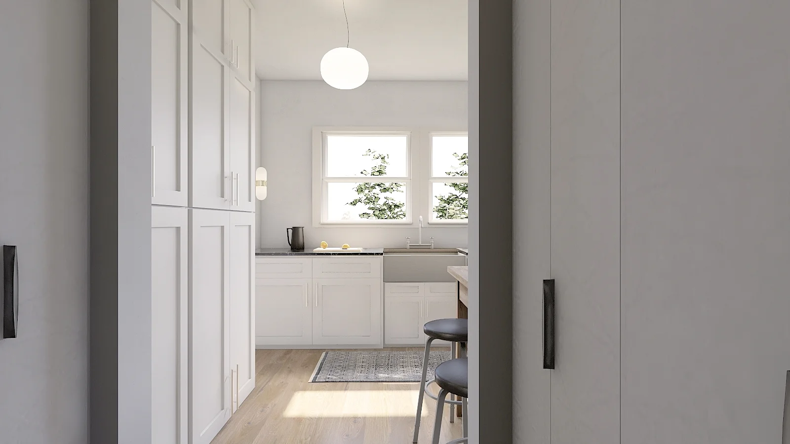
There’s currently 4’ 5” of space between the peninsula edge and the pantry cabinets. Lots of room for walkin’ even if you swing your arms out oddly wide. Seen through the pocket door are the master bedroom closets on both sides, and it dead ends into a wall for master bedroom privacy. No views into the master unless you walk in.

From the bedroom, there’s no sight of the kitchen, just the doors to the closet. The closets would have slender doors like Kim and Scott’s so everything would be concealed.
If you’re paying super close attention to the differences between Option A and Option B, you’ll see that I removed a row of closets to create hallway access but we aren’t actually losing any storage without it because all it did was create two corners that would have been unusable anyway. The other beauty of this plan is that there’s now natural light flowing into the closet instead of being a cave in the middle of the house.
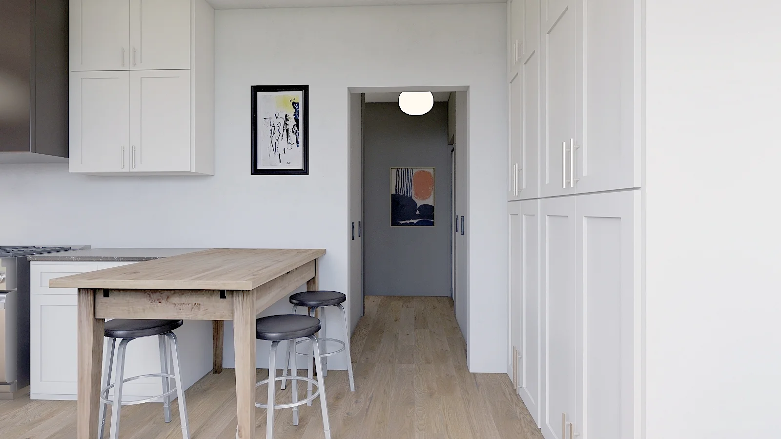
How pretty is this view to enjoy in my way to my morning coffee? As a reminder, this would be a pocket door, so we could close it for privacy - but I feel like it will be open most of the time.

Also with this plan, we have the benefit of not needing to make the den much smaller!! I’ll have to add this little 4’ x 4’ bump out into the room to accommodate the turn from the closet into the master, but I’m okay with it. After all, it’s better than taking the whole length of the room to make a hallway (like option A and many other plans). Some will ask, “why bother keeping the door from the den to the master?” My answer is basically “why not?” I really like the view from our office all the way down the hall and out the master bedroom door, so I’d be sad to lose that and the natural light that flows through. It also wouldn’t really do much of anything for the master to not have a door, but it would be a big weird box in the den if a door wasn’t there to give it purpose. I also like the circular flow of our house so keeping a door there would be a plus. Lastly, having easy access to a future baby’s room sounds pretty convenient to me.

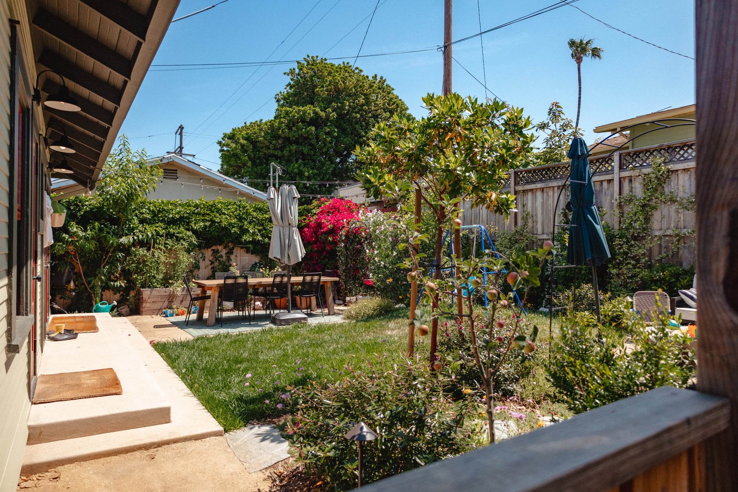
And here’s that view from the backyard. The white door would be a dummy door (that I’d paint to match the rest), but its okay-ish. Right? Riiiight??

If you’ve made it this far, I assume you’re into the nitty gritty, so here’s a floor plan with rough dimensions. This isn’t the most perfect representation of dimensions because the software I use has some limitations so I have to fudge things like my chunky door casing. So don’t hold me to the inches but this is still pretty darn close to what I’m working with.
I’m really leaning toward option B (clearly) but I’d love your feedback. Since this is the first time I’ve shown you option A, maybe some of you prefer that? Do tell.
Tell me your thoughts!
The survey is closed. Why? Because I made a decision! Click below to find out what I chose.